Screenshot / More abstract-ish stuff
-
 13-February 15
-
 Abstract art park
-

 4 of 4
- Views 2,013
- Fans 1
- Comments 7
-
 Description
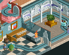
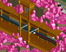
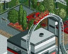
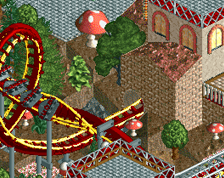
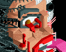
The bottom bit is based on a painting i made, the upper bit will just be a floating town not necesarily being abstract, rather just normal fantasy stuff.
They aren't this near to eachother ingame if you were wondering, i put them together in Paint. -
 Full-Size
-
1 fan
 Fans of this screenshot
-
 Tags
Tags
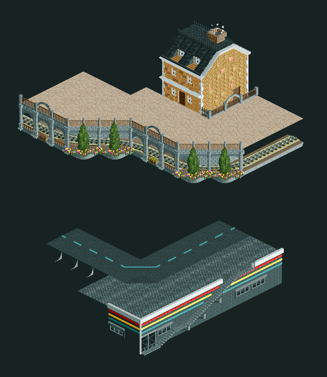
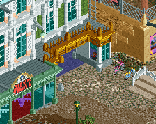
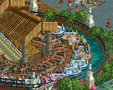
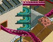
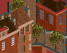
Really like the tram location, getting some Sey vibes from it which is great. I think maybe the path + light brown building combination is maybe blending together a little too much though.
The lower picture is certainly intriguing. The touches of colour are very nice but context is important when determining how an area like that would 'work' so I'll hold off on critique for now.
You've got me thinking if maybe they should go together. Clean city on top, with the industrial/utility landscape cut through below. I love the composition of both of these individually too though.
Good shit otherwise. You're pretty good nowadays. Glad we didn't ban you.
Yeah, i changed the buildings texture. I didn't know what colour to use so i thought i'd just use a texture without colour and i personally find it fitting (but Stoksy won't).
Okay this ties into the giant pink rock swamp area? I'm sold again. New building looks good.