Screenshot / Extinction Ending
-
 13-February 15
-
 B&M Invert - Extinction
-

 5 of 9
- Views 4,090
- Fans 2
- Comments 23
-
 Description
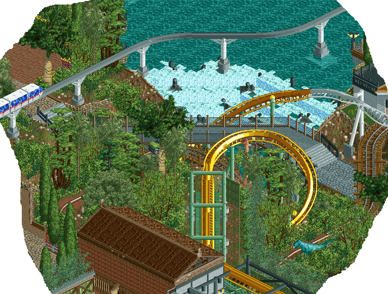
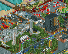
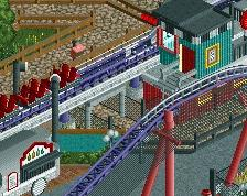
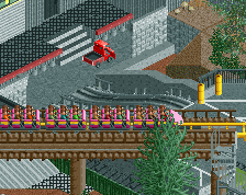
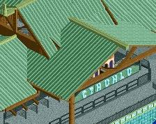
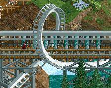
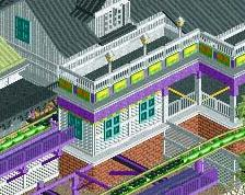
Another finished screen. Just showing off the three main rides [Monorail, Safari, Invert].
Ending up replacing the small building by the safari station with a path that meets up with the entrance plaza. This allows for better access through the park, and also makes the safari station area to appear a little more open than what it was before.
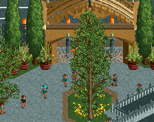
Foliage is actually quite enjoyable at the moment, although I hate trying to build on slopes because the 1/8 tile flowers don't work very well there. -
 Full-Size
-
2 fans
 Fans of this screenshot
-
 Tags
Tags
flawless
Richie Offline
The change in colour on the invert track seems weird but without seeing the whole thing its hard to comment. Look forward to seeing the layout, it looks interesting.
If you are going to have a waterfall like that, I would suggest putting some ripples in the water further up to simulate rushing currents.
Lovely work nonetheless.
I will say there is something Turtle about this screen. Well Done
This is amazing... I agree with Louis but that's the only minor suggestion I have.
Wow that's incredible. I agree with what Richie said, we'd need to see more to understand the color change unless you're still working over there.
This is a fantastic screen: nice composition!
Its amazing how clean and well put together this all is! Fantastic work yet again. Is this a design, or a park, or what?
I love this park.
That truck ride looks so much fun. Great choices for the track types it uses. The supports of the monorail, again, look fantastic, and there's something really appealing about the way it glides above the waterfall and lake. Really great stuff, and I can't wait to see this in-game.
it's cool man, lovely waterfall. i've got my doubts about the foliage though
I love this so much, but I think bolder colors on the coaster could help make things pop. My eyes are craving red or orange somewhere
Wow, thanks everyone!
@Liampie: I think that the lack of a focal point is a valid critique. I think that I imagined that the bridge would be that, but with the generally quite tall and relatively dense foliage selection that got lost a little bit. To be fair, this area isn't really a focal point of the park as it's purpose is more for ease of access to other areas rather than a main path.
This is a design, and the colour changes do make more sense once you see the whole layout
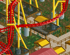
The colours of the coaster are something that I picked very early on, and make the changes in colour [which I'd like to keep if possible] a little more subtle than if I'd chosen a bolder colour scheme. However, if I see that the coaster blends in too much with the surroundings once they're finished then I would certainly consider a bolder colour choice [orange with dark blue supports].
I am still working on the coaster surroundings. Unfortunately, I got a little distracted by the outer park but will be starting on the main coaster next session.
Regarding the waterfall/lake; great suggestion and something that I would never have really considered. I will endeavour to try and implement that as best I can given that the large pool of water is essentially a man-made lake I have to try and work my way around having a system to recycle the water through quite a large area.
You know what I noticed with nedesigns, they want everyone to have a perfect ass park lol. Just let the person just create what they want and not criticize every little thing, because if you do that they will eventually not have desire to make something anymore bc your always bashing their work. But nooo if your a legendary parkmaker like Kumba or Corkscrewed or something there is no flaw..smh
The point is not to get people to create a perfect park. The point is to give feedback so the player improves, which is why most people are here.
Everyone is ever improving, nobody is perfect, and that is through critique
May be true but sometimes I feel like all that hard work is sometimes worthless bc they always will fail at something. Maybe I'm looking at this a different angle. This is why I never released a park even how long I've been on this website, It will never be perfect to that one person.
If you're building to please everyone then you're doing it wrong. We critique parks for the same reason people critique movies, art, architecture, etc. We do it in hopes of helping the builder, so he or she can create even better work, just as a filmmaker or artist would look at reviews and critiques and later improve their own work.
The "perfect park" will never exist, just as the perfect piece of art won't either. I personally build to satisfy myself (just as anyone else should), but I do look at criticism and learn from it. If I ignored it, I'd continue to make shit and that wouldn't make me happy. I get the biggest kick of looking at people react to my work and liking it, and listening to people and learning helps me obtain that.
Also, if you think Kumba and Corkscrewed are without faults then you're dead wrong. Son of Kumba was awful.