Screenshot / New Playground / Updated Swinging Ship
-
 07-February 15
-
 Sunset Vista
-

 16 of 17
- Views 2,176
- Fans 1
- Comments 18
-
 Description
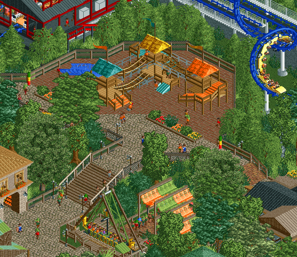
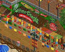
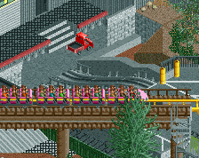
This is my first attempt at a playground but I think it's the perfect fit for this area so I decided to try my hand at one. This area is branching directly off the main entrance plaza.
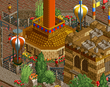
The swinging ship area has also been totally updated.
Amazingly this park is on pace to be completed this month. -
 Full-Size
-
1 fan
 Fans of this screenshot
-
 Tags
Tags


Looks great!
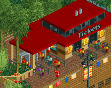
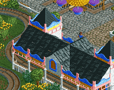
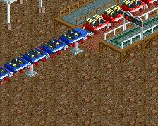
Love your style. Only thing that might be an issue is the Arrows station, the colors seem a little odd.
Lovely stuff. The playground looks fantastic and you've done a really neat job with the stairs by the ship. Are the green-yellow-red things height boards?
The orange, yellow and green is a nice combo. However, some other colours don't fit: the blue slide, maybe the cyan stuff, the arrow station colours. Perhaps the arrow colours too. But eh, it's up to you anyway.
The playground is cute though!
Really like the playground.
Fuck this is getting good!
Love the playground for the most part, although the bobsled track for the slide AND queue covers isn't quite working for me. I'd just go with the dinghy slide to be honest. Also, from this angle I think the queue covers are a unit or two high but that might just be me.
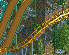
I am a little worried that the foliage is getting too dense though...still, as long as everything is visible for certain angles then I guess it should be fine.
you're really getting there, bill. in all honestly your work is now just a notch below what top-notch realism is, and this park may very well be scraping 80 though will most likely score gold.
some crit, because you can escape it with me
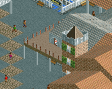
-playground on brick, so that when some retarded kid tries to jump off the bridge he'll break half of the bones in his body
-foliage a little too thick, it's covering up some things and muddling up the swinging ship queue
-the colors for the ship and awnings. they're fun, but there's loads more atmospheric ways ot achieveing that in my opinion
Very atmospheric, looks really cool with the peeps on it in places, would recommend choosing a different fence for the bridges on the playground, the grey qrails just seem a bit out of place and floaty.
The park looks really neat and it looks like a great place to put a playground, however I would change the brick path underneath the playground to something a bit softer just to add extra realism
light yellow and dark blue...orange and dark green..you can pick a better selection
My only worry is that kids will burst their heads wide open if they fall on that brick tile.
Thanks so much for the great feedback everyone!
I updated the railings, the slide, the colors and got rid of the bricks. Let me know what you think.
I'd use sand, grass, or gravel, rather than a path type
I personally think it looks fine, it might look odd if its just on the ground. Nice work.
ooh, those white box objects in the station are pretty bad. get rid of that shit.
It's supposed to be a rubberized surface which is very common in playgrounds now and won't cause people to track dirt / sand all over the midway. I think I might stick with this.
And Cocoa I sort of agree with you. I have it used infrequently in a few places as either a loose article bin or a file cabinet and didn't know of an alternative. Does anyone know of a better but semi similar object?
Thanks again for the feedback!
Shouldn't the height sticks be the other way around? And I love the color of the clay.
Fuck! Good catch. I've been good about flipping them around with kids rides but I sort of went into "height stick autopilot" with these I guess.