Screenshot / New Entrance area for new project!
-
 06-February 15
- Views 1,281
- Fans 0
- Comments 10
-
 Description
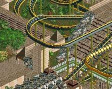
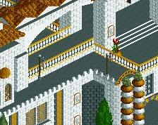
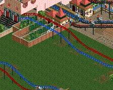
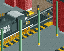
What does everyone think of the beginning of my entrance area as a basis to follow on from, in terms of architecture and design. Any tips and pointers would be welcomed. What you think of the pagoda style fountain with trellis above? to much?
Thanks -
 Full-Size
-
 No fans of this screenshot
-
 Tags
Tags
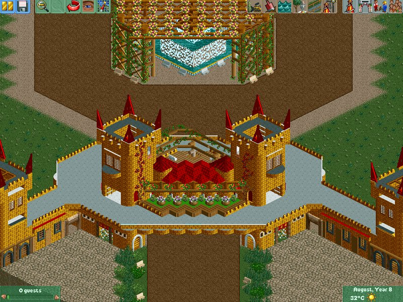
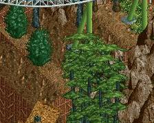
The colors are bold but I kind of like this.
I don't know how I feel about the fountain area though.
A garden above a fountain like that would be a maintenance nightmare. Leafs and petals getting stuck in the pumps all the time.
I quite like this. clever use of the wooden support peaks.
this is quite charming. although i would go for a colour change maybe, the red and gold contrast a bit too much for my likings. and i agree with inthemanual, those woodensupportworks are used really clever
Yeah the colours are a bit wild indeed. Not 100% that I'm going to keep the colour scheme as yet. Obviously its not finished though so I'm hoping a few buildings of a more neutral colour surrounding fountain area will diffuse things somewhat. Yes a maintenance nightmare that's very deep thinking, but also true lol
Cheers lads will definitely review the colour and maybe remove the fountain and just have a pond, I can pay a handyman to clean it ha
The gray is ruining this. I almost wish there wasn't a walkway, but instead the peeps would walk directly under the portion seen in the thumbnail. I'm not really sure how to explain that, but basically remove the wide gray cover and use the two large towers as the beams for the entrance.
I like the hanging garden, but think it's a tad too high (I assume this is to allow the fountain underneath?) I think a pond would be a nice choice, allowing for the reduced height, and perhaps the fountain could be relocated.
The entrance structure is certainly interesting, almost like a corporate castle. However, I think the almost-but-not-quite symmetry throws me off a bit. I think you should either make it symmetrical, or push the asymmetry further. Either way, good start!
Yeah I hear you there about the grey. It is a touch overpowering. If I remove the grey area though it kind of removes that two level element that I went for. I agree though its something to look at as it is starting to offend me all the grey as well!!
Thanks, yeah I think your right about the height of the hanging garden, and removal of the fountain is the perfect way to do it!
Yeah corporate castle good shout! Well noticed on the asymmetry its only off by one tile. I think I will push that further and make some additions/removals based on everyones input. Thanks all
I personally don't mind the grey walkway, but I think that nin is right that it would probably look better without - or even change the colour to black. In my opinion the dark red and gold is a little too dark and contrasting for me but how well it 'works' will depend a lot on the surroundings so I'll hold off on too much critique for now.
Despite the maintenance nightmare, I do kind of like the wooden trellis over the fountain. I do agree with Chocotopian though that a pond might fit better. Alternatively, replace the flowers on top with more of a weed/brush growth on top.
Yeah I didn't myself, I wanted it to feel as if it was a used area, hence the gardens etc...have thrown a few more bits of detail in. Will try it black have just uploaded a revised version, reducing the amount of walkway and it seems to work better. As you say the surrounding buildings will hopefully diffuse as I wont continue the heavy contrast of the colours.
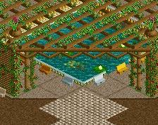
I have massively improved the fountain, well its gone so no maintenance nightmare, a pond in place and with a reduced height as chocotain suggested. Also I felt myself, as you say, that the flowers on top needed more a vine like growth and have changed that. Much improvement?
Hadn't realised I could attach instead of making a new thread