Screenshot / SoNY Round 2
-
 28-January 15
- Views 2,250
- Fans 0
- Comments 10
-
 Description
Wanted to start on second Streets of New York project. 500 points to whoever can guess (specifically) where this is.
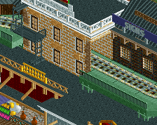
Also, I love the bridge, but I'm not too sure about the wooden planks. I put those there to make it portray a wooden bridge, but I think the striped texture is a bit odd. -
 Full-Size
-
 No fans of this screenshot
-
 Tags
Tags
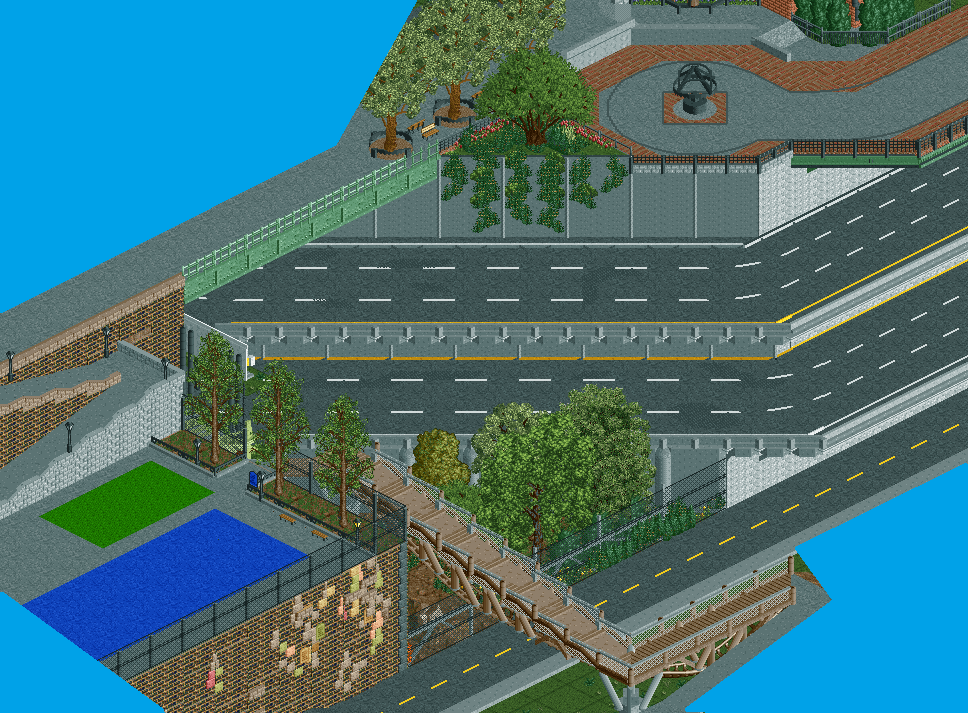
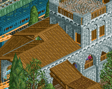
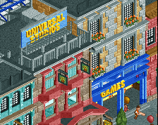
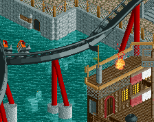
Woah, the textured wall looks surprisingly good here.
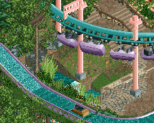
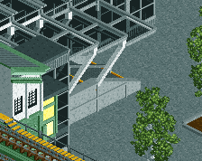
The bridge works well enough, but I do think that you need some more support for the B&M objects. There just doesn't seem to be much stability underneath them for me [the grey base doesn't look connected to the coaster track].
Really interesting, and something new/different. Not something that you see very often nowadays.
The bridge works perfectly. What doesn't look so good is the coloured textures. The blue and green are too bright and harsh, I'd dull them down a bit.
Nice breaking up of the road though, the texturing is down well, this is what you need to do in your boardwalk.
The world is collapsing! Everybody out of the World!
Nice, looks like somewhere along the Hudson Pkwy but I have no clue where.
^Looks more like the FDR to me.
Love it.
Wrong borough.
@louis: The real pavement is darker there, which provides a lot of contrast, which I really liked. The problem with the darker pavement in RCT was that it blended in with the highway too much. I'll see what I can do with duller colors though.
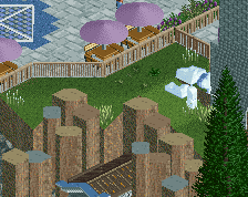
Also, does anyone have any ideas on fixing the bench sprites so that they're not hidden partially behind the curb they're in front of?
Don't use curbs, place them on the other tile, make them into a wall object, use an existing wall object for curbs, find an excuse to have other than curbs in that particular spot, so many options
ugly trees <3
Love this.
I actually don't like that blob of colors and stuff on the big brick wall. It just doesn't make sense to my eyes