Screenshot / Mineral Springs
-
 24-January 15
- Views 3,268
- Fans 1
- Comments 14
-
 Description
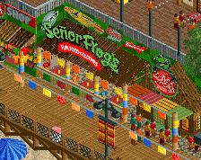
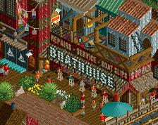
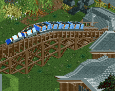
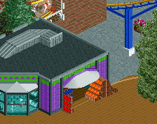
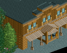
A preview of my entry for the January Reddit contest. Mineral Springs, a wild west theme park. Sure it doesn't have a snow theme (though according to the rules it doesn't have to) but I did try to keep the integrity of the bench intact.
This screen showcases 3 of the park's major attractions including Diamond Diver, a small B&M dive machine. -
 Full-Size
-
1 fan
 Fans of this screenshot
-
 Tags
Tags
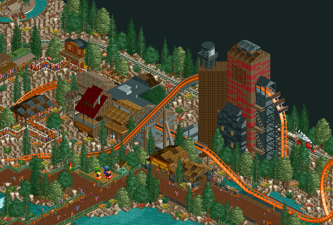


Too many 1k ruins, and the tree selection doesn't really scream "wild west" to me - I think that you need some sparser trees [ie the chinese cedar for example, just trees with fewer leaves] or a few cacti if they're in the bench.
Coaster colours are perfect [perhaps black/grey supports though] and the water tower looks really good if a little out of place on top of that massive wooden structure. Themed queue looks awesome as well.
You have to try to merge on a holding brake though.
My only complaint is too many ruin objects, they're somewhat distracting.
Your use of 1k ruins has surpassed my own.
I didn't think that was possible.
I like the rocks.
Yea the rocks, nonethelesss great screen
i like it, even though it's repetitive in terms of rocks, the coaster has a good presence in the screen/area
It looks pretty cool and believable. The rocks don't bother me that much, but maybe throw in some other quarter tile rocks or give one or two rocks a different colour (lighter brown and gray).
Yeah the rocks could be better, BUT, they aren't that bad. The rest of the screen is lovely, like Gee said, the coaster's presence is fantastic.
Also, I think you misspelled "csw mining"
no i think he spelled it just fine
also this looks really cool, i love the atmosphere. though i agree i'd switch some of those 1K ruins for normal landscaping. the divecoaster is awesome
You could mix in normal landscaping like gdb said, or try mixing in some monorail curves.
Wow! Thanks for all the comments. Positive or negative it's always great to get so much feedback on your work so thanks for taking the time to check this out.
The loose concept here is for the park to be sort of like a miniature version of Fiesta Texas which is built within a quarry which is the reason for all the rocks. Generally with Reddit parks I try something totally new for me and at times may overdo it. I don't know why that happens but I'm usually able to scale it back and apply it to future parks in a less prominent way (see my use of trackitecture in Whispering Pines). I'll see if I can add in a bit of foliage or something to break this up when possible.
I'm really happy to hear so many positive comments about the coaster though.
I feel really good about this park and I managed to get a few cool tricks in there that I've never done (or in some cases seen) before so hopefully when this is released everyone enjoys viewing it as much as I enjoyed building it.
6ca Offline
I think this looks fantastic. I'd love to see you add a little bit of snow to this to recapture a bit of the winter theme. I've been to Bryce Canyon and Arches national parks in the winter and the atmosphere is breathtaking, and something I haven't seen many folks really capture as a theme in RCT. I'm also not the biggest fan of that shorter, bushy tree--I'd go with more conifers.
That being said, I can't wait to see the finished product when you finally do release it. The layout on that dive coaster looks great from here.