Screenshot / Slot Swaffelhoeve 2000
-
 15-January 15
-
 Slot Swaffelhoeve
-

 13 of 28
- Views 2,202
- Fans 2
- Comments 9
-
 Description
No new additions in 1999, but this has a reason!
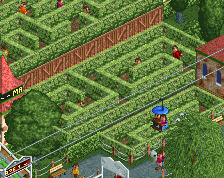
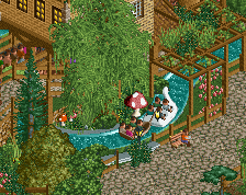
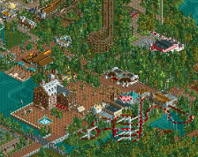
In 2000, De Beukende Boekanier, the first Intamin Mega Coaster in Europe opened in Slot Swaffelhoeve! We hope to definately outsmart our competition with this addition, bringing in more and more visitors. This millenium will be one of great additions and wicked thrills!
Check the comments for another screen. -
 Full-Size
-
2 fans
 Fans of this screenshot
-
 Tags
Tags
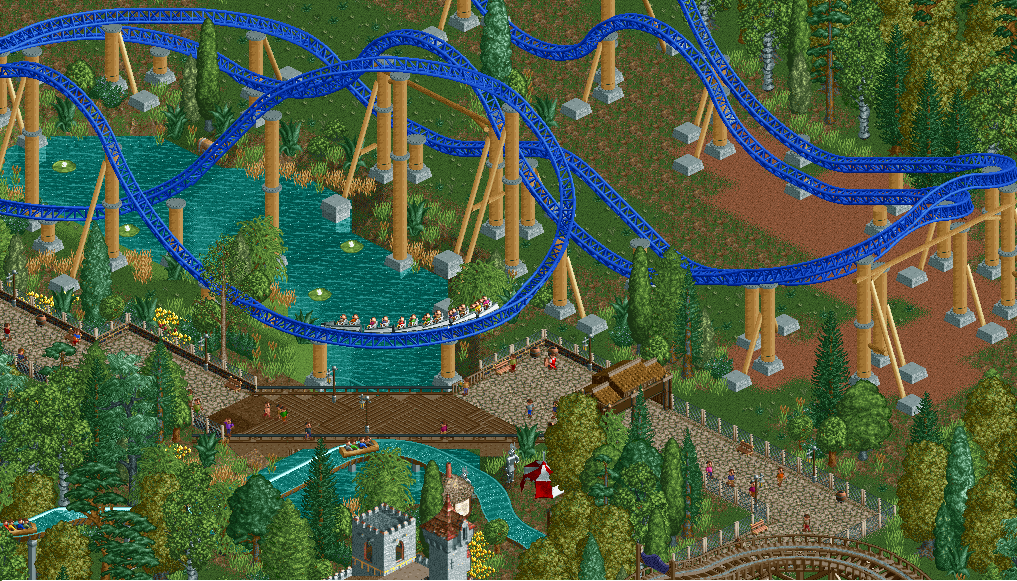
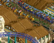
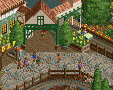
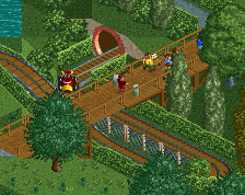
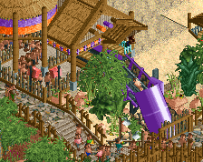
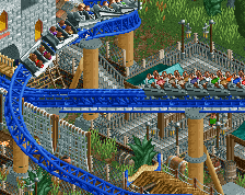
That swooping drop near the walkway is beautiful. I'm a big fan of the lift too... it's simple but very well done and that little antenna is a great touch.
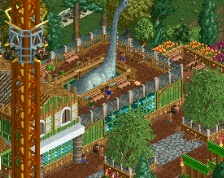
I'd suggest flipping the Top Spin though so it faces the path.
^I agree. Really nice track layering as well in the second screen. I don't know if the deep blue is quite right, but that's just me.
Looking great so far.
Seems like Slot Swaffelhoeve outsmarted atleast the Holidaypark, building the unique ExpeditionGeForce Firstdrop a few years ealier than them! The coaster is really looking great, but I agree to coasterbill. I think flipping the topspin around would improve the interaction with those too scared to get on it.
Wonderful placement and interaction of the coater, the path and the lake.
That swooping, big, curvy drop is my personal favorite to design on an Intamin and you've successfully incorporated the coaster very well with its surroundings. Very well done.
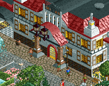
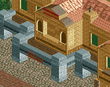
Really nice composition.
dat instant competition between the dutch parks. Swaffelhoeve took a jump year but it pays out
Yay! No one ever builds Intamin Mega Coasters anymore!