Screenshot / Midway
-
 15-January 15
-
 Stoksy's Magnificent 'Musements
-

 21 of 21
- Views 2,874
- Fans 4
- Comments 17
-
 Description
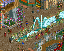
Finally got around to opening this park again, and it's embarrassing how dated some of the stuff is. Not only object-wise but aesthetically as well.
Basically, I'm going to try rush through it's completion because I'm really annoyed at seeing it on my hard-drive at this point haha. Will try to ensure that the rest of the park is completed to a high standard but don't think I'll be going all Pacificoaster on it and going back to redo stuff unless it's completely terrible/important [eg layouts].
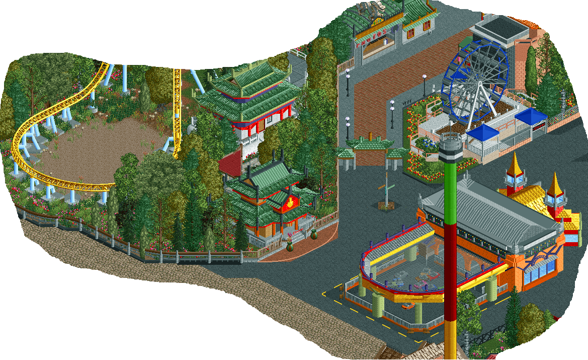
*This is one of the better parts in my opinion - more wanted to show that I will be bringing project back very soon. -
 Full-Size
-
4 fans
 Fans of this screenshot
-
 Tags
Tags
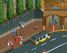
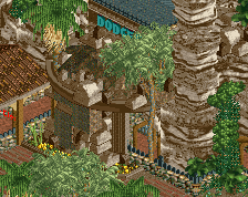
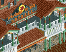
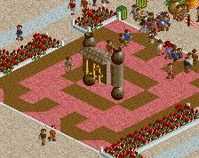
wow this is simply fabulous, only thing I'd advise youto do is to have a few larger trees in there so they don't look as a bunch of same sized trees and it'll add a little more variety into the foliage
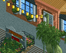
I love the Asian stuff though! The path arch and the dragon statue are amazing.
The diagonal covered entrance is fantastic!
This is easily my favorite part of the park. I agree that the rest of the park may need some work but I still love the asian area. I feel like this area was what propelled you to the level you're at now as a player.
Join the club xD
Love what I see here though
The one thing I do have to say is nagging at me the more I look at this screen is the fence on the left. It just seems messy and overdone. I like what you did with the track, I would consider lowering it 1 value and cleaning up the scenery.
I love the colors on the pagodas.
This reminds me of Prodigy, which is not a bad thing by any means.
Keep up the great work man.
Thanks for all the wonderful words everyone.
I will say that the fence to the left that you don't like disneylandian is certainly not one of the best things I've ever done. I totally agree that it looks quite messy and I will probably go back and try fix that at some point.
Completely agree with your point BG, but I'm having some small object problems [in that I've used them all] so would have to replace an already used object that I don't know if I used in an important area, and it's just a pain really. I'm trying to make do with just the large oak tree at the moment but unfortunately the foliage won't be the best. If anything this park has just taught me the importance of selecting the right objects early on.
It's okay nin, that's still going
Thank you Maverix, took me a while to truly appreciate prodigy's work but have become a huge fan. I thought that prodigy's architecture was very high quality and am glad that mine can compare.
Roof textures of the bumper cars will be fixed, thanks for that.
Everything here looks awesome! My only minor suggestion would be to change the railing colour around the big wheel - just thought the peach blended in too much with the white and made that area look a bit bland. But yeah, fantastic work on everything else.
I love the bumper cars here, but inthemanual has a point! the color scheme doesn't match the pagoda/Chinese/Asian theme. Try to make it look more like the other fantaboulus building. The "Chinese Purple" is a nice touch (or was that by accident? ).
).
I really like this.
lmao, nice to get a screen bump but this is very dead, very old (although some of the stuff hasn't actually aged *that* badly eg Chinese archy), and can be downloaded in full here: https://www.nedesign...usements-unfin/
Cool....I love the middle finger on that gable roof end there...
What a weird park this was. It was godawful macro-level but super promising detail wise.