Screenshot / Teutonicus
-
 30-December 14
-
 Kings Valley
-

 7 of 7
- Views 2,149
- Fans 0
- Comments 17
-
 Description
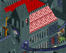
Teutonicus is the parks newest coaster, being build in 2013, and already is the parks flagship attraction. the ride is themed after the old german Teutonic Order, and a mystery surrounding it (more in the readme). getting some constructive criticism would be great.
-
 Full-Size
-
 No fans of this screenshot
-
 Tags
Tags
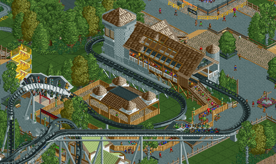
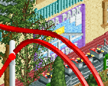
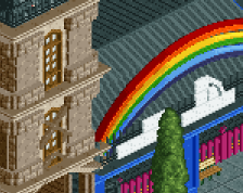
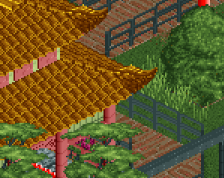
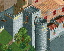
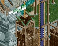
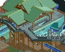
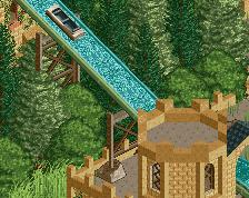
I like the station. I really do not like the queue cover gazebo thing. The towers don't work, the colors are too samey, and the whole structure is too heavy. Go for something either lighter and more airy, or a full-blown theme-dedicated structure that carries the architectural theme a little more than a shingled roof that looks like it's still under construction.
thanks ling, i just couldn't put my finger on what was up with it. is this better?
that helped with the "samey" but not the "heavy"
you know things like that are usually just hollow structures often not even made of brick right?
Visually heavy, not physically heavy.
Maybe just have the brown roof over the queue and add a separate structure with the stone tower.
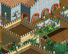
It's quite not bad at all. A bit too clean maybe?
^I agree. Most of the shots I've seen of this park are really clean, not a shrub out of place. Just a bit too perfect to be an accurate representation of a theme park.
I like it a lot but you need a transfer track since you seem to be going for realism.
darn @posix and @csw finally nailed my issue gdb. its too clean. underbrush is almost surgeon filled tiles no randomisation. its too planned for my taste
any idea on what i can do about that? i seriously have no idea what's missing or what's there that shouldn't be there. right now i really want to finish this up (the park is at like 95-98%) and get a silver, and i really want it to be up to that quality
This is a pretty good screen man.
But please stop (like me and others have said a million times before) building for a specific accolade. Did you seriously just say that you want to finish this so you could get silver?
not in any way, it's just that if i can put in an extra few hours to improve this i'd do it
Hmm,I think this is one of the lesser screen you've shown us. Like everyone has said, it is definitely too clean. I don't like the fencing you're using here, it closes off the queue to much.There are also a few things bugging me about the coaster :
-You don't have a transfer track. Every b&m has one and you're also running two trains.
-Your peeps can only enter one side of the track, which means only half of your trains would be filled.
I think it might be best to redo this area and part of the layout, maybe cutting the pre-lift section so you can fit the transfer track easier.
The station, although solid by itself, really doesn't fit in with the surroundings in my opinion. You've got this kind of medieval/castle feel for the station that is surrounding by generic and carefully manicured foliage. I think you need to theme a little around the station and it will help it fit in a lot better. I don't get the german feel that you're apparently going for...maybe the readme will help but you shouldn't really rely on it in my opinion.
Transfer track might be a nice touch, but the layout itself is more important - hopefully it's solid.
This is a great catch. I know fixing it would be a pain in the ass but it's worth the effort as it's essential for any wingrider coaster.
gdb, I hardly ever advise this, but in your case I would actually try to think less when you build. It's not about adding something it needs, it's about making it more organic and less controlled. Put some good music on your ears that gets you into your creative zone and let it flow. And then just try.