Screenshot / Kings valley's mainstreet
-
 23-December 14
-
 Kings Valley
-

 4 of 7
- Views 2,793
- Fans 0
- Comments 11
-
 Description
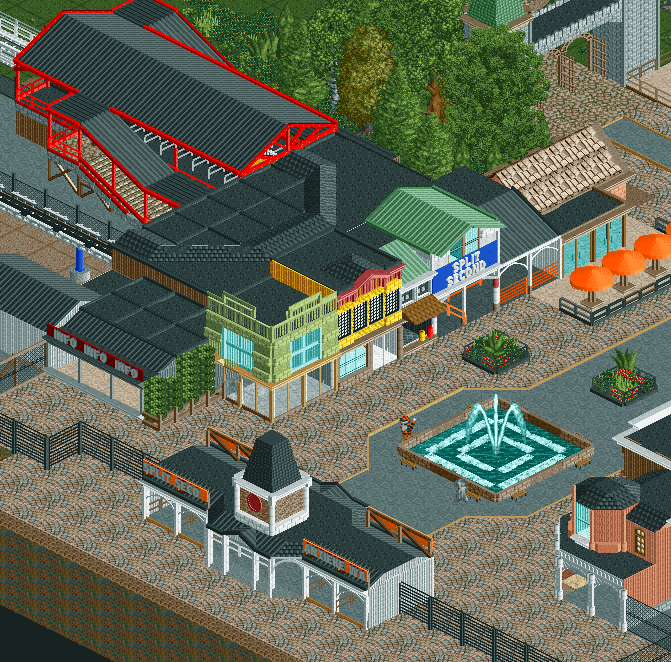
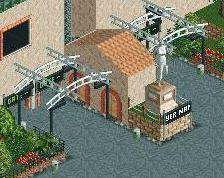
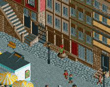
not 100% finished, i still need to add benches and other stuff in other places than around the fountain, but i'll do that later when i'm wrapping everything up. also some extra planters and small vendors. it'll probably get a whole load more atmosphere with peeps too
-
 Full-Size
-
 No fans of this screenshot
-
 Tags
Tags
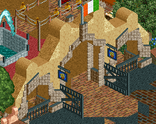
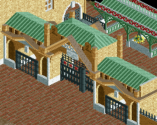
Don't rely solely on peeps to provide atmosphere. The big black metal fence is pretty uninviting, I'd at least stick some flowers on either side of it.
is red better?
also i'm not relying on peeps for atmosphere, that's why i put in those planters and that fountain in the first place and yeah planters and stuff are still to come there, but maybe some flowers wouldn't hurt
Actual criticism:
I can't tell what any of the buildings are for. They're also very flat; they share the same plane for the front of the facade. Set one or two forward or back, make things a little bit bigger, and clearer as to what they're for.
I just don't understand this sorta critisism. Not from anyone. If you're building a street, do you really need to give EVERY house a purpose? Can't they be decoration? Houses are supposed to be lived by normal people and aren't shops or anything special. Not some type of purposeful thing other than being a building, in RCT2.
And everything in the screen is clearly a shop. Is that so hard to tell?
My only complaint is that there is a lot of black. Try using some other roof colours, even just grey could look good. I really like the Split Second building, i'd suggest colouring the roof on the right of it green too.
I'll say this... almost every theme park pulls a trick where on Main Street they give the appearance of having a lot of quaint little shops, many of which with no real identity but in reality they're all one huge, connected shop on the inside. Everyone from Six Flags up to Universal does this and since it's obvious that all of your facades are on one building I would buy into that but there's one problem...
I'm assuming "Split Second" is the rocket coaster and the turnaround is actually inside that building... so I feel like in reality the building would probably cover the Split Second gift shop, the photo booth and the queue line which is fine except that it's kind of strange that that would all be right inside the main gate rather than a more generic gift shop.
I see you have a gate to what I assume will be a themed area of the park on the upper right... why not have the entrance plaza for that ride in that area? That allows you to build a larger queue line which the ride deserves and a better entrance plaza and it also allows you to make this building more functional.
ITM couldn't be more right about the glass doors either... open that up and add some shop objects like ik maps or clothes racks... something to draw people into the store and add color and life to the midway.
Also, I think a buffer zone between the path and fence would be nice as very few parks go right up to a gate like that... maybe an area with some plants and flowers on either side would breathe some life into the area.
Overall I like this, I just feel like there's room for improvement. Sorry if I sounded overly negative but I know you have great potential and I could easily seeing this being a fun, lively area with just a few small tweaks. I'm really liking this project so far.
You seriously need to spice up your colour palette I think. You use such dull colours: browns, black, white, pale green which just makes it look generic.
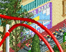
sorry this took so long, but here's an update. i would've posted this sooner but my game decided to make all my invisible entrances go null and created a couple of black holes so i just reloaded the last save file.
keep in mind the teal building is supposed to be the giftshop. like i said the only reason you're not capable of seeing the purpouse yet is because this isn't 100% finished, but now you should.
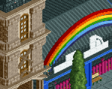
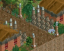
edit: here's an updated screenshot of the coffeehouse
i really have no idea how to make it look more like a coffee house than it already is
I think the coffeehouse looks fine.I dislike the big tree though. In the garden.
I think this is a pretty good screen and I agree with the criticism it's been getting. The fence really gives off an uninviting atmosphere, and I think it'd be best if you changed it to a brick fence or something. There's also a lot of black and the screen, which you could fix by recoloring Split Second's roof. And this is maybe a personal thing, but I would start Split Second's queue one block in front of the building to make it stick out more.
Probably my favourite screen from you, although Tim brings up a really good point about the flatness of the buildings. Just bringing out the corner building and the queue cover building for Split Second would help a lot!
Also, not convinced by the path choice here; I find the Cena path object really doesn't work in a main street setting - brick or even crazy paving would work better I think, just because the Cena path object is quite intricate and wouldn't be used for such a populated area in my opinion.
The fence isn't ideal, regardless of colour. I'd maybe try for something similar to Parque Warner [from H2H] where you've got the main central building but the roof continues over the park gates. Would also allow for ticket purchase booths on either side.
Lovin' the modern station - simple but effective.