Screenshot / Where The West Begins VI
-
 06-December 14
-
 Where The West Begins
-

 6 of 7
- Views 2,604
- Fans 1
- Comments 7
-
 Description
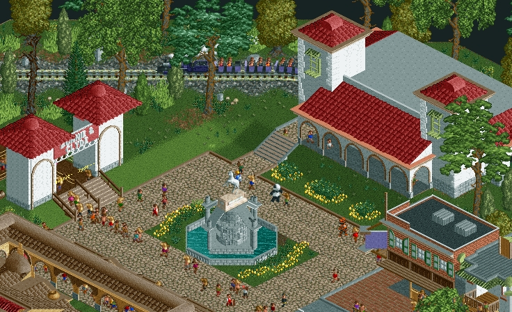
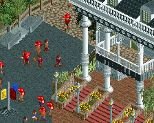
Everyone knows the town Square, you'll find it when you see the fancy horse trough. Folks will stop right there and tie the horse up and stop off at one of the Saloons down on Main. You gotcha`r train station right there to, straight to California. Got some of that ol` Spanish look to it. Some folks be usin that train as a quick escape when they try and rob the banks.
-
 Full-Size
-
1 fan
 Fans of this screenshot
-
 Tags
Tags
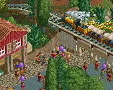
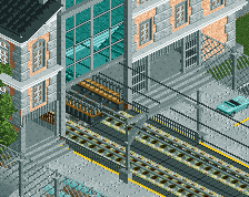
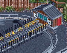
Lacking a bit of detail. But still, nice all the same. The fundamentals are lovely, just a bit plain on the white walls.
Project is getting really close, just wrapping up some things.
I do have a question for ya'll, is there any way to import entertainers besides the 3 animals that come with everything? I really want the sherrif and burglar guys.
I think the sheriff and burglar come with the wild west tab.
Very nice. I wish the path gave the fountain more room to breathe but besides that it's very nice.
The Bonnie and Clyde arch seems too bulky to me. I like the idea with the statue, but I think it could be a bit more coherent looking.
I like the rest. The arches are definitely giving this area the right feel.
Agree completely with Louis on this; everything just seems a little...flat. In that there isn't enough texture to give the idea that the walls of the buildings are in any way solid. The arches themselves are quite cool in here but don't look as if they could support the roof. Something as simple as adding in a 1/8 or 1/16 block behind the arches could help a lot here, or using a 1/4 tile arch.
I do agree that the Bonnie & Clyde arch is a little bulky; I'd maybe try something with a curved arch over the queue instead of the 90degree angle you have at the moment. The colours are decent, if perhaps a little roman rather than western, but the towers are a little flat in my opinion - try a steeper roof perhaps.
The fountain statue is probably my favourite thing in this screen although a little big. Like the car in a previous screen; you've got a really awesome looking custom object that's just a little too big for the scale you're building in. Lowering it a unit or two may help.
I think the square is too... square?
Maybe make sure that the stairs towards/from the train station (?) flow out into the path a bit more, by maybe adding small diagonal pieces on the one tile part of straight track between the stairs and the square.
I really like the train, the fountain and the building on the bottom right.