Screenshot / In honor of reaching year 500...
-
 03-December 14
-
 Sunset Vista
-

 15 of 17
- Views 2,935
- Fans 2
- Comments 14
-
 Description
I haven't posted much about it lately but I've actually made a ton of progress on Sunset Vista and am starting to see the light at the end of the tunnel.
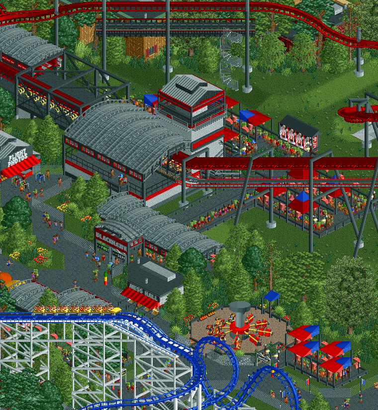
The area near Blackhawk (which is still it's name despite the new color scheme) has been totally re-vamped. This includes new foliage, a new S&S tower ride and a new Arrow coaster to replace the old Zacspin. Blackhawk's layout has also been changed to make it flow better.
I've also gone through and updated almost all of the foliage in the park. I still have another hundred or so game years to go but this park is finally starting to move along again. So in honor of year 500... here's my latest screen. I look forward to hearing your feedback. -
 Full-Size
-
2 fans
 Fans of this screenshot
-
 Tags
Tags
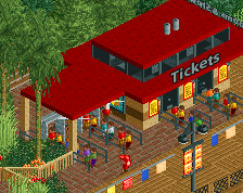
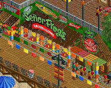

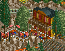
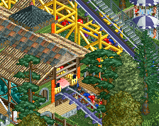
I'll give you my standard 1/2 "this is such an improvement" 1/2 "release this and move on"
this is getting really, really good
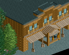
I'm very conflicted about this screen. The station is great, the coaster looks good, the entrance is a little flashy but is fine (is that duplicate awning supposed to be there?), and the form of the supports is good.
However, the flat ride just looks so "plopped down" and the queue coverings are boring and just kind of... there. The realistic elements on the supports are all failing at what they're supposed to do in real life - i.e. hold the track from above and support the catwalk from below. This is an easy fix but currently it just looks very off. The foliage colors are nice and light and airy in contrast to the reds and blacks, but the tree choice looks very off to me. The path is too thin everywhere and the fences look so out-of-place, like there's a dangerous animal exhibit on either side of the midway. Expand the path and make the area breathe a bit more.
I'm also assuming the path connects back around off to the left of the screen (by the photo stand), but if it doesn't, it should.
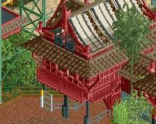
Ling's right about the supports being off, and I think the awning on the "mess hall" is a bit low, so I'd raise the roof on that a bit.
Other than that though, I think this is a great screen. I'm excited for where this has come, and where it's still going. Can't wait for a release
You're suffering from too much repetition in my opinion. It started with the oddly peaked roofs that you keep building and now the queue awnings are way overused.
I can sort of tell that you're suffering a bit from an old-bench that isn't quite giving you the ability to make what you want here. Especially considering the aforementioned repetition; however, the trackitecture and form of the station is certainly unique and therefore works here so that's a step in the right direction.
The high mesh fence doesn't work in such a confined area, you would be better off just making that a curb or much lower fence. Despite the overarching top-gun/air force kind of theme that I see here doesn't necessarily mean that you need to fence off the area in a restricted area/air force base kind of way. Here and there it works, but not framing the entire area.
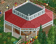
As Ling said; the flat-ride is poorly executed in this setting. How you did it in the western area was great because it fit with the ground texture and setting. However, in this area it's just an eyesore. Considering re-texturing the ground there [maybe use the roof texture object, cover the entire ride, or raise it on a platform] just so it fits better with the surroundings.
Overall though, I love the colours and the transfer section looks really clean. You've made that weird trolly object [which I've never seen before] almost fit perfectly here - the texture is way off so could (probably) never be made to blend in to my liking. A bit bare, but that's just me and my "fill every square with foliage" craziness. Foliage has certainly been improved though so kudos!
Also, please finish this
I would suggest breaking up all the grey curved roof. The station is great keep that, but some of the other roofs don't necessarily need to be this hangar style roof, or at least, change the colour of it. I commend you for trying this different roof style, but there does seem to be too much of it in this one colour.
When using the mesh fence, make sure to put in some posts with it, otherwise it looks like the fence is just self supporting, which looks a bit weird, this fence is quite formless and so having the posts there would help it look more substantial.
Great work though, good to see this becoming more and more finished. If you need any in depth feedback at all, drop me a message!
Wow, kudos to you for sticking with a project for 500 years! That's some serious endurance. The screen looks good, though I can't add much more critiquing than you've already received from others. I was looking over some other screens with this project and I'm really impressed. I can't wait to see the finished product, hopefully in the very near future! Keep up the good work.
Thanks for the great comments everyone. I really appreciate all of the responses as your feedback has helped me a lot throughout this process.
Okay... response time.
FK: Thanks! I'll have to give you the standard "This will be released but I'm going to bring everything up to the level that I want it to be at before releasing it"... I think it's only a few months away though. lol
GDB: Thanks!
Ling: Thanks for taking the time to write such a well thought out response. What duplicate awning are you referring to? I'll look into that and see what's going on. As far as the supports you're totally right... what the hell was I thinking, maybe I was drunk lol? I'll fix those so they support the catwalk.
As far as the canopies I do use them quite a bit but it's because theme parks really do use them everywhere these days. I picture this park as being somewhere between a Busch and Cedar Fair quality and Cedar Fair especially loves nothing more than shade canopies. Soon they'll put shade canopies over their shade canopies... that's how much they love them. I've tried to restrain myself in this area and actually removed them from the arrow queue and avoided them for a 3d theater ride that's nearby but not pictured so it's not as bad as it seems. I'll see what I can do to replace them in a few of my queues though.
inthemanual: Thanks! As I said above I'll fix those supports. I'll play around with that awning though it actually seemed a little too tall when I originally had it 1 square higher.
Stoksy: Thanks for the great feedback. I'll try to vary up the roof textures or at least colors a little bit more. As far as the fences I always feel like every path needs a fence next to it and I know it doesn't but I keep doing it... I'll try to remove them where they're unnecessary. I'm going to trust you guys on this since I know I need to cut it out with my fence obsession. lol
I'm surprised at the reaction to the flat as I actually like it's placement quite a bit. I'll try changing the base though I like to use the ground textures as they glitch less than objects do. I'll play around with objects and see if I can get any to work. If I can correct that I agree that it would look a lot better.
I think you repeat that 1x1 wedge shaped queue awning to much, maybe ateast change how you do that.
Good idea. I'll try that... I might check out a few other parks for inspiration on alternate queue cover ideas.
you've gotten so much better in the past six months bill, it's astounding to see the progress on this park from then onto now, and i hope you finish sometime soon
high gold is easily within reach for you
once you break out of using the same architecural forms again and again to no avail, you're really gonna get up there
i agree with this, though, it would make the screen a lot more inviting from a peeps persepctive if you removed those seemingly unnecessary fences. you should work on the form of the air hangers and the station tower i think as well
Thanks! I really appreciate the kind words and the advice. I'll keep tweaking this area to try to improve it.