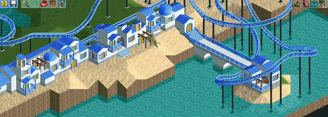
Screenshot / Shoreside Buildings
-
 01-December 14
-
 Shoreside Theme Park (Abandoned)
-

 3 of 5
- Views 1,750
- Fans 0
- Comments 10
-
 Description
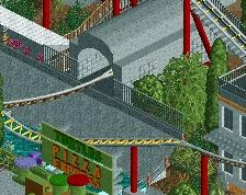
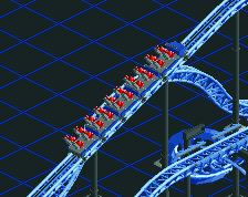
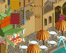
Wow, I really enjoy building this style. It's probably the most I enjoyed playing RCT and the first time i enjoy it for months. So I build a little more of my mediterreanean village at the shore. The coaster will launch along a line of buildings that block the view to the sea until the appropriate moment.
-
 Full-Size
-
 No fans of this screenshot
-
 Tags
Tags
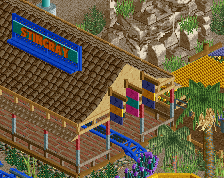
The scale is small, but that's OK if it's consistent.
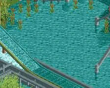
I'd like to see the sand be more like a beach, and actually touch the water. I'd suggest doing that by making the houses on a bit of a cliff, and having parts of the sand lower down at/around water level. I also like that you took the dome advice into account.
I gave this a 40 vote, because although I like it, it's rough and unfinished.
I will do that, but I guess it will be a lot of testing around and stuff, so I thought I build the houses first as long as I'm still motivated
the blue is really overpowering the white here. and it feels a tad cold, instead of the warm atmosphere you'd want. really try to break it up as much as you can with coloured stone paths (think brown/light brown crazy brick objects), wooden arches and foliage. not making the windows blue would help too, you really need as much warm (but not too bright) colours as you can get with this
This project would look so much better if you introduced some more color. I will say that of the screens you posted this is my favorite though.
More color (even just other shades of blue), textures, and foliage would help.
Aww, I really like this. I think the limited colours is good for letting us focus on the form of the buildings, and the way you have varied them is great. I think a bit more foliage (window boxes, some vines, shrubs) would add to the screen and give it a bit more warmth, but other than that, I like where this is going.
I like it a lot
Nice screen. Glad to see your enjoying yourself and have some motivation, keep it up.
Not bad man. But you'll need some bigger structures among the small buildings. It will enhance both the bigger picture as well as the smaller composition. Besides, a village containing only 1x1 houses isn't credible anyway. But you're onto something anyway! It's possibly some of the best stuff you've posted so far. Good to hear you're having fun too!
First of all: Thank you all for your response. I hope I can use it to get better, but I wasn't the best in improving upon feedback in the past. I'll do my best though.
Maybe I misused the word "village" a bit, because this is merely a street in a village. My thought process behind this dwelling was, that this is a shoreside road in a small meditereanean town. In my mind, this town isn't the richest, so it would try to build many small houses in this special location. The one rich guy probably lives in the house on the sea.
I will build some bigger houses in the mainstreet which i completely deleted. I think I can go way bigger with it after I build these houses so stay tuned, I'm going to go crazy there