Screenshot / Ehh... You guys name your screenshots?
-
 08-November 14
- Views 1,960
- Fans 0
- Comments 6
-
 Description
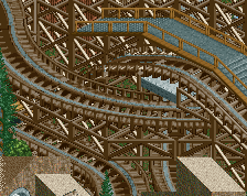
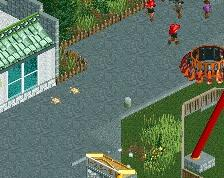
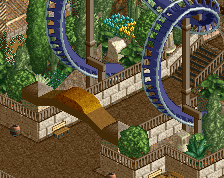
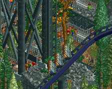
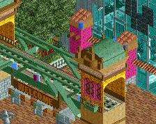
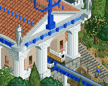
Highly unfinished, Just opened up rct and actually built something for the first time in ages, And unless I get blindingly drunk again at the end of next working week, No progress will be made Took me about 3 hours most of that time staring drunkinly into an "abyss" The square is supposed to be a remembrance square giving the fact its 100 years since WW1
-
 Full-Size
-
 No fans of this screenshot
-
 Tags
Tags
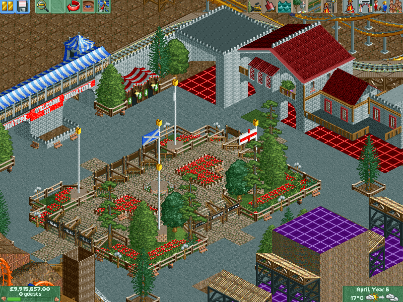
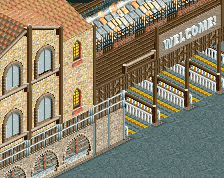
The signs are a little small compared to everything else. Maybe see about raising them with MOM and adding some extra objects below to prop them up?
Nice and clean. I like it.
Much cleaner than what you usually do. Definitely an improvement.
70% lol.... I get ya mule, I haven't used any trainers yet so that can be easily fixed later on IF i get that far.
Yeah it is much cleaner, But thats because its not a mine theme lol
Posix I guess you don't like my other work much, If you think this is an improvement In my own opinion this is nowhere near the quality of goldrush especially since its the first time i've actually built something for about 6 months if not longer.
Didn't mean to look down on your other work, but to be honest, yes, I prefer this. I like clean and coherent.
Lol, Yeah I get you, You just prefer more "organised" straightforward stuff. German effiency as it were Yeah this work right here tho is just more from the heart, well at least "remembrance square" was the rest is just meh tbh.,,, but Coyote and Goldrush pretty much started from 'meh' so we will see where this goes......