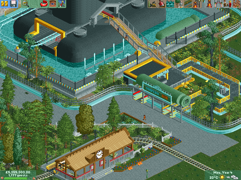
Wow, I absolutely love this station and the overall idea, it looks freaking great and the idea is just so cool. The green thing over the queue line looks great and the entrance to the submarine also looks really cool with the small divider in the middle, I could see that in real life in any theme park. However I'm not really a big fan of the layout which you showed in the other screenshot to be honest, it looks a bit forced and doesn't have a lot of flow imo.
The actual submarine is really out of scale in my opinion. The top looks quite good, but the part of the submarine closest to the water is too square in comparison. I would personally either just have the top portion, or show much more of the submarine itself. Possibly even extend it all the way to the edge of the water.
Also, the monorail and steeplechase fence is waaaay too curvy and unsupported. Definitely add some columns so it doesn't look so odd, and also consider adding in more straight sections. The second screen is fine, but the curves in the top screen seem largely unnecessary.
Pretty interesting idea overall, but the queue line should probably be fixed - floating peeps is never a good idea if it can be avoided.
Very cool. My only gripe with this screen is that I think the area surrounding the submarine could be more organic (diagonal paths, make the pond less rectangular, etc). I think you're going for an artificially made pool, but I'd round it out and make it look like the sub is in some sort of jungle estuary or something.
As its Halloween soon here a ride that has nothing to do with it, as it is the mother of all none holidays. Anyway, here's the first ride in the 'Battleship Row' area; Torpedo Run.
here's the entrance
The actual submarine is really out of scale in my opinion. The top looks quite good, but the part of the submarine closest to the water is too square in comparison. I would personally either just have the top portion, or show much more of the submarine itself. Possibly even extend it all the way to the edge of the water.
Also, the monorail and steeplechase fence is waaaay too curvy and unsupported. Definitely add some columns so it doesn't look so odd, and also consider adding in more straight sections. The second screen is fine, but the curves in the top screen seem largely unnecessary.
Pretty interesting idea overall, but the queue line should probably be fixed - floating peeps is never a good idea if it can be avoided.
Very cool. My only gripe with this screen is that I think the area surrounding the submarine could be more organic (diagonal paths, make the pond less rectangular, etc). I think you're going for an artificially made pool, but I'd round it out and make it look like the sub is in some sort of jungle estuary or something.