Screenshot / Boardwalk Rides
-
 25-October 14
-
 Pacific Point Boardwalk and Amusement Park
-

 9 of 10
- Views 3,264
- Fans 3
- Comments 18
-
 Description
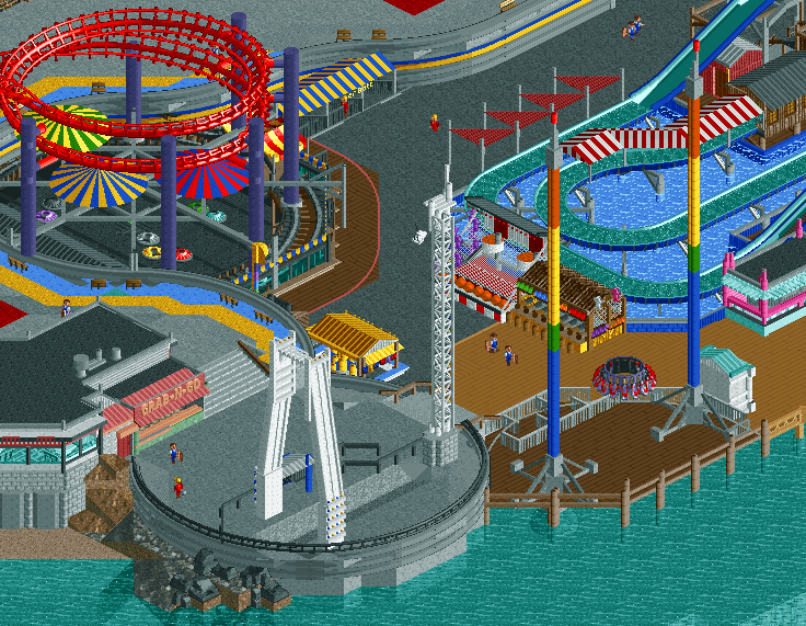
I'm starting to shoot all my screens from this same angle now. That's gotta be bad...
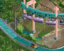
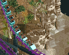
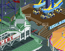
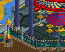
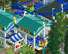
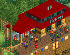
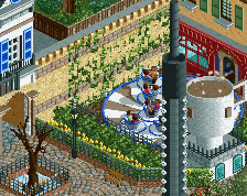
Anyways, here's some rides in the lower section of Pacific Point. It's it's own kind of central hub, with paths from every other part of the park pouring into the area. As such, it's obviously quite exciting, hosting the park's flume, a killer interaction with the PepsiMax's Helix, and a new slingshot ride, purchased from a park near Mt. Baker after they decided to replace it with a ropes course. Pacific Point's management is in talks of building a ropes course of their own. We'll see how that goes... -
 Full-Size
-
3 fans
 Fans of this screenshot
-
 Tags
Tags
Love the dive devil placement. Shops and games are spot-on. The paths do need perhaps some cover though. Shady spots to sit - long days in the sun can get really tiring.
I'm a hungry capitalist who won't spend no money on something as trivial as benches and shade. That'll give them reason to rest. And when they rest they aren't on rides. And when they're not on rides they're not giving me money.
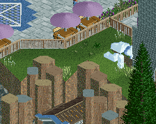
In all seriousness, I have benches and seating around the outskirts, and I'm trying to actually keep them sparse on the interior for basically the reason above. I'll have a few spots, but probably not in places like this, where there's a lot to do, and spend your money on.
^^This is the only thing that I can see is missing. You've made some headway with those covers by the flume but I think a few more wouldn't go amiss.
I'd also definitely change the colours on the slingshot car. Really awesome other than that!
^I broke the slingshot trying to do that before. Something about tower rides makes them super finnicky for hacks.
TwistedHelix Offline
As a hungry capitalist the 8 deck slingshot would have made a lot more sense lol.
But no it looks nice and apparently I was wrong with claiming that it would block the view of the log flume.
You've made the paths work so much better now, they look a lot nicer. Whats the story with the circular pads by the way? Are they meant to be the pads for old flat rides now taken away? Or are they just, everytime the park wants some extra space they build these circular pads out?
I was just wondering that was all
Suggestions:
Boardwalks are grungy and grimy. But don't worry, I know you are going to add this at some point.
Boardwalks are in your face and colourful, almost festival like. So shove loads of awnings and bunting up.
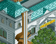
this park is fucking balling man. you can do more with the shops to the left of the dive devil though because as it stands they're not nearly as vibrant as they should be
that description though
If you're going to bomb a screen with a 55% rating, please say why.
"Bomb"? 55% is not what I'd call a "bomb". Maybe for this type of work, which is pretty flippin' fantastic, but 55% is still accolade-worthy.
I'm not complaining about the score, just the lack of explanation to go with it. If you hate my shit, tell me.
To be fair, 55% isn't really hating.
But I do agree that scoring screens 55% means you think they can improve, in which case tell them what to improve.
I think you're better off without the roadlines. Don't like the mix between extremely angular and extremely curvy bits. But it's too late for that. 20%
Otherwise 70%
Getting rid of the curves.
isn't that like how real life works? there's like different angles and directions and shit
Is there any reason why the water beneath the flume is overly blue and not matching the regular water? Otherwise it's very nice.
Liam, is it the angular path tiles with the curved road lines that's bothersome, or just the road lines at all? Really no part of this is supposed to look angular, but I don't know that I can make anything that does curvier.
Navalin, it looks gross if I match the default water colors. Flume blends in too much, and I think this helps give the impression that it's a shallow basin, and that it's cleaner fresh water, rather than whatever's out on the beach.