Screenshot / Jurassic Safari Station
-
 22-October 14
-
 B&M Invert - Extinction
-
 1 of 9
- Views 4,521
- Fans 4
- Comments 19
-
 Description
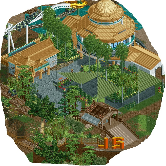
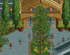
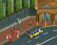
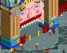
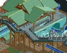
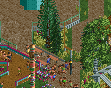
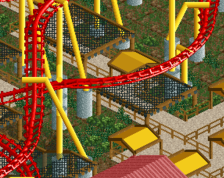
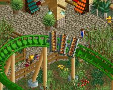
Station for the monster trucks that traverse much of the landscape for a jurassic/prehistoric themed invert design.
[And yes, I know that the queue covers have been done before and some people aren't a fan, but it fits here in my opinion - certainly more so that just using the 1k netting without any substance]. -
 Full-Size
-
4 fans
 Fans of this screenshot
-
 Tags
Tags
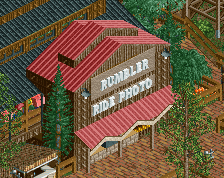
wow, this is really amazing stoksy. A vast improvement. The atmosphere is wonderful, the structures are really wonderful.
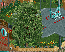
The one thing that is a bit off is the macro layout, it becomes really compact and tight, which while great for the peeps, makes some of the details hard to see. I would recommend trying to lower some of the trees, particularly right in front of the main building, so the viewer can see more of the actual structure.
FK
You know I've always been a fan of your work but the difference between your work a year ago and your work now is truly astounding. Bravo.
That building is so ace.
Wow is all I have to say. And I'm one of them who doesnt like the covers but they are quite good here. 95%
Love it. The covers totally work in this instance and don't feel forced like they often do.
i love it, the foliage around the queue is awesome
I love how you made a big round roof without making it look like an overly complicated clusterf*ck. Great job! You can be more daring with colours though I think. But I don't think a lot of people will agree with me.
Unless the monstertrucks are some sort of "guided tour" thing, I think they need rails or fences or something to keep them on track.
The rest of this is awful. Please start over.
(I'm kidding, i've already told you how much I love this.) Glad you took the opportunity to add more color in with the monorails.
Absolutely amazing. 90% only because it's not finished.
Wow.
Stunning. The main building is really well put together. Love the foliage and green awnings contrasted with the dark path. Only gripe is the JS. Unless it's copying something in real life, I'd do away with it myself.
wow! when can we see more this looks fantastic
The round shape looks so good..
Thanks for all the feedback everyone!
@Fk: I would agree with you for the most part, it's just that I think that I need that tall contrast with the other foliage. I get that it hides some of the building, but I think that adds to the atmosphere - suggesting that this large structure is peaking out over the overgrown forest of a prehistoric area. Nonetheless, I will definitely consider this for future reference; this is the first real park where I've been focussing more on clumping foliage so hopefully that will allow for more building details to be visible in other areas.
@inthemanual: The only issue I would have trying to add in some sort of guide for the monster trucks is how to integrate that with the surroundings. Part of me is tempted to actually use a path underneath [something like the coloured crazy paving although if I do that I'll end up overusing it I think - have used it for two queue lines thus far], but I'll see what I can do. I think I can get away with the whole 'guided tour' idea as soon as peeps are let in, it might make more sense then.
@That Guy: I was slightly ambivalent about the JS sign as well, really wanted to have some sort of custom sign that was jurassic park-esque but wasn't sure how to implement it otherwise. I have to try and track down a two-tile jurassic park sign or something.
Incredible! The circular building is so well done, with clean lines, great form and a lovely colour selection. The foliage is really adding to the area, giving it a jungle feel without overcrowding it too much and obscuring the details. And this is the best use of the covers that I've seen. Normally, to me, they look like glitches and it takes me a while to work out that they're intentional, but here it's clear what they are. Amazing work.
why does everyone make these diagonal covers now? are they from some real life park? or just copied from robbie? surely there is a more interesting way of covering your queue line that works with the theme a bit better...
having said that, this is excellent work, the station is amazing architecture (if not a little big for a jeep safari station), and i can't wait to see more.
They're meant to simulate canvas awnings, thus the netting object over the pathblocks to create a new texture.
They're just really, really common in real theme parks now and it's only natural that we're seeing more and more of them in RCT2 parks.
See the El Toro queue for example.
Six Flags and Cedar Fair especially have been adding canvas queue covers everywhere lately as it's a cheap solution that's actually kind of aesthetically pleasing. I mean... look how nuts Cedar Point went with them when they built Gatekeeper (and it actually looks really good).
It's now become a bit of a modern style that's even being applied in places besides queue lines and Cedar Fair has realized that these areas become major gathering places that can be built quickly and cheaply.
That cover on the lower right of that last rendering is always full of people and now they've replicated it with Banshee at Kings Island.
Here's Banshee's queue (under construction at the time) and they have the same huge canvas-covered seating area out front.
So yeah... canvas covers are just taking over theme parks lately. Parks just seem to love building them.
Very nice. I always love it when people do Jurassic themes well.