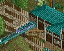
Too many box supports. I'd space them out more, or get some B&M supports in. This is tremendously better than what you started with though; it's clean and has good organization. Paths could be a bit more organic but it's not bad.
I honestly, if I were you, take this one as a learning experience, and start on a fresh new map, as I think you'll have better organization/theming knowledge on another round; it's much improved, but still in an awkward area of the map/terrain that will make it relatively unfixable beyond this point in my opinion.
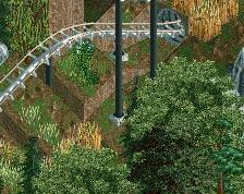
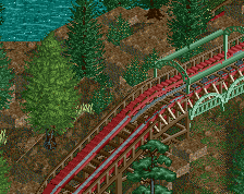
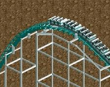
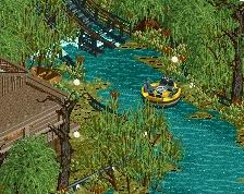
Swamp monster makes me think deep purple and toxic green. Not barf green and pale red. Break up straight lines with anything you can. Long straight sections are boring and uninteresting.
 06-October 14
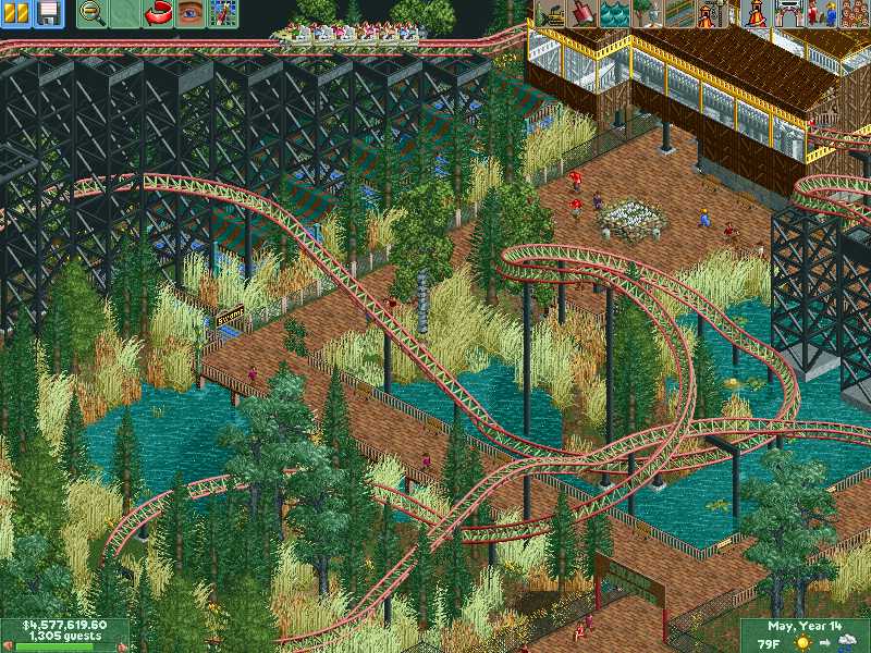
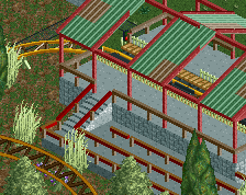
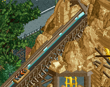
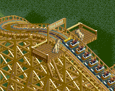
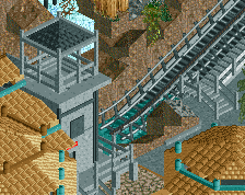
Too many box supports. I'd space them out more, or get some B&M supports in. This is tremendously better than what you started with though; it's clean and has good organization. Paths could be a bit more organic but it's not bad.
I honestly, if I were you, take this one as a learning experience, and start on a fresh new map, as I think you'll have better organization/theming knowledge on another round; it's much improved, but still in an awkward area of the map/terrain that will make it relatively unfixable beyond this point in my opinion.
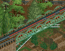
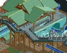
Your colors are throwing me off. Take out the red and try some other colors. You should also diversify your palette.
Swamp monster makes me think deep purple and toxic green. Not barf green and pale red. Break up straight lines with anything you can. Long straight sections are boring and uninteresting.