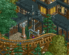
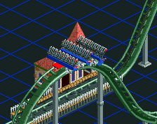
honestly, i haven't ever liked your "cutesy" style as it felt cookie-cutter and lacking, so i'm pleased to see you break out of that with this screen. far better than most of all the other stuff you've built, for sure.
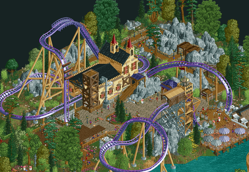
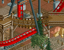
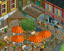
really nice, liam(and a little bit of dimi)-esque station here, i can see that station easily in some spotlight park somewhere. i have some qualms with the mesh fences you always use for some reason and the way you're doing the rocks, especially near the queue, but other than that this is impressive.
An interesting choice of colours, which adds brightness and life to what otherwise might've been a very subdued area. Definitely a bolder theme compared to your usual style, and it works well. Great coaster/path interaction too.
Thanks for the kind word guys. I don't know what I did different, but somehow you see some change in my building style haha.
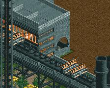
I agree with Belgianguy about the supports but I didn't feel like building on this more as I wanted to turn something in for the contest and was already a bit too late.
I don't see a change in your style I just think you're refining your style. You've refined it so much actually that if you build a larger park than you generally do with this level of quality I'm convinced that you could win spotlight.
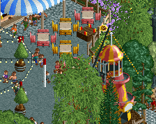
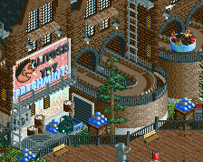
Finish the supports and you will have a basically flawless screen. I do think the umbrellas in the bottom right could use a bit more of a touch of color to make that corner pop a bit more.
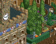
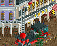
I think your style is still here, the atmosphere is pretty amazing. I'm not sure, as you have said you weren't trying anything different, how the station came to be, but it's perfectly scaled, which is always my problem with your work. Everything looks so bright and fresh, but your work has a tendency to be just too small.
Sometimes you can stack 5, 10+ of your buildings and it be the same height as the coaster, or have a building that is the height of two peeps on top of themselves, which just doesn't make sense for any scale. If you could just adjust your scale to be a bit bigger and (i hate saying this) more realistic, your work would be killer. I hope you can make this change at some point, though you seem pretty set on this scale.
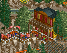
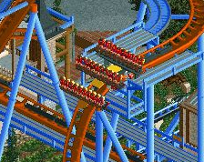
Made for a contest (organised by Liampie) on some Dutch site. The idea was to make your own interpretation of the new Dive Coaster coming to the Efteling in 2015.
 04-October 14
So simple, but so effective. The colour really works too.
Holy shit, wow. Atmosphere is impeccable. Fantastic work.
Wow nice!
It just screams FUN FUN FUN!
This loses the cutesy feel of your prior work in the best way possible.
plz do the supports everywhere, nothing is a bigger eyesore than 2 different types of support especially if it's ingame mixed with custom B&M supports
Faas you're so good now.
More of this please!
This is so awesome!
charming. love this!
honestly, i haven't ever liked your "cutesy" style as it felt cookie-cutter and lacking, so i'm pleased to see you break out of that with this screen. far better than most of all the other stuff you've built, for sure.
really nice, liam(and a little bit of dimi)-esque station here, i can see that station easily in some spotlight park somewhere. i have some qualms with the mesh fences you always use for some reason and the way you're doing the rocks, especially near the queue, but other than that this is impressive.
An interesting choice of colours, which adds brightness and life to what otherwise might've been a very subdued area. Definitely a bolder theme compared to your usual style, and it works well. Great coaster/path interaction too.
Thanks for the kind word guys. I don't know what I did different, but somehow you see some change in my building style haha.
I agree with Belgianguy about the supports but I didn't feel like building on this more as I wanted to turn something in for the contest and was already a bit too late.
Great screen!
Finish the supports and you will have a basically flawless screen. I do think the umbrellas in the bottom right could use a bit more of a touch of color to make that corner pop a bit more.
I think your style is still here, the atmosphere is pretty amazing. I'm not sure, as you have said you weren't trying anything different, how the station came to be, but it's perfectly scaled, which is always my problem with your work. Everything looks so bright and fresh, but your work has a tendency to be just too small.
Sometimes you can stack 5, 10+ of your buildings and it be the same height as the coaster, or have a building that is the height of two peeps on top of themselves, which just doesn't make sense for any scale. If you could just adjust your scale to be a bit bigger and (i hate saying this) more realistic, your work would be killer. I hope you can make this change at some point, though you seem pretty set on this scale.
FK