Screenshot / Some buildings
-
 04-October 14
- Views 1,685
- Fans 0
- Comments 4
-
 Description
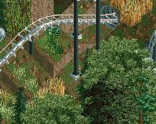
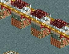
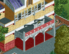
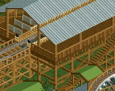
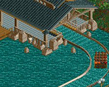
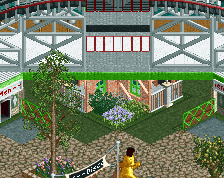
2 buildings on the back of the map. I know your not supposed to build things this close to the edge, but I saw no way around it. I wanted to also set up the idea theirs a lake or river on the outside so that's why the waters there. I'm going to add smaller plants to the side without the water. And I'll also add fences to the side of the path.
-
 Full-Size
-
 No fans of this screenshot
-
 Tags
Tags
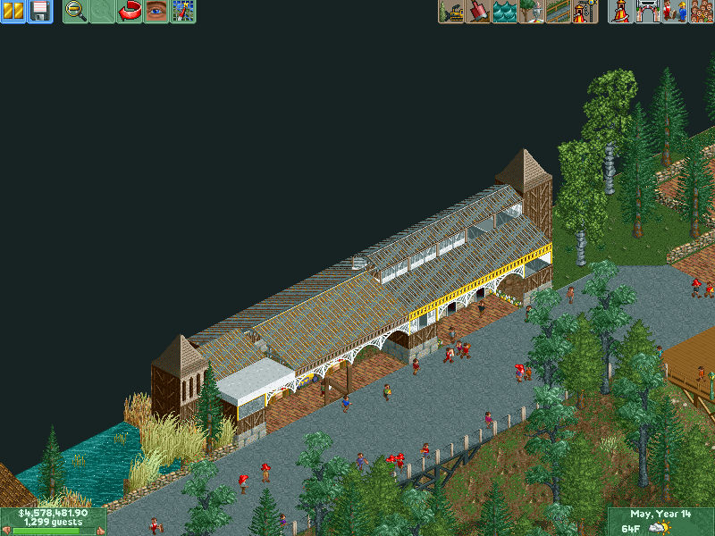
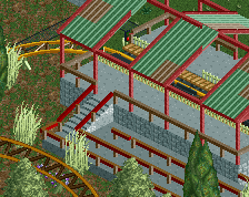
I'm no fan of those roofs. I think if you used different walls and etc it would be decent, the way you build is pretty good but imo you use the wrong scenaries
Why is someone voting 5% on almost all of dusty soul's work? I mean, sure it's not crazy parkmaker good, but it's not like it's worthless. This had time put into it, and frankly, I enjoy these frequent posts. It reminds me of what rct should look like. Maybe I'll pick up the game again.
I agree dont vote low without giving any critique
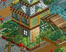
There's something about your combinations of building textures that I feel just doesn't quite work. It's as though the structures are lacking a theme, or else are trying to combine several into one. Perhaps if you chose two textures for the entirety of the walls, and decorated them more with frameworks, windows and trims it would give some clarity.
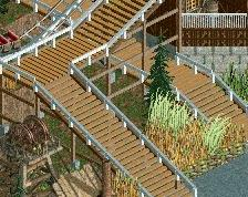
That being said, the setting for these building is nice, and I like the way the path bridges the dips in the landscape. I think here is a good opportunity to make more of these bridges, with more elaborate (or at least custom) fences along them or more varied supports.