Screenshot / The Curdling Swamp
-
 24-September 14
-
 The Caste Project
-

 4 of 4
- Views 3,997
- Fans 13
- Comments 30
-
 Description
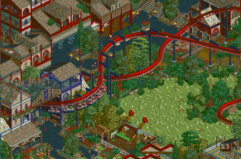
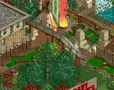
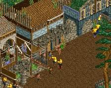
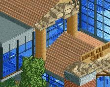
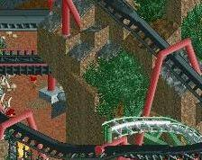
The Necromancers' corner of the world is riddled with death. The swamp around which they've built their lives only bubbles because of the amount of corpses beneath. The Bloodboil Inn(not pictured) is home to the elite and dangerous guild of assassins, payed for work by anyone with the right weight of gold. The necromancers' favorite creation born of the dead is the Moltwing. While they have a limited time alive, their soaring high spirits and rotting wings bring joy to an otherwise somber community. The marrow skink trappers along the banks of the Curdling Swamp offer a hearty stew to the necromancers, the rejects of the higher world. While shunted, these people are dangerously proficient at magic..
----------
I've made a huge burst of progress in the last 2 months or so. From an empty map where this screenshot came from, the entire area is at about 50% and growing.
Lower Class-90%
Middle Class-12%
Upper Class-98%
Necromancers-50%
???-???% -
 Full-Size
-
13 fans
 Fans of this screenshot
-
 Tags
Tags
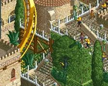
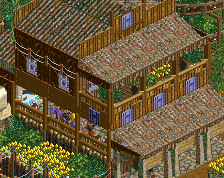
Don't be that guy who doesn't click on the image and miss the whole thing.
FUCK. Those colors!
Your colors are wonky.
But this has to be the BEST ncso screen in a while. Architecture and foliage are ace.
Woah this is good! I think that maybe there's a little too much dark red in the buildings [I would perhaps save that exclusively for the coaster or have it much less pronounced], but other than that it's fucking incredible.
Really can't tell this is NCSO, which makes it so brilliant. The swamp is a little meh to me; but that's purely because I've never really liked that swamp object. You've done really well given the object limitations for it, especially with the implementation of the bushes around it. It almost works for me, but that's just personal preference.
Absolutely love this. Best screen from you that I've seen. I'm very excited about this project, you really do make NCSO look like CSO. The atmosphere and the colors are stunningly terrible in the french sense of the word (which is a very positive thing)!
Now this has a real old school feel to it. It's so full and atmospheric. Very nice.
cool ncso!
This is so good
This is one of the coolest NCSO screens I've seen in awhile. The little details on your buildings are great (those diagonal roof supports on the lower left...damn). Cool use of a path as a roof too... it kind of reminded me of Loopy Landscapes but it blends perfectly.
BigB Offline
Best use of swamp tiles so far
That must load so slowly in-game but it looks awesome. I'd take away that dark tree at the bottom so that the path isn't so congested. Otherwise, looks so good.
Love this so much.
Strangely enough, I can't seem to grasp what everyone else sees in this screen, and I really wish I could, considering how everyone has responded. I actually enjoy it more as a crop, rather than the full size image?
It clearly shows a high level of skill, but I find the composition to be lacking. Idk, I feel overwhelmed looking at it, the swamp is a bit overbearing, some sparsity in those pieces could help I think. The top spin sticks out to me like a sore thumb, maybe it's the color or the bones. And the whole thing feels a bit cluttered to me; it could use a bit of breathing room to come alive.
That said, this is still a solid 75% from me. I really enjoy the foliage, and the theme/inspiration you have is great, and it's clear you've put a lot of thought and effort in! I also really do like the purple trimmed building with the coaster going through. Maybe it's the way the screen was saved, it looks like MS paint colors from the path textures, that is throwing off my perception. I wish I could see the ~90% screen everyone else is seeing!!
Keep it up, I loved the other screens in this project, particularly Granny June's!
this is brilliant. absolutely everthing you could want, cool looking coaster, incredible theming, coaster dominating the area without looking out of place, interaction with paths, buildings, thematic elements, the colours are fantastic, what else can i say.
brilliant work.
i love you
I like this, I like this a lot, it's got that grumpy spooky still funny vibe that only a few people could pull off...
Some minor gripes:
- There's a piece of wall missing. Lower red building on the left
- Watch out with the dichromatic colour scheme for each building. Your buildings are all brown-red but suddenly there's an all brown-blue building which could clash really bad. You prevented this very well with the red flowers, but I think you shouldn't do this too often. Besides the red looks cooler than any other colour anyway.
- The building at the top where you used land arches is a bit messy. When we got to the roof from the bottom we've been through four textures; there's six if you count the textures on the front gable. It's too much in my opinion; and too much wall for a front facade to not have any windows or other features on it.
Wow, how did I miss this park? This screen makes me incredibly nostalgic and it's awesome. Very well composed and extremely fun. The other screens are just as great. Keep it up!