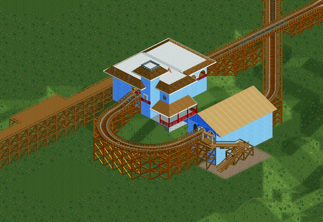
Screenshot / Raven, Station First Pass.
-
 24-September 14
- Views 1,449
- Fans 0
- Comments 5
-
 Description
Here's my first shot at the station, and I feel as if I got a good feel of the orginal with this... however...
1. I feel as if the left side of is too wide, but want to hide the exit hut of the ride [same with the top of the Entrance as you can see]...
2. The roof's Windows and the roofs edge. If some one can show me how to edit in some steeper roofing for it, then I'd love to change them to make them much more like the Orginal. [Working with a Louis! 13 Bench btw]
3. The stairs next to the coaster housing is not in the real version, but with no real way to get up there [not sure if they just walk the curve or not] I though to just put them in for looks and access.
Thank you for looking -
 Full-Size
-
 No fans of this screenshot
-
 Tags
Tags


You can use the "Son of Beast" Trainer to rotate the exit hut, so you can make the left side smaller.
Why is the track and path leading to the station so high above the ground? I just looked at the video and while it's elevated, the path is on a hill and probably is never higher than 5 ft. and the track probably is like only 10-15 ft. off the ground.
1. Version1 is right, you can lose a whole tile if you perform that hack. Look up a tutorial, it's not hard.
2. What I think is way more important than getting the angles of the roof right or in- or excluding the windows, is that every roof has the same colour and texture. Now I get that it may be hard with all the different angles, but surely it must be possible. For the steep roofs, you could use these (top right in blue), for the 45 degree roofs colourable pirate roofs, and for the 30 degree (?) roofs these. The steep and the 30 degree probably go pretty well together, more than your wood and steel combination in three different shades.
Lastly I think you picked the wrong colour for the walls... The real station seems to be greyish blue. Grey is probably closest, but I can see why you'd go with a shade of blue. Teal or light teal might work better. Not sure on this though...
Lastly (for real now) lose the overhanging roofs, at least don't let them hang over so far. There is a set of shorter awnings on almost every bench more suitable for these purposes!
I would try light purple for the walls and magenta for the roofs...at least try it and see what it looks like.
Unrelated to the architecture, because I think everyone else has you covered on that... the ride just feels too big. I think the large curve (3 tile wide curve) would be more than adequate to recreate the ride; spreading it out is going to spread some stuff thin, or make the people seem overly small.