You reeaaaly have an eye for color, I'm envious. I only wish this area had a bit more cohesion. It can appreciate the style though, it's just not quite my preference.
I agree with Louis though, I had to go take another look at the release, and you've already got an exceptional park. I'm appreciating it more now than I originally did, too. With enough content, and a big coaster or 2, spotlight is definitely within reach. I gave it 85%.
Your stuff is getting increasingly refined and complex in a good way, but the aesthetics are still off. The colours are a mess... Very good work all in all, I definitely enjoy this, but I reckon you won't ever get spotlight until you review your colour policy.
Also good that you're expanding the park. Quantity is a quality.
I actually really like the colours, but I think with this much non-functioning rides next to each other, it all becomes a bit too static and perhaps lifeless in game. The rides look really good though the way you made them.
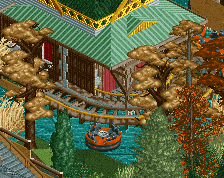
Shoulda let me put a hammerhead in there for a bit of life/motion.
the colors are tacky and gross, but they're supposed to be, it's a boardwalk. And they do a good job of unifying similar things, without feeling too overwhelming or powerful.
I think the in-game colors are slightly too rich to pull off the boardwalk look, but I know what inthemanual is saying and from that standpoint it makes sense. I really like it, but you already knew that.
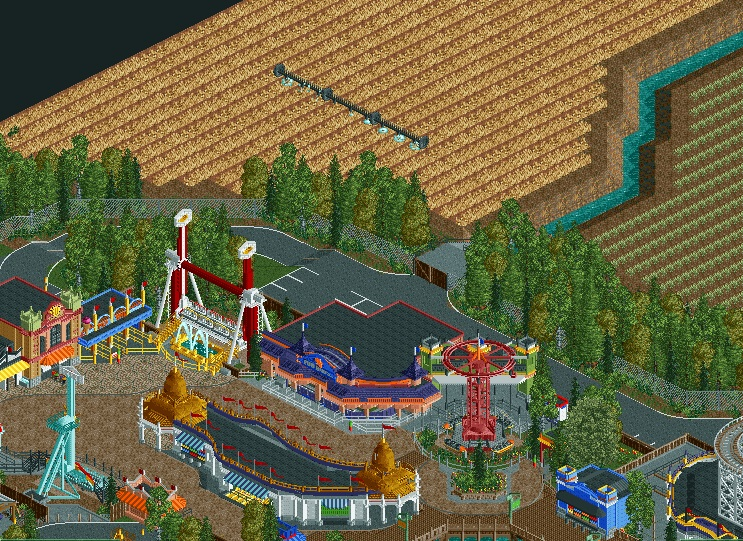
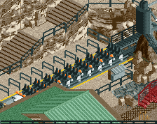
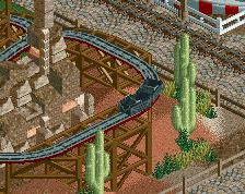
You should put some imperfections in the farm fields. For example, I've never seen a field of beans without some random corn plants sticking up from crop rotation. Just to give it a bit of accuracy I guess
Very nice individual portions but the overall composition and color choices aren't the best. If you took each individual ride and building and isolated them by themselves, each would look absolutely stellar. Place them together the way you have, and they clash, they fight each other, and nothing flows together harmoniously. I would take some time to plan out the placement and position and color of each individual element that you've pretty much perfected and try to be more conscious of how they interact with each other in terms of spacing, size, and of course, color.
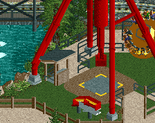
I still think that topspin doesn't need the yellow stairs as it distracts from the actual ride, don't add colour for the sake of it... also the overall composition is a little lost in parts. like some stuff looks like it was clearly an idea that hit you after the real "develpment" of the area...
 24-September 14
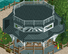
So full of colour.
Like I said before, so glad you are continuing this. It has the potential to be spotlight if you really work at it.
You reeaaaly have an eye for color, I'm envious. I only wish this area had a bit more cohesion. It can appreciate the style though, it's just not quite my preference.
I agree with Louis though, I had to go take another look at the release, and you've already got an exceptional park. I'm appreciating it more now than I originally did, too. With enough content, and a big coaster or 2, spotlight is definitely within reach. I gave it 85%.
Also good that you're expanding the park. Quantity is a quality.
whats wrong with the colors?
I actually really like the colours, but I think with this much non-functioning rides next to each other, it all becomes a bit too static and perhaps lifeless in game. The rides look really good though the way you made them.
Shoulda let me put a hammerhead in there for a bit of life/motion.
the colors are tacky and gross, but they're supposed to be, it's a boardwalk. And they do a good job of unifying similar things, without feeling too overwhelming or powerful.
I think the in-game colors are slightly too rich to pull off the boardwalk look, but I know what inthemanual is saying and from that standpoint it makes sense. I really like it, but you already knew that.
so much color hate. at least having more color is better than having no color at all
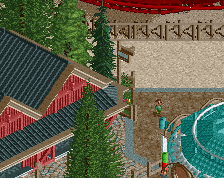
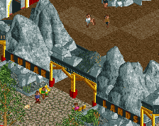
Dude, that path is awful.
You should put some imperfections in the farm fields. For example, I've never seen a field of beans without some random corn plants sticking up from crop rotation. Just to give it a bit of accuracy I guess
Very nice individual portions but the overall composition and color choices aren't the best. If you took each individual ride and building and isolated them by themselves, each would look absolutely stellar. Place them together the way you have, and they clash, they fight each other, and nothing flows together harmoniously. I would take some time to plan out the placement and position and color of each individual element that you've pretty much perfected and try to be more conscious of how they interact with each other in terms of spacing, size, and of course, color.
I agree with the last three posts.
I still think that topspin doesn't need the yellow stairs as it distracts from the actual ride, don't add colour for the sake of it... also the overall composition is a little lost in parts. like some stuff looks like it was clearly an idea that hit you after the real "develpment" of the area...
I for one really loke this and hope to see it released.
LOKE
like my bad.