Screenshot / Found a few old projects lying around...
-
 21-September 14
-
 Old Screenshots
-
 1 of 2
- Views 2,039
- Fans 1
- Comments 10
-
 Description
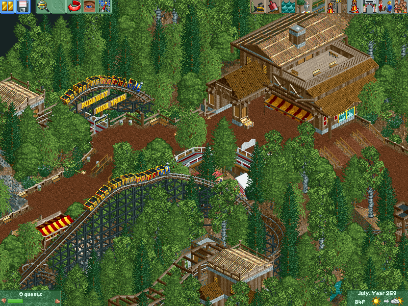
So yeah, I decided to have a look through my e-mail history and see what parks I've got lying around in there. The earliest park I could find is a park simply named 'Project K'.
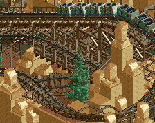
Project K is from around 2006 - 2007 and this screen is from Project K.
Also a note: I want to upload a few screenshots into a collage type thing, is there any way to do that here or should I just upload a screen and link to it in the description? -
 Full-Size
-
1 fan
 Fans of this screenshot
-
 Tags
Tags
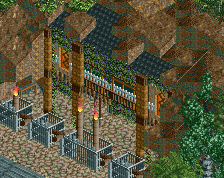
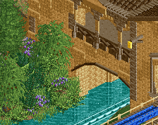
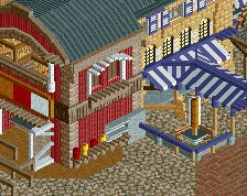
So much charm and atmosphere.
Woah, I remember Project K...had a download of it ages ago but new computer and don't have it anymore . The sign for Evolution (i think it was an invert) was the source of much inspiration for me.
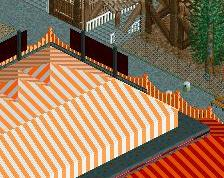
With regards to the screen, agree a little with Shogo in that there is a distinct lack of colour which, while it certainly portrays a lovely earthy vibe, means that things are kind of lost in the surroundings. Usually not a bad thing, but here it detracts from the screen a little because there are basically only earthy colours [the awning seemingly tried to add some colour but the yellow, as said above, still blends in a little too much]
Any chance you could upload these parks to the database, would love to check some of them out in-game.
Thanks Robbie! Atmosphere has always been one of the stronger areas of my parkmaking I think.
I'd agree it's lacking any focal colours Shotguns, but that's largely because I believed, at the time, that the coaster train colours were bright enough to keep the area going. I look back now and don't feel the same way as all your eye is attracted to is the coaster, which isn't necessarily a good thing. Thankfully it has a pretty cool layout so it's not too bad. But yeah, I know that the foliage is shit anyway, it's 8 years old created by like a 13/14 year old me, give me a break haha.
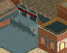
Stoksy, you mean this sign?:
I'm honestly flattered that you even remember it existed, I'd forgotten about the invert completely. The layout was complete crap but the sign wasn't too bad actually!
But yeah, again the colours weren't too good. I think my problem was that I built each building individually, not taking into consideration how it'd look on the whole, and then just filled the bits in between with crappy foliage.
As for uploading the parks, I could do later today when I've finished work. I've got 3 that I could upload that are somewhat finished I believe.
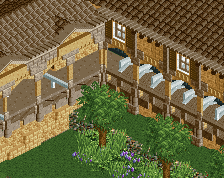
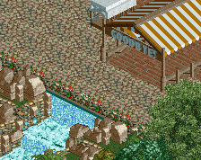
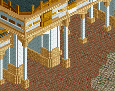
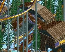
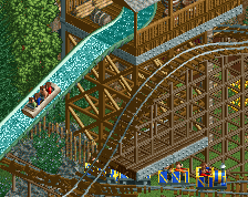
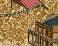
For now, here's some more of Project K:
I love project K now that I look at it. It's a shame it was made in an era where letting actual peeps in your park was a no-go....
I actually really like the Runaway Mine Train sign.
Thanks! It's actually peepable I believe. Not in the sense that it's all laid out so peeps can get around easy, but peeps can definitely get in.
Thanks! It's a pretty simple hack that was lost over the years to more complicated ones
I really like the tunnel/support structure that arches with the track. Very nice atmosphere going on, with some great touches of colour to break up the brown. Interesting inclusion of a motion simulator though.... I suppose it's a mining machine?
I still believe you have big potential. The new screen has distinct macro qualities but is still a bit unbalanced. The height variation seems unorganised and the trees are too overpowering. Broaden your vision when building even more, then go with the flow and build in concentrated sessions.
Just wanna point out again that this was built 7 or 8 years ago Posix I'd say I've progressed a lot since then, on both a micro and macro level. I like to find a balance between the two so that everyone is satisfied, but sometimes I'll admit I do go a bit too far with the micro details.
The trees are very overpowering here as this was basically before I really tried with my foliage - at this point, I was just trying to include a few different shades of green in my foliage to give it a more dense feel, while still keeping all the textures there so that it looks pleasing on a macro level.
As for the height variation, I'll admit that 14 year old me changed heights just to make it seem less flat and boring rather than for any particular reason; something I've definitely progressed past.