Screenshot / New Gunslinger Gulch
-
 21-September 14
-
 Sunset Vista
-

 14 of 17
- Views 3,443
- Fans 2
- Comments 9
-
 Description
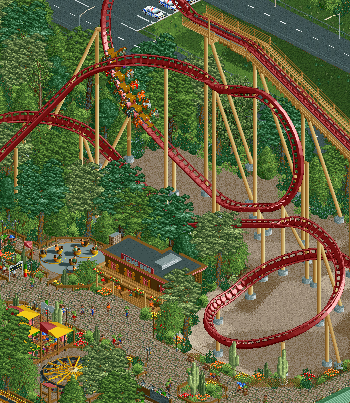
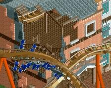
Gunslinger's new inverting drop offers guests a brand new thrill experience. The layout has been totally re-done and improved and this element (based off of similar elements on X Flight and Gatekeeper) is the centerpiece of the new layout.
I'm just about finished with this new area now and am moving on to improving the Mountain Pass area and filling in some of the land surrounding the park. -
 Full-Size
-
2 fans
 Fans of this screenshot
-
 Tags
Tags

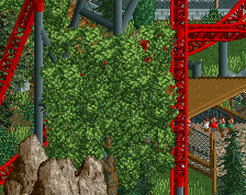
Diversify your foliage other than the liam trees, looks very repetitive right now.
Other than that this is coming along nicely!
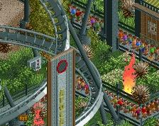
I love the setting of that enormous helix.
I like the idea of using wooden track as cross-ties to connect to the catwalk. Also a flat catwalk scenery piece is missing, just an fyi. Love the drop. And helix. I like the colors too. The foliage seems pretty realistic to me, but I'm no expert.
This is such a marked improvement, the foliage is SO much better than before, and really brings this shot together, great atmosphere.
I think the next step in ur foliage evolution will be varying ur sizes and shades just a bit more. Right now, it looks wonderfully lush, but at times it just looks like the same color grass on 4 tiles. changing different shades of green, layering it with more sizes, this will help. Not sure though, given how much time you have spent on this park already, that you should do it on this park or wait till ur next one. May be good at some point to move on. I'd say just keep that in mind.
to be clear-cut for the forest, i'd taper it off a little smoother and add brown flat rooves for a smoother transition into the sand. clay would also be a better option than what you have, and wouldn't need the rooves probably.
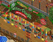
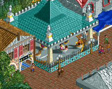
your BBQ building is nice for what it's supposed to be (e.g cookie cutter facade) but your color choices are hurting this. the darker brown for the walls would be clearer, and darkening yhe balcony to the mid-brown would help. i'd consider using green shutters or the crimson and red combo would go good too.
i'd put the fence a quarter-tile closer to give the path more room as it's
being compacted by flats/building/foliage. you're missing a huge opportunity fot theming at that helix, i feel.
this is super nitpicky; take what i said with a grain of salt.
I love the sense of scale you have there. the buildings and trees somehow make the coaster look huge and imposing like it would in real life. Gives me a taste of that real life charm.
That's a great viewing area of the coaster helix on the right. I like the neatness of your BBQ building too. It's getting the theme across without any clutter or over-detailing.
Thanks for the feedback everyone. I shared this in a stream already but I realized I never posted it here. I've made the transition from bare ground to full underbrush more gradual and added in a few oaks to break up the repetitive foliage.
Let me know what you think.