Screenshot / Diagonal Layout
-
 19-September 14
-
 Diagonal Design
-

 2 of 2
- Views 2,654
- Fans 0
- Comments 13
-
 Description
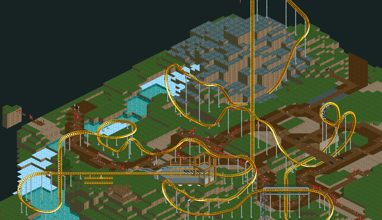
Though I had great fun building this hack and making it work nearly perfectly, ultimately I lost interest in the layout and concept when I finished the hack. I've tried going back to it several times but I never make any progress, so I figured I would release unfinished.
-
 Full-Size
-
 No fans of this screenshot
-
 Tags
Tags
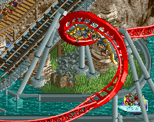
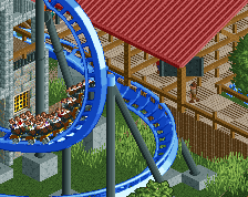
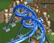
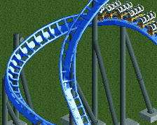
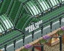
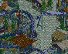
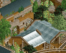
for both of your dive-loops, you should switch the barrel-rolls to flip the other way, looks less awkward and bumpy.
Yeah it looks a little bumpy, but it's a lot more realistic, so I prefer the direction they are in now. Not going to be finishing this either way, the screens are supposed to be attached to the park download.
Just a tip: In RCT it's not about recreating the real life but to fit the real life into the game. So I would just use the other direction. It doesn't look as bad as your way and you won't be able to recreate a real Dive Loop anyways.
I'd leave it in the other direction since it's more realistic and looks better from alternate angles. I just personally wouldn't have gone with an inclined turn into the roll like that
Version, sometimes it can be about recreating real-life if that's what you so desire. Besides, changing the direction completely changes the ride from the rider's experience and creates a different inversion.
Okay, but I still would give you a lower score because of that, because it is worse than the alternative. (and more unrealistic, because it's more about the flow than the actual look)
*But it's not more unrealistic, it's just limited by the RCT track pieces. "Flow" as dictated by RCT is different from flow as dictated in real life, considering RCT is limited to a small kit of parts. These inversions aren't the best "flow" as far as RCT goes, but to say it's more unrealistic is purely false; Hepta's current flow is more realistic standing to real-life flow over RCT "flow". Artistically, yes, your version is nicer to look at, but is more unrealistic in relation to an actual dive loop or immelmann on a B&M coaster.
If coaster designers had only these two options, they would chose the "normal" way to do it above this, that's all I'm saying.
But coaster designers don't have just the two options and have it flow closer to the way that Hepta did it. I'm not saying that either direction is false, but if he's aiming to imitate real life flow over a stylized RCT flow, he is doing so correctly.
That's all I'm saying...
I know, so I prefer building something smooth instead of something unsmooth and unflowy. When I watch the Dive Loop this way I just see all the flow jumping out of the window, because the movement looks so wrong
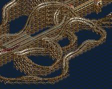
The layout itself is quite good, I just dislike the long strecthes of diagonal track (station and lift), but the diagonal mcbr looks awesome