Screenshot / Diagonal Station
-
 19-September 14
-
 Diagonal Design
-
 1 of 2
- Views 2,150
- Fans 0
- Comments 7
-
 Description
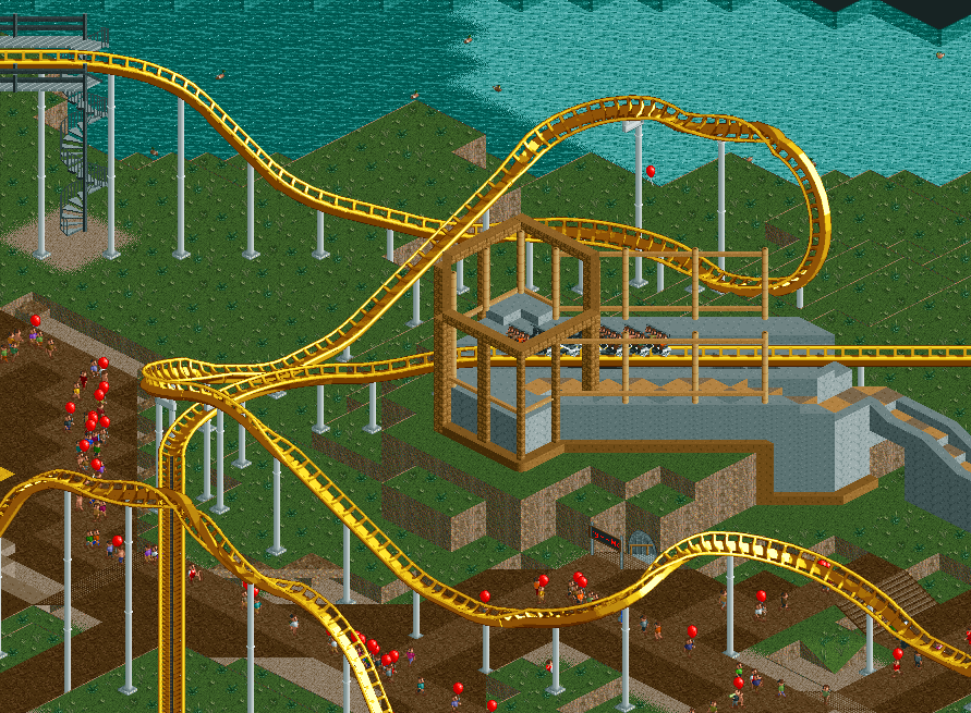
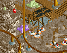
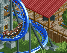
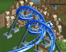
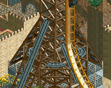
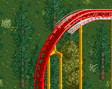
Though I had great fun building this hack and making it work nearly perfectly, ultimately I lost interest in the layout and concept when I finished the hack. I've tried going back to it several times but I never make any progress, so I figured I would release unfinished.
-
 Full-Size
-
 No fans of this screenshot
-
 Tags
Tags
Not sure what the point in it would be other than 'Look, a diagonal station!'
I don't think it's a gimmick worth sacrificing the aesthetics of a standard station for.
WHAAT!? That's awesome!
Rating this 5? Sure it will never be finshed but imo it looks awesome
trav, maybe by itself it's a bit gimmicky, but layout possibilities really open up when you take advantage of using a (working) diagonal brake run as well. The idea for me came about when trying to recreate a ride that has a "diagonal" station (with respect to the rest of the ride, at least), and it was impossible to make the layout work without the station and final brake run being diagonal.
Now, this layout isn't the best example of that. But it's not just a gimmick, it's functional. What it is though, is far too much work to stay motivated with the project. Posix warned me of that, and it came true.
Thanks wouter and torre.
I'm not worried about the rating. Whoever gave this a 5 clearly has no idea of what goes into making this hack work...
I gave it a 50 as well, and I'm telling you why:
It might be a great hack with a lot of work in it, but it just doesn't look good. Even if you manage to build a great station around it, long diagonal strecthes just look terrible ingame. This station looks incredibly weird just because it's diagonal and the isometric view is strange for it.
And I don't really see why it would open up so many possibilities. I mean, why? Usually it's not that hard to build a turn more. Again, I think you should focus on doing something that works ingame and not something, that is done in real life.
I'm just gonna keep on focusing on having fun!
Again: Do it, but don't say something like "Whoever gave this a 5 clearly has no idea of what goes into making this hack work..."