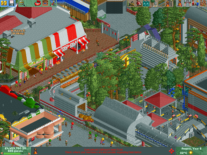
Just saying, everything on the screen except the foliage is made out of concrete. It's not the only building material... Some extra steel would look great. I like how you did the tent roofs on the second screen. Interesting.
Just saying, everything on the screen except the foliage is made out of concrete.
Are you looking at the right screen? Yes, it has a lot of grey, but it's quite obvious that most of it isn't concrete. On top of that, he's included a lot of accent colours so the grey really isn't that overpowering. Plus, the steel block/wall has an AWFUL texture if it were to be used for something as large as this, so using a grey textureless block is definitely the best way to go for what he's trying to achieve.
Most of your comments just seem as though you're trying to criticise just to boost your own ego, and the worst thing about it is that your criticisms are normally unfounded and sometimes just ridiculously false.
I love your style... it's incredibly unique and fun to look at.
I love the colors you used here, I love the queue rails and the design around the tunnel exit (on the left) is great.
If I had to criticize anything I guess it would be the fact that everything seems to follow the grid very closely. I think you could benefit from adding more diagonals. That's a minor complaint though as overall I absolutely love this screen.
I don't think there's too much grey. There's a bit, but it works fine. The "full" or somewhat cluttered style isn't quite my preference but this is good work!
youre building fast man. i like it, its way too grey, but it looks fun.
Me first park was a massive learning curve but Im getting hacking sorted. That ctrl buttons useful aswell. just a question: how do you get you flag next to your name just wanna do some flag waving now we got scotland back in our empire!
oppersite angle:
Oh yes. I can't wait to see how that giant helix turned out.
That first screen has a very Magic Realms Resort feel to it.
Just saying, everything on the screen except the foliage is made out of concrete. It's not the only building material... Some extra steel would look great. I like how you did the tent roofs on the second screen. Interesting.
Everything you do seems to be very 'full' and I can't decide if that's a good or bad thing. Love the idea though!
Are you looking at the right screen? Yes, it has a lot of grey, but it's quite obvious that most of it isn't concrete. On top of that, he's included a lot of accent colours so the grey really isn't that overpowering. Plus, the steel block/wall has an AWFUL texture if it were to be used for something as large as this, so using a grey textureless block is definitely the best way to go for what he's trying to achieve.
Most of your comments just seem as though you're trying to criticise just to boost your own ego, and the worst thing about it is that your criticisms are normally unfounded and sometimes just ridiculously false.
I love your style... it's incredibly unique and fun to look at.
I love the colors you used here, I love the queue rails and the design around the tunnel exit (on the left) is great.
If I had to criticize anything I guess it would be the fact that everything seems to follow the grid very closely. I think you could benefit from adding more diagonals. That's a minor complaint though as overall I absolutely love this screen.
I'm the star wars prequels of rct2!
youre building fast man. i like it, its way too grey, but it looks fun.
I don't think there's too much grey. There's a bit, but it works fine. The "full" or somewhat cluttered style isn't quite my preference but this is good work!
This park will be amazing. It's extremely creative and really well done. I am really looking forward for the release
Me first park was a massive learning curve but Im getting hacking sorted. That ctrl buttons useful aswell. just a question: how do you get you flag next to your name just wanna do some flag waving now we got scotland back in our empire!