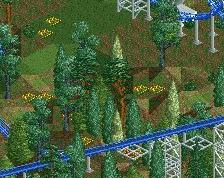
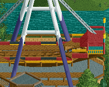
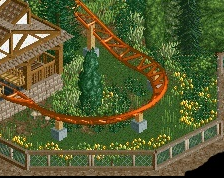
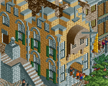
Screenshot / Holiday World's Raven, Track Layout
-
 17-September 14
- Views 3,294
- Fans 0
- Comments 8
-
 Description
Hello NE, I'm new to the site but a rather long time player of the games. So let me explain on this one:
I live near a park with some age to it, Holiday World, and I wanted to try to recreate the coasters they have there [and the surrounding area if possible]
I'm new to the postings here but I'd like to ask you guys for your input on this compared to the real ride.
Reference materials:
http://newsplusnotes.blogspot.com/2011/07/blast-from-past-holiday-worlds-raven-pt.html [The Inks are larger if you click on them]
https://www.youtube.com/watch?v=fsiP6x9K_kk [On Ride POV]
http://www.holidayworld.com/rides/the-raven/#inner-content [Parks Fact Sheet]
Thank you for looking/rating/etc. -
 Full-Size
-
 No fans of this screenshot
-
 Tags
Tags
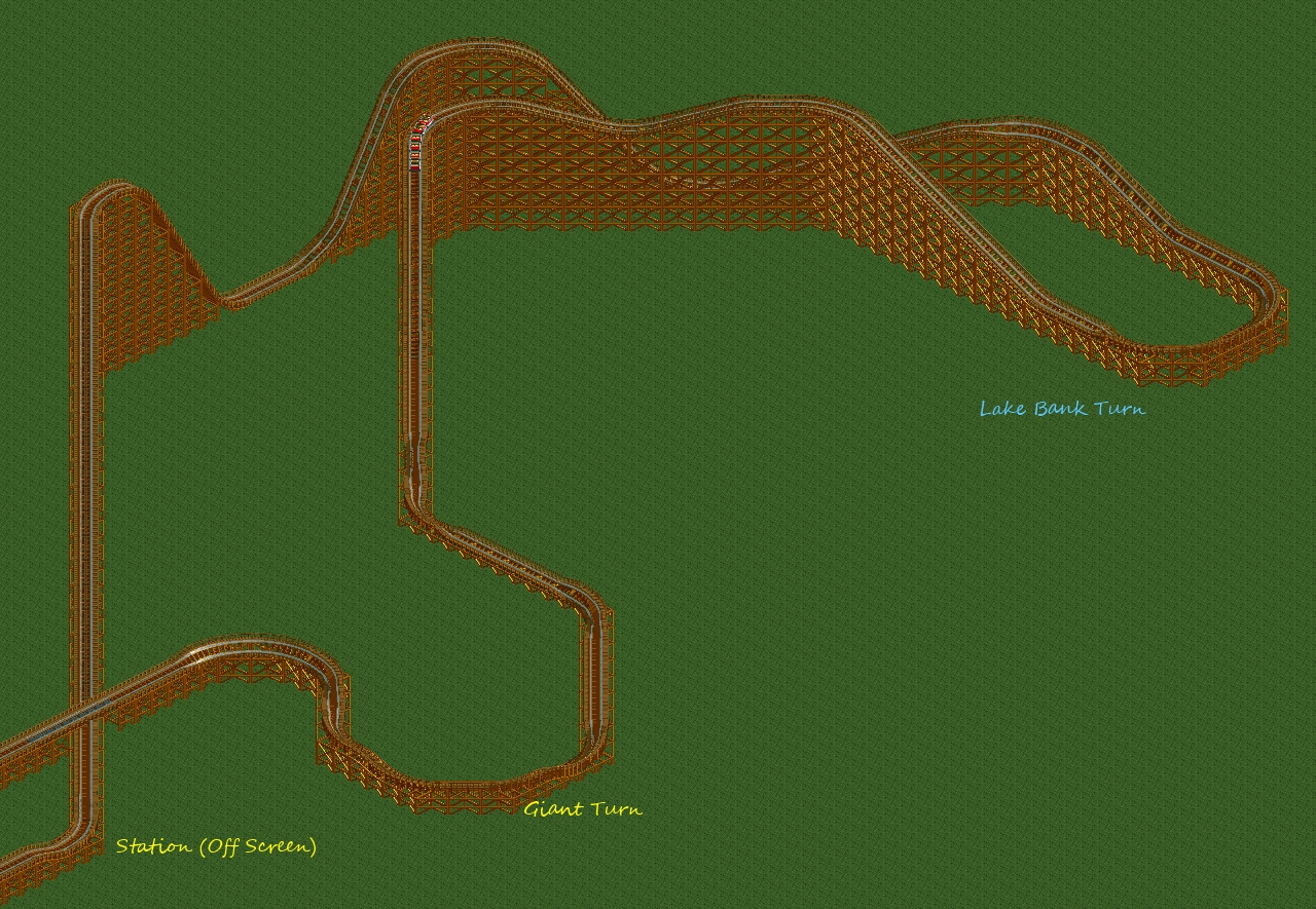
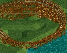
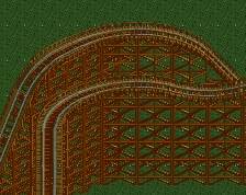
Oh ok, so the Thumbnail is the frontpage/sidepage thumbnails, not the one atop here. *noted for future ref*
Way to big. I know the Holiday World Coasters are awesome, but you have to find a way to scale it down into the game. The way you did it seems really boring to ride, whereas the original is not, I'd imagine
first welcome
there isn`t a flow. some coaster are really difficult to build in rct2 like the raven or x2 (for example). never build long tiles where nothing happens.and maybe you should open the whole layout a bit and so far a little work. However, I like this idea to build raven . very cool
-remove the tiles before the lake turn
-remove the tiles before the giant turn
oh and in my opinion you should not always one up after each curve at the end.
Recreating real rides in RCT is always a challenge, but particularly with rides that feature diagonals, and diagonal lifts. Most people on this site prefer a recreation to be more focused on aesthetic recreation rather than pure accuracy. So for example, try building more to get the feel of the ride as a whole, rather than trying to match the RCT height to the real height, RCT track length to the real track length, RCT speed to real speed, etc.
What you've got seems to be decent start but there are some improvements that could be made.
1: I would lower the height of the lift and first airtime hill by maybe 10 or 15 feet. This would make the overall scale of the ride a bit more accurate to the real scale.
2: The lake turn is very drawn out with those straight sections of track. The real ride seems to have a more compact turn here, and it goes about 270*, whereas your turn is barely going past 180*
3. The giant turn is also a bit drawn out, though not as badly as the lake turn. If you fix the height and lake turn, it might make the giant turn a little more flowing as well.
Keep trying, it seems like you've put a decent amount of effort into your research!
Edit: Don't forget to take a look at the differences between the real Kumba and Kumba's recreation of it!: http://www.nedesigns...ark/1536/kumba/
FullMetal Offline
HW is my home park, so I think it's really cool to see a recreation of one of the coasters.
But as everyone else said, you should fudge the facts and focus more on aesthetics. Shorten up some of the straight sections and definitely bring the lake turn around a bit more.
It's a great start, though, and I'd be eager to see it completed.
Hint - Diagonal Lifthills kill the system...
I've tried to recreate this one as well. My biggest problems were the turn over the lake and the final helix thingy. I gave up on it though, as it's way too stretched out of a layout to make it look interesting. If you're going for accuracy, all there really is around it is trees anyways. Good luck with this though. I'd like to see an accurate recreation of my first roller coaster ever
Alright, so what I get is:
1. Too Big: yeah, it is a bit x3
2: The lake turn is very drawn out with those straight sections of track. The real ride seems to have a more compact turn here, and it goes about 270*, whereas your turn is barely going past 180*
I May need some help here, if to make a better lake turn.
3. Diag Lift hills kill: Well, I'd agree, but the setup and the way it feels IRL does also make it feel that it goes from the station to the lift hill with a diag lift hill and a normal hill would kill the look/feel of it.
Thank you so far for the input