Screenshot / Pink Lady & Plaza
-
 13-September 14
- Views 2,125
- Fans 0
- Comments 7
-
 Description
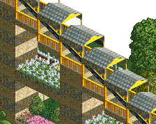
So this is my first screen here in a long time. I've been working on this area for probably around 30 game years, and this is the best looking spot for a screen so far. This is much better than what I used to post here but I know it's still not great. Any tips?
-
 Full-Size
-
 No fans of this screenshot
-
 Tags
Tags
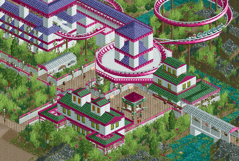
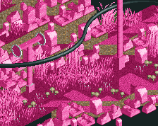
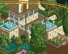
Too much of the purple roof. Fill those spaces with other details or objects. The color scheme is fun but could maybe use one more color...
This looks really cool and creative. I also love the fact that you spent a lot of time on an area before showing it. I can see that thought and effort were put into this. I actually don't mind the purple roof.
A few larger trees in the foliage might look good.
Wow this is very pretty. I like it a lot. Keep up the good work!
I enjoy the different syle and color.
Great colour scheme! I'm impressed that you've used that pink in abundance, but in a way that doesn't making it overpowering or cartoonish. There's a certain repetitiveness to the purple-roofed buildings and towers that I think could be broken up a bit (perhaps with some arches and tunnels over the coaster track, or some non-symmetrical parts here and there), but other than that, I'm liking this a lot.
I just noticed the stone benches. Small detail, but an excellent choice here. Wouldn't mind a little more sandy tans here and there.