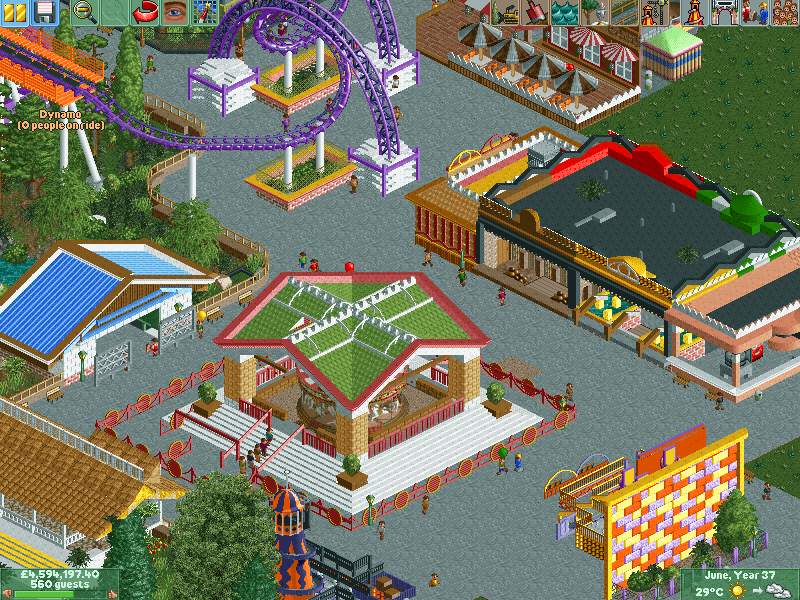
That fence screams "fair / carnival" to me... very nice. Everything is a bit large but it's nice to see some larger scale parks that look drastically different from the rest of the work on NE.
Everything seems like it;s plopped on top of the concrete. Maybe it's supposed to be like that. But if it's not, try adding a few small planters here and there.
Very nice elements on this screen, they just feel disjointed. There are buildings that feel massive like others have said, but other stuff is actually small/too small for the large scale. The carnival games should, at minimum, not be 4 times the size of a donut shop in my opinion. The corkscrew coaster is very nice but again, feels small, especially when a carnival booth is twice the height of it. I also agree that you could use something to tie the buildings together across the paths; maybe just extend the grass a little from the building to add gardens.
Fun and colourful. I would maybe add a custom floor to the carousel tho the sand blends in with tan brick. planter or 2 but apart from that.. great stuff
All the fun at the fair at nowton without the creepy clowns. So we have Phantasm (magic carpet), Helter-Skelter (spiral slide), Grand Carousel (merry go-round) and Swan Lake (swans).
the opposite angle
That fence screams "fair / carnival" to me... very nice. Everything is a bit large but it's nice to see some larger scale parks that look drastically different from the rest of the work on NE.
Great job!
I love it. Very creative and feels different.
Everything seems like it;s plopped on top of the concrete. Maybe it's supposed to be like that. But if it's not, try adding a few small planters here and there.
Very nice elements on this screen, they just feel disjointed. There are buildings that feel massive like others have said, but other stuff is actually small/too small for the large scale. The carnival games should, at minimum, not be 4 times the size of a donut shop in my opinion. The corkscrew coaster is very nice but again, feels small, especially when a carnival booth is twice the height of it. I also agree that you could use something to tie the buildings together across the paths; maybe just extend the grass a little from the building to add gardens.
Fun and colourful. I would maybe add a custom floor to the carousel tho the sand blends in with tan brick. planter or 2 but apart from that.. great stuff