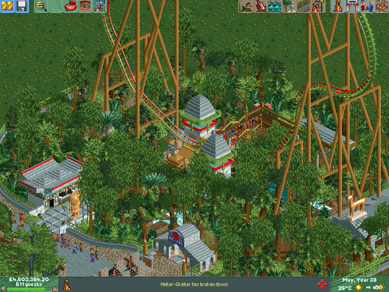
I really love the idea, but it feels a tiny bit oversized. Try bring it down by like 50, maybe even 100 feet. I'd also suggest hacking a chainlift in instead of making it powered launch. Totally fresh on this site though, and the theming looks great so far.
That is awesome. I,love the setting and theming. Its colorful, but not too much. And the aztek style is very recognisable. I think the coaster is great the way it is! Dont be afraid of huge structures and high coasters. This really pops and I love it!
The entire shape and location of this coaster is a lovely break from the norm. Where a lot of rides seem to strive for interaction, this works as a standalone piece, lost in it's own jungle area. Excellent hints of colour, and nice job on the support work which blends in with the trees well.
Hey peeps, parks comin' on good. here's the first ride in the first area 'the new world'; Quetzalcoatl. the serpent Aztec god. its a sort of multi-demetional powered launch coaster. Dynamo is in the background
I really love the idea, but it feels a tiny bit oversized. Try bring it down by like 50, maybe even 100 feet. I'd also suggest hacking a chainlift in instead of making it powered launch. Totally fresh on this site though, and the theming looks great so far.
Sick ideas!
got better ideas in the mix! watch this space!
opposite angle
The entire shape and location of this coaster is a lovely break from the norm. Where a lot of rides seem to strive for interaction, this works as a standalone piece, lost in it's own jungle area. Excellent hints of colour, and nice job on the support work which blends in with the trees well.