Screenshot / Update: Entry Village
-
 03-September 14
-
 Agencia
-

 8 of 13
- Views 2,357
- Fans 0
- Comments 6
-
 Description
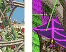
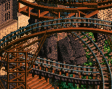
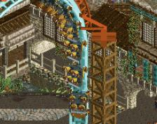
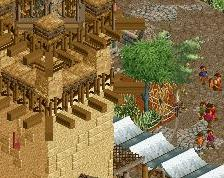
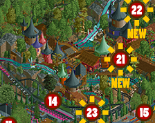
An unfinished update with some snapshots of the entry area of Agencia. I'm going for darker + brick heavy + clusters of thin buildings (many 1x2, 1x3, and even 1x4 buildings). I would love some feedback on the overall tone / texture / colors of the area; any suggestions?
P.S.
This will probably be the last update for a little while as classes have begun again. -
 Full-Size
-
 No fans of this screenshot
-
 Tags
Tags


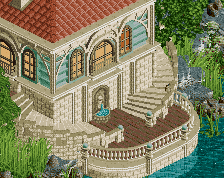
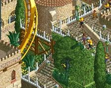
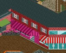
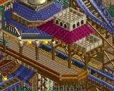
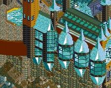
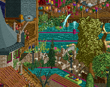
I'd personally love to see more imperfections and variations in the texture. You have these large expansesof brick, and it could be worthwhile to add some instances to break it up, whether through different stonework or more heavily-textured vines.
I think you have some .bmp color issues. Agree with rob about too many blank faces. both some graveyard and the yellow extrusion need some more texture.
I agree with robbie, the texture work on the brick walls is a bit boring, try making it messier and more gritty and add some details to the windows cuz now nothing really sticks out much for me
I echo what's been said about the brick texture, but you have some great forms and structure in the architecture. Good stuff.
i dont think the issue is necessarily the expanses of brick. for me, more offputting is the abundance of straight lines, especially on the roof lines. more angles will soften the screen for sure.
as far as the tones go, colours look dark but still warm which is exactly how i like it. looking great to me so far.
Thanks for the suggestions everyone. Appreciate the feedback as always.
This whole area is going to be like a dense city/village feel with multiple levels and a lot of overhead bridges.
I'll rework the brick textures and try to add more detail to the walls. I agree that too much brick can be overbearing and boring.
I am liking the straight lines as that is the aesthetic I was going for - there will be an abundance of 1x3, 1x4, and even 1x5s that criss cross and overlap, etc. How would you suggest adding angles @Turtle? Perhaps some diagonal straight lines? Or do you mean roofing as in more slanted roofs instead of flat roofs?