Screenshot / how do i original?
-
 03-September 14
- Views 2,658
- Fans 0
- Comments 18
-
 Description
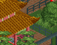
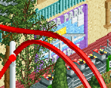
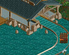
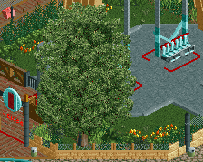
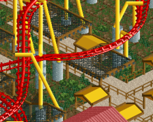
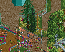
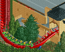
i really hope this is original enough to be considered "my style", after it happening a couple of times it'd be a bummer for it to happen again. but i hope it doesn't this time. anyways here's a tepanyaki restaurant.
also if i do end up being a rip off once again, how do i improve that? -
 Full-Size
-
 No fans of this screenshot
-
 Tags
Tags
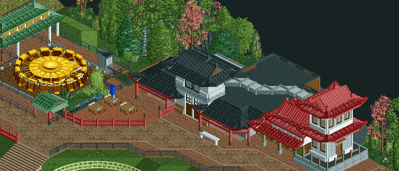
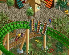
I know Robbie is working on a smilar theme but this doesn't strike me as a rip off. I'm still trying to figure out how you got so good so fast.
The umbrella pole looks a bit thick. No real criticisms other than that. Maybe try to hide the base on that enterprise ride.
I think it's perfectly original, and looks pretty nice. I can definitely tell that you built it.
But you have to admit you "robbed" (haha) the pink trees straight from rob.
The issue that I see is that you're building this theme so soon after rob has, and therefore people are more likely to draw comparisons. I can definitely see he has inspired you, but there are sufficient differences that distinguish the two.
Perhaps you should maybe try to build a more 'unique' theme that hasn't been done for a while, people are going to be more likely to judge the work itself (and therefore your 'style') rather than comparing it with someone else's work.
What.. so just because rob builds this theme no one should for a while because of people comparing it?. Im sure robbie would agree that hey this is pretty damn good and he would probably use something similar in his park. GDB is trying out something new for him and I say hes done a great job, Keep going with this. It is only not original when you get like shotguns a while back copying the forms of buildings n shit.... He has moved on and has improved a shit tonne ... and i dont see any copying here.
Nah it's a stereotypical asain theme does'nt look like anything in particular. Looks good.
Pleasant.
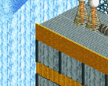
Only gripe I have here is textures... you seem to be using textures for the sake of using them,in my life I've never seen a pagoda type building with steel plate walls... also the ride op hut could use some love, we have the kumba control box object so I'd advice actually trying to use it, get rid of the blocks being the ride op hut on the chaotic and use thin walls instead to help give you the feel you want to deliver...
^the corrugated texture isn't always used to represent steel. I'd assume that it's wood here. I don't like to see people assuming that a certain texture always means a certain material (You're not the only one who's done this, I'm just expressing my frustration now). A combination of the color, texture, and context should be used to determine what something was intended to be.
Not entirely sure about the trims on the building on the right. Also i do think there's a bit too much red. I'd like to see another pagoda-ish building like the building on the right in the left corner of the brown building, would look nice. I'd also really like to see some more stuff on the bottom of the path, looks nice btw!
I'm really not sure what you're going for tbh. It looks like you're trying to emulate the PortAventura Oriental theme, but there's just not enough here for that. It needs to be a lot more crowded to get any Oriental atmosphere I think - it's far too open. The buildings are also far too small, to the point that I can't figure out what the purpose of the building actually is.
The ride also just looks like you've literally plonked it there cos you had the space. I'd like to see some more interesting theming around it, perhaps rework the path so that it doesn't just border the ride, leaving you some room for a bit of rockwork/foliage, just to make it look more than just an empty plot of land with the easiest ride/queue combination possible.
I like the scale of the screen. I think the umbrella could use 1-2 more units of pipe to proportion it correctly. I love the bench and I think the path needs some trash bins/lamps/benches. Good solid start though.
never expected to get this much replies
@coasterbill
thanks! school doesn't take up a whole lot of time for me so i can always play for atleast an hour a day (if i feel like it
  ) i don't have anything as grand as sunset vista though!
@Ling
perhaps you're right, maybe i'll just unfold them. it might give a bit more atmosphere and create the impression that it's sunny because the umbrellas are unfolded.
@csw
thanks! originallity is my main issue with this. about the trees though, they're common enough or atleast shown enough for this to pass i think. robbie did help me a tiny bit though but still pink trees are one of the first things i think about when i think about japan.
@stoksy
i'd say inspiration was minimal though, a lot of the objects or shapes i use are also very much existant in japanese architecture, though robbie did think of them first so credit to him i guess. also i should add that for about half a year now i've wanted to do japanese things but never could find a workbench that contained the quarter tile roofs nor did i know how to parkdat. who knows though, i've had some ideas going.
@ScOtLaNdS_FiNeSt
i think we're about almost on the same line. if we start to complain to people using the same object for certain things which looks a lot more realistic than the alternative, nothing will ever be enough. i might be a bit too close to robbie releasing his BGA screens but japanese themes have been done many times before. that's not to say you can't copy and still have your own shapes though, an example was my previous californian screen which did took a lot from robbie and pacificoaster. anyways i'm glad you liked it!
@Austin55 & Aveninecommuter
glad you like it!
@ like inthemanual said it's supposed to be wood. i don't think folding their metal hundreds of times for their houses like they do for samurai swords is going to be very effective . i'll switch the controll box though, i actually forgot about that object
@ inthemanual
you are right about the wood (no reddit gold though).
@ WouterVL
personally i like the building. you're right about the red though. i feel like this design has a tad too much of it, but old japanese buildings often had a lot of red too. but as more foliage will be placed i think i can get rid of that.
@ rawrylol
you're in luck, because i'm not going for puerta aventura. to be honest i only know the park from some of your photos placed on here and FredD's Shangri La. so i think what you said about scale and crowdedness doesn't apply as much as it would when i would have gone for that feeling. overall i actually do try to make my parks open and with lots of foliage, i like trees. what you say about the thrill ride is pretty much spot on though, i'll try to see what i can do.
@ fizzix
from what it looks like now the umbrella's most likely will get redone, but i like your suggestions. i still have to make path accessoires though, those benches were more to brigthen it up a bit before posting the screenshot. also thanks it looks like i will finally finish something again as most of the architecture is already in place and all that's left is some hacking and foliage.
I'm glad you decided to stick with the white buildings .
.
"they see me buildin' they hatin"
Well, you yourself have pointed out that it's similar to Robbie's work, so I'm guessing you've taken inspiration from there, and Robbie took inspiration from PortAventura, so I guess in a way you're taking secondary PortAventura inspiration. I know what you mean about leaving open spaces, it gives your work space to breathe, but that's only the case if your work needs the space to breathe.
These buildings are incredibly small and, for the most part, only one floor. If you want to have any sort of atmosphere building like that, you need to put many more details across the path, and crowd the area much more, otherwise it really does look like something that a park with not much money would build in the middle of a field. Look at how Robbie has done his Chinese area; his buildings are small/not very tall, but he's crowded the areas in front of the buildings with things to look at so that the eye isn't drawn to the large open spaces. Having lots of foliage in large open spaces is good, but not necessarily when it's in the middle of an area.
I think something else that you seem to suffer with is that you're afraid to build architecture on both sides of a path. It doesn't have to be like a midway, but the way you build your architecture makes it seem as though you're trying to showcase your architecture talent rather than make an amusement park, so your parks become a collage of buildings stuck on the side of paths in between rides rather than a flow of themes.
I think its really nice, I just think you need to use less path textures. Youre using 3 different textures for a path that is only 3 tiles wide?
i like it a lot.