Screenshot / Old stuff made new
-
 29-August 14
- Views 1,705
- Fans 1
- Comments 9
-
 Description
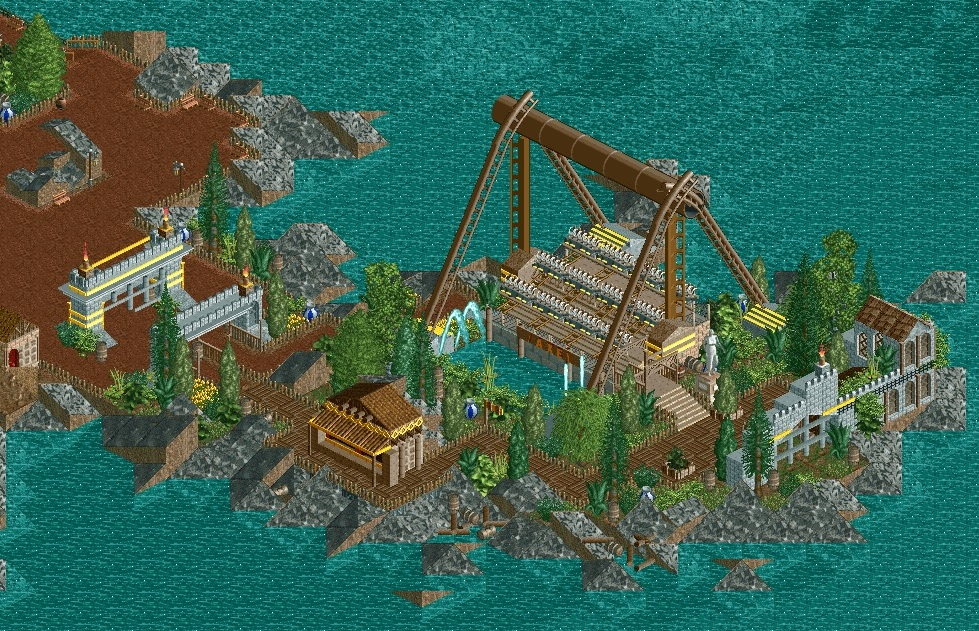
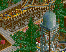
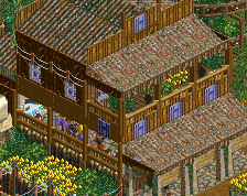
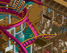
I made a restart in RCT2. the last few years it bugged me that my Thunder Rock never finished... Made a few adjustments here and there. started a new area (wild west thing)... Made this stuff on a workbench fron the year 2006\2005.
Hope you like it... New stuff is coming soon... -
 Full-Size
-
1 fan
 Fans of this screenshot
-
 Tags
Tags
I like it.
PBJ Offline
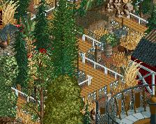
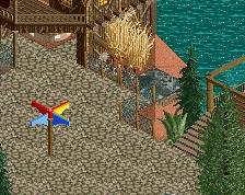
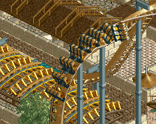
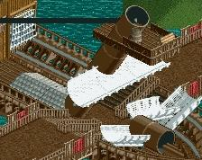
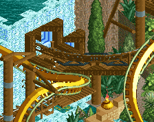
here is an other screen from another part of the park:
^Agree completely with you there Liampie; really old school and I kinda like it. Very reminiscent of artist/turtle/x250 spotlights.
I thought we were in an age where we didn't need any trackitecture supports anymore... looks very nice and oldschool though, i like it. It doesn't look very wildwest though, rather looks like a pirate themed section.
Very old school, I like it! My only issue is that literally everything is brown, and mainly the same shade of brown as well.
This is a nice break from all the overdetailed hyper realism stuff going on. Two thumbs up!
Very nice (on both screens). The only thing that really bothers me is the row spacing on the Top Spin... I'd make it just a 3 car train, because it's too far apart right now. I think the trackitecture supports on it is done very well, but throwing in B&M supports in the second screen makes me wonder if it will look consistent across the park. Nonetheless, wonderful style.
I will always love anything that resembles ProTour 2-era parks.