Screenshot / The Eagle #1
-
 21-August 14
- Views 2,141
- Fans 1
- Comments 6
-
 Description
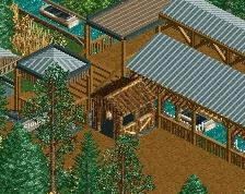
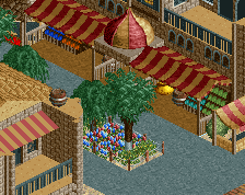
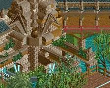
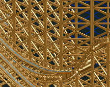
This is a little teaser of my newest design called the eagle.
The ride will be centered around an old american town that booms with culture and spirit. Half of the map will be a mine town with various rides that deal with the concept and then the other half will be the american town that holds the behemoth that is The Eagle. -
 Full-Size
-
1 fan
 Fans of this screenshot
-
 Tags
Tags
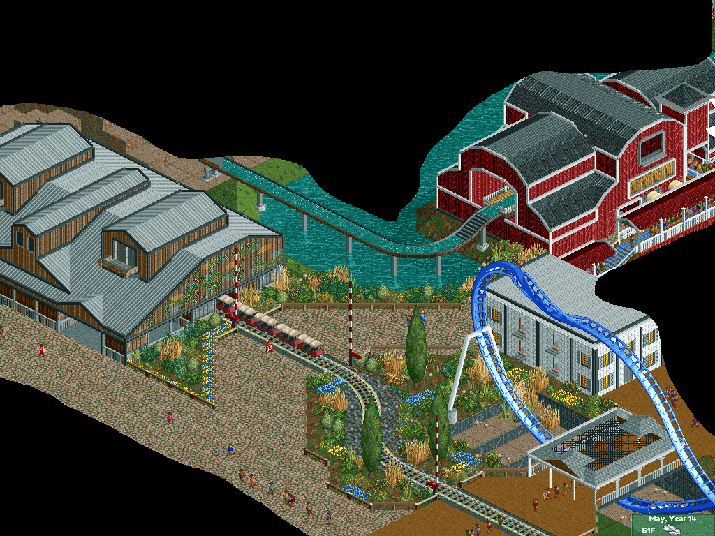
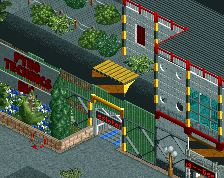
Super clean and nice looking. I think you might have gone overboard with trim on everything, and I also don't like the diagonal path going across the train tracks (just make it go straight over). Otherwise looks very nice.
path might flow a bit better if you did something like this:

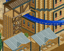
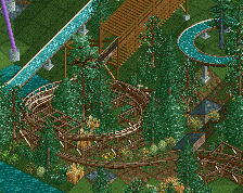
B&M could do with four or five more supports. On this visible spot.
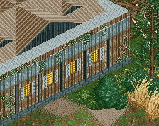
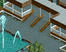
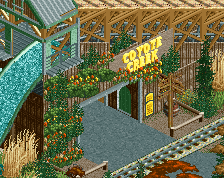
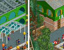
Not every building piece needs a trim. There are more details to be put on buildings than trims, don't forget other details. Now your buildings still look plain and boring, but with a shitload of trims everywhere.
PBJ Offline
I agree!
On the red barn (white trim) they looking fine.
But the black trims are looking too much!
i agree with PBJ, usually those barns do have white trims so it passes here. the black trims on the other hand make the building feel more boxy than it already is. i'd recolour the ones around the roofing grey so that it looks like they expand the roof a bit. the ones that don't touch the roof i'd just make brown, just to make a bit of accent in the building. also i'd put some large trees next to it, that might help hide the massiveness of the structure