Definitely glad that you're continuing this project. You have this knack to make stuff 'work' (especially in NCSO, but also in your Disney's Wild Animal Kingdom project) despite there not being a very high level of detail. Refreshing is a word that gets thrown around a lot but I think it should be applied here.
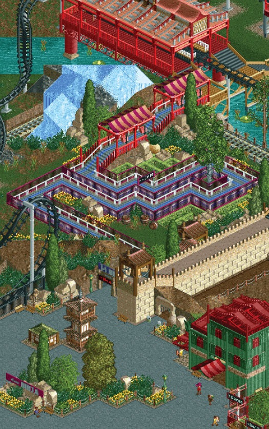
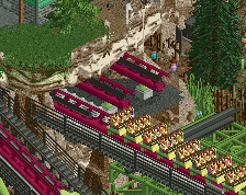
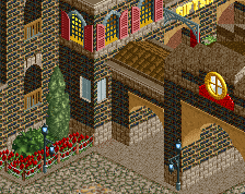
don't like the queue colour, I know it's NCSO but you're better than going for the babyblue here... try yellow or red even, might intensify the area a little
don't like the queue colour, I know it's NCSO but you're better than going for the babyblue here... try yellow or red even, might intensify the area a little
Yeah it needs some more colours, some yellow things here and there would probably work well.
I understand what BG is saying about the queue. On the one hand I'd like to agree, blue is not the perfect colour here, but on the other hand it pops very nicely and the area would lack some stark contrasts otherwise. The blue actually makes a great combo with the magenta fences and the light green of the mazes too, in my opinion.
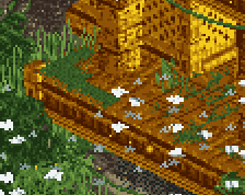
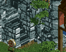
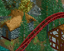
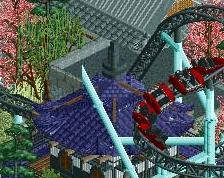
honestly i actually like the blue, it mixes in well with the purple and it's something different here. the wall looks nice too, but i feel like it would be nice having it meander around the landscape a bit more, like the actual wall of china. also is that a zen/rock garden? because that looks pretty cool. the green asian building looks good as well apart from the fact that you can see the wooden supports for the roof, i think something like wooden fences or another type of fence would look better here
Hey, glad the zen garden idea got across! I agree with the building and wall, both could for sure be better. This actually an older screen I had laying on my desktop that ShoGo had bothered me to post long ago, so I figured Id finally do so. This park will certainly be finished in the coming months if all goes right, it's just getting quite a bit of help.
 20-August 14

I GET IT
^haha Fk...
Definitely glad that you're continuing this project. You have this knack to make stuff 'work' (especially in NCSO, but also in your Disney's Wild Animal Kingdom project) despite there not being a very high level of detail. Refreshing is a word that gets thrown around a lot but I think it should be applied here.
don't like the queue colour, I know it's NCSO but you're better than going for the babyblue here... try yellow or red even, might intensify the area a little
You are still working on this? Fantastic.
^it's not like the bench is getting dated...
Yeah it needs some more colours, some yellow things here and there would probably work well.
Great to see new screens from this park!
honestly i actually like the blue, it mixes in well with the purple and it's something different here. the wall looks nice too, but i feel like it would be nice having it meander around the landscape a bit more, like the actual wall of china. also is that a zen/rock garden? because that looks pretty cool. the green asian building looks good as well apart from the fact that you can see the wooden supports for the roof, i think something like wooden fences or another type of fence would look better here
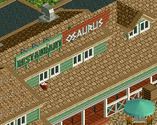
I like the blue. I still dislike Pretzel Palace.
good cause mine is shit.
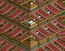
I am in love with that multi-layer station.