Screenshot / New Standup (Clarity)
-
 19-August 14
-
 Six Flags Quest
-
 1 of 8
- Views 2,504
- Fans 0
- Comments 5
-
 Description
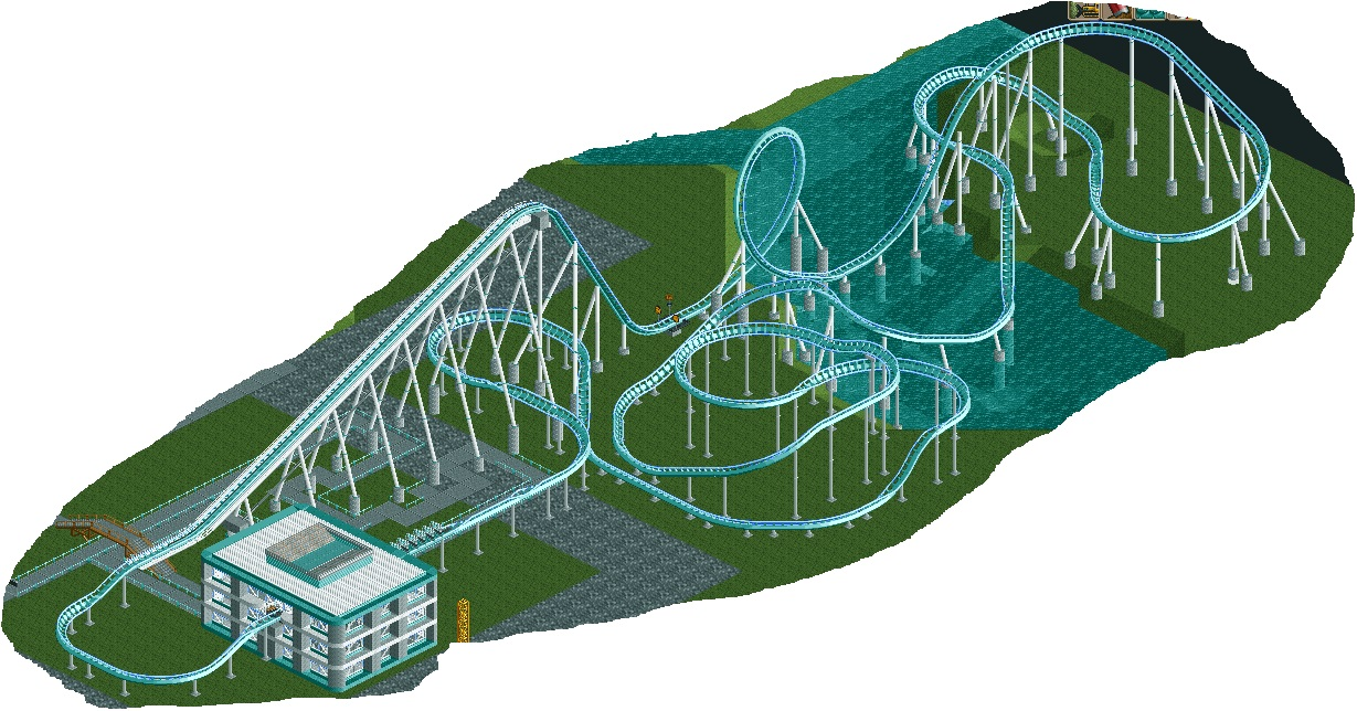
Probably the last rollercoaster in my park before I begin shops, paths, and all the other details. Park is years in the making as I am on and off with my RCT2 motivation. I love the game and try to make some cool (real) looking stuff. Not the best.
-
 Full-Size
-
 No fans of this screenshot
-
 Tags
Tags
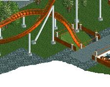
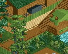
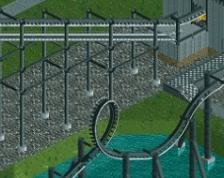
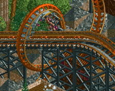
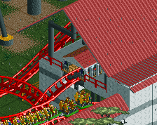
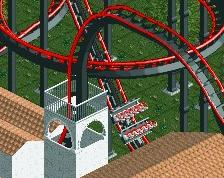
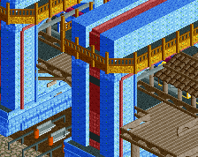
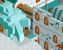
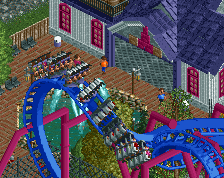
As you can see I am working on the supports still....I am not the best with those, so please don't be too harsh
PBJ Offline
Lay out is nice... but need some work imo.
The track is waaaaay to much banked. and only one loop is a track this big? 1 loop can work if the surroundings are done and the track is fully themed...
ps. beter track lay out then i ever did btw
I'd color the flanges the same as the supports unless you want Ling to bite your head off
Maybe some more inversions.
The whole thing just feels too massive... I would recommend starting to bring it down by taking the first curve out of the station and into the chain and make it a much sharper turn. The chain lift and loop are very well done, and your supports are done well on the rest of the ride, but the ride layout itself after the loop just feels like it meanders with no purpose. Give it some more inversions and pull out the endless wandering of banked turns. Also what's up with the weird straight bank right before the brake run?