Screenshot / The Only Place Thrills Are Paramount!
-
 02-August 14
-
 Paramount's Movie World
-

 7 of 30
- Views 2,864
- Fans 0
- Comments 4
-
 Description
I was dumb to make the building for The Outer Limits in the middle of the park. So I basically landscape everything around to somewhat cover it up. It was grey at one point until I realize that it was just ugly so I did what anyone would do. Pull a Dark Knight and make the building look like a sky. Anyway I wanted to show you this because this screen is one of faves cause of my Paramount sign I made and it's the only thing I made that actually turned out nice. Also I'm almost done with my Action Zone.
-
 Full-Size
-
 No fans of this screenshot
-
 Tags
Tags
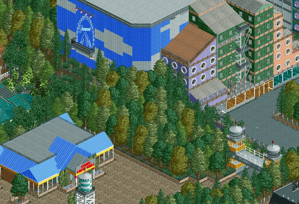
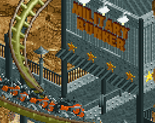
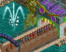
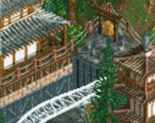
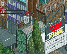
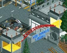
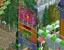
Try to use more tree types, it'll definitely make your foliage look less monotonous. The sign looks pretty good, but i can't help but think it'd look less distorted if you had stretched it more horizontally (say, 3 tiles instead of 2).
Also I realize the buildings by the soundstage are meant to be skyscrapers (or I'm assuming so), try to make them more interesting to look like, and perhaps match the textures of actual buildings. THe wood doesn't look great here and I know that you could make it look more like a city set piece.
All in all though, this is one of my favorite parks current being built. I've always loved the Paramount brand and I love seeing it in RCT. You even have me thinking of trying it out for myself in my next park.
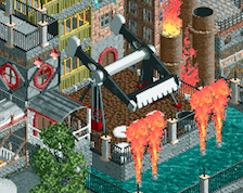
Well I really don't know how to make a proper image for the game. So if you know any good tutorials, could you maybe link me. Mainly because I want to make a Hurler logo and a smaller paramount logo for Hurlers station. Also I don't really know what other walls to use for the "skyscrapers". I don't want to resuse the same walls, because it will looks repeative and ugly. I will try something though, but if it doesn't work out. Then I will leave it be. That green building was suppose to be like a old/ more out of date look anyway. Like a thug hangout or whatever. I get that feel from The Crow movies haha. Anyway here is the other side of the buidling. I just wanted to show you the rest. This is the tighest area of the park by the way. I didn't intend it to be, but it turned out that way. I guess my Wayne's World area is pretty tight to. I know I'm missing like a few pieces for my building next to the hangar. I just realize that while I was typing this. Oh and I will try something about my foliage. I really hate the foliage by the Stunt Crew Grill. Just I don't know what to put there. Foliage is my weak point tbh. I will try something though.
Agree about the logo. Personally don't mind the trees too much, I think they just need some underbrush. Really like the skyscraper personally although I don't necessarily mind the wood I could see the city set piece looking quite good here.
Really great to see someone doing a semi-detailed recreation, after Airtime's I've realised that recreations can actually be made to look good in RCT and you're certainly on the right track.
i cant wait to see the final project.