Screenshot / Knight
-
 01-August 14
- Views 1,285
- Fans 0
- Comments 8
-
 Description
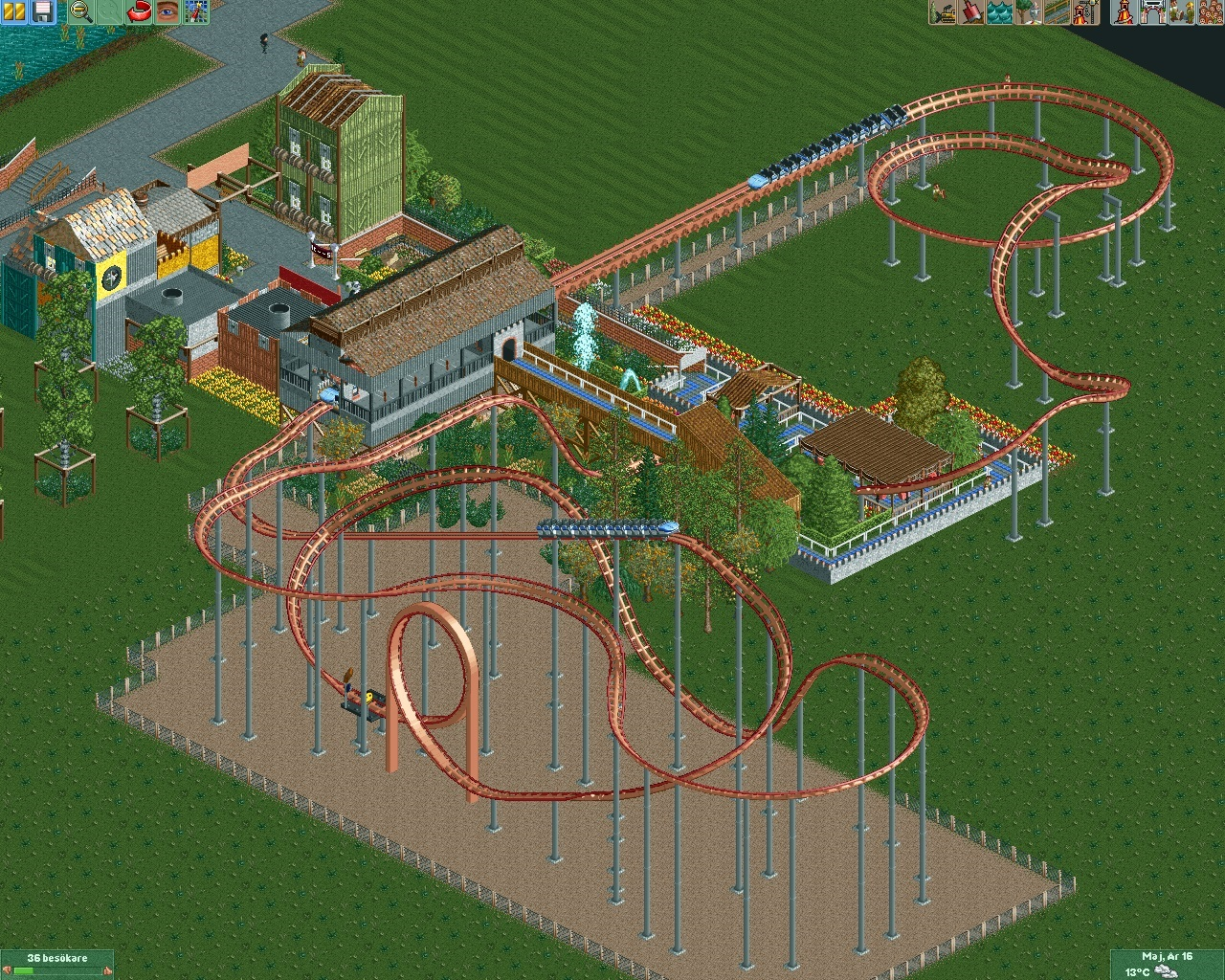
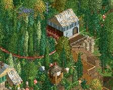
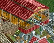
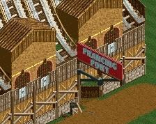
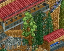
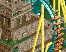
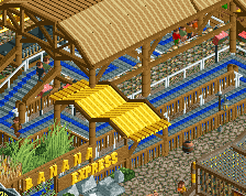
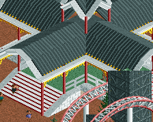
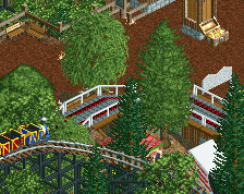
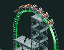
So here's Knight I scrapped Salmon Knight. I'm kinda happy with the layout and will probably stick with it if it not suck to much :) . I'm trying to get some sort of overgrown feeling at the queueline, do you guys feel it? Also I'm working on a new entrance with trackitecture really hard imo, I will post a pic when the entrance is finished. Sorry for not changing to much as I'm very self-critical I'm deleting and re-building and etc, so I want feedback :)
-
 Full-Size
-
 No fans of this screenshot
-
 Tags
Tags
Yea the fence around the coaster hit or miss?
The layout is just kind of... off.
Queue is nice though.
Well how should I change it? thanks for queue line
The first part of the coaster just sits off by itself in the middle of nowhere. There is nowhere to fill in buildings or add paths to produce fun flybys. The entire thing spends quite a lot of time very high up with only two or three real "hills". The s-bend into flat straight section is very strange and I think you could find a better way to get down to the level you need it to achieve the queue dive. The second half of the ride looks like "Whoops, I still have too much speed, have to burn it off somehow".
Try to condense the ride's footprint if you can. This weird bifurcated thing doesn't really work unless you have a distinct reason for the two concentrations, and here I don't think you'll be able to theme either - they'll just be hidden off in the trees or whatever. I would lower the lift by a few tiles and make the first drop steep, get it closer to the ground before having the loop. For diving the queue, perhaps have the train approach that section from underneath the lift instead of from above it. And leave some clear space somewhere to fit a building or path inside the footprint to give the ride a sense of belonging in the area, not bolted off to the side.
Thanks for the advice will post the resluts later, really appreaciate it
Pink Knight???
Well if you just gonna vote 25 and not saying anything why bother
Could use more theming in general. Like castles and medieval buildings.