Screenshot / Thunder River Rapids
-
 28-July 14
-
 Schwarzkopf Design
-

 2 of 4
- Views 2,874
- Fans 1
- Comments 16
-
 Description
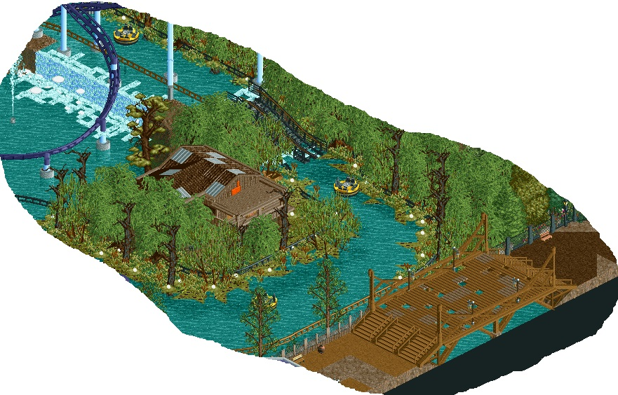
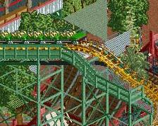
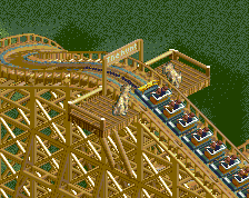
Portion of the supporting rapids ride. [any suggestions for a better name would be nice]
There are essentially 3(ish) themed areas shown; the haunted woods lead into a swamp, which is connected to an abandoned mine town by an old wooden bridge. -
 Full-Size
-
1 fan
 Fans of this screenshot
-
 Tags
Tags
Holy shit I love this. The black rail may be a little overpowering but that's really my only critique.
Nailed it. Absolutely adore the foliage.
I dunno, I'm not really getting any atmosphere coming from the screen. I feel like the rapids ride it's self is too open for what you're trying to achieve, and I also feel like the house is unnecessary due to the amount of foliage around it meaning all you'd be able to see from the ride is the balcony.
Maybe try to mix up the colours in the foliage as well, one green across that many trees/bushes is very monotonous.
I like the idea you're going for with it, it's a theme I tried to pull off once and struggled with, but I think there's just a few things holding this back currently.
I will say that trav has the right idea here, from an efficiency standpoint that ride wouldn't work (needs bumpers to help guide the thing), but I still love it. I wish the bridge didn't feel as open as it does, with more foliage surrounding it, you'd have a sweet photo spot for guests walking along the path. (the idea being that they wouldn't see the rapids until they're actually on the bridge, only catching glimpses through the trees/shrubbery beforehand).
great atmosphere. love it!
Very much reminded me of Swamp People. I love the work you've been showing lately
The purpose of the bumper rails is defeated if trees are in front of them. If the bridge is supposed to look decrepit, then I love it. Good atmosphere.
I hope people don't have to walk over the bridge. Rapids lift should also be submerged in the water. Otherwise great.
being at the top there in the rapids ride would be annoying, you'd get stuck becasue the waterfall pulls the boats towards the edge and the water will just move towards the waterfalll causing the boats to get stuck
Hmm, interesting comment about the trees. I was feeling that there was too many of the same colour as well, but felt that given it was only this quite small area it would be okay [ie only extending a few tiles away from the water]. Nonetheless, will keep that in mind.
Regarding the railing, I honestly did intend it to be completely visible originally but as I started putting in the foliage I felt that it would look more atmospheric if I kind of blended the two together. This was the reason behind colouring it black because then it at least appeared visible but still didn't take too much away from the dingy swamp feel.
The building was more to break up the monotony of the trees, I think that it would still be acceptable even if only the balcony were visible. Where the rowing boat is provides a decent view of the building, as there is a small clearing there; so I think that there is enough in way of viewing areas of the building for it to make sense as a theming piece.
The openness of the bridge is purely because it bridges the gap between two areas, [an abandoned mine town] although maybe some denser foliage/rockwork could work.
Any suggestions as to how to fix that gdb, or is it the fact that this would simply not happen on a rapids ride?
Thanks for all the feedback.
Great macro features in this. Same goes for the other screen as well. Looking forward to this.
Very nice foliage, I will be taking hints from you.
Small thing - there probably shouldn't be footers in the path of the rapids.
what a creepy foliage mix! I adore it.
Nice screen! Just one thing that would improve it even more: all dead trees are arranged in exactly the same way. Making it random would make it look more natural I think.