Screenshot / Doppler Cinema complex
-
 20-July 14
- Views 1,934
- Fans 1
- Comments 10
-
 Description
let's hope you guys like this better, but i'd really like tips on how to include more colour here
i took inspiration from this http://commons.wikimedia.org/wiki/Category:Bakersfield,_California#mediaviewer/File:2009-0726-CA-Bakersfield-FoxTheater.jpg -
 Full-Size
-
1 fan
 Fans of this screenshot
-
 Tags
Tags
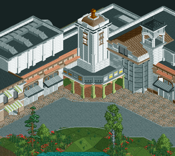
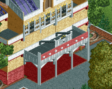
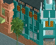
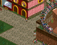
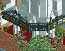
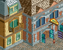
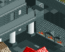
This definatly looks better and perhaps more original. The large wall of glass left of the central tower doesn't seem to fit in to well though, nor do the steel looking awnings.
More original yes, but like all your work there's waaaay too much white.
Few things; the contrast between the green columns and the peach is ugly and unnecessary.
The issue with using a building such as the one you mentioned as a source of inspiration is that the colour of building is more of an off-white, which is difficult to make in RCT. I would suggest instead of using the white brick, use the crown moulding objects and colouring them brown. I think that would be closer to the off-white that you want and also prevent the entire complex from being a super bright eyesore.
Cena's path object is showing under that glass, so I hope you do something about that.
Agree with Austin; the steel awnings definitely don't fit. This is especially because you've got quite nice looking canvas awnings on another building, why change?
There's too much white! Zhy don't you make the tower light green? Would fit perfect I think and it would break the whiteness... Also, those peach arches between the green columns don't look nice together as Stoksy already mentioned.
Get rid of the glass on the right, change the glass doors and windows to blue (or at least don't leave em white). And do something about those awning because they look hideous!
You're making improvement. 70%
the 1k posted signs like that suggest a theatre, but it looks nothing like a theatre.
I liked the other one better, it was a lot smaller and it looked nice. And now there's a gigantic white factory building taking up all the space. Besides, i don't like the orange arches. Why not make them green too? Remove the big building on the left and add some more green stuff like those arches.
@ austin 55: the glass wall was pretty much an afterthought and i'm not happy with it either, it's the first thing to be demolished here.
@ stoksy: i'll change the colour of the arches, the colour you suggest for the tower would be good.
@ faas: why don't you suggest something else first
@ FredD: the light green for the tower could work really well, i'll definitely do that if it looks good.
@inthemanual: why not? sure there are shops in front of it, but i have multiple viewing rooms in the back, look pretty theatre like to me.
@ wouter, those large structures are viewing rooms wouter, you can't have a movie theatre without an actual room for a large screen and lots of seats to fit in.
anyways i'm glad you guys enjoy it, or atleast more than the previous one.
My suggestion is all other colours except white. It doesn't really show a lot of creativity if all of your buildings are white. Whether you show a larger screen or just a screen of a seperate building, you always seem to go with white. Try green, yellow, dark red, peach, grey, blue, anything.
Theaters can generally look like anything, the only prerequisites are to have some form of ticket and concessions desks and an actual theater or two. They are also usually quite large. But I agree with Faas - the whiteness rivals rural Montana.