Screenshot / Dropzone
-
 18-July 14
- Views 1,972
- Fans 1
- Comments 12
-
 Description
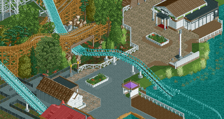
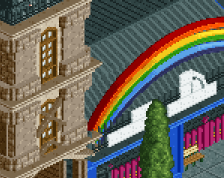
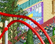
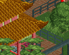
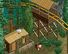
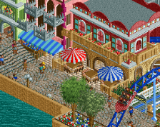
it's that time of the month again where i post a screenshot of a generic park and it most likely won't go anywhere again! luckily this time i can always make what i have a design as i didn't start with an entrance this time. and i didn't want to post anything anymore if i didn't knew for sure that it would go anywhere.
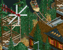
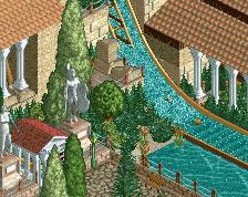
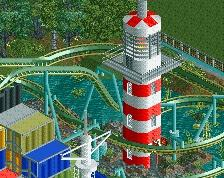
as for the interaction with the coaster and the watercoaster, it was not copied from park edda, but from the actual watercoaster and woodie at europapak germany, however when i had already made everything i realised that park edda had such an interaction too. though my watercoaster is closer to the actual thing, with only 1 small drop before the large drop. -
 Full-Size
-
1 fan
 Fans of this screenshot
-
 Tags
Tags
You need to do like a 60 x 60 park or a design so you might actually finish something. lol
Anyway I like this a lot, like I said the other night I really see the Europa Park inspiration. My only 2 suggestions are to make the splashdown area a bit longer and do something about the queue line which is a bit of a mess at the moment.
i really like colors and the flow of the rides. the fencing is nice. the queue is a bit messy, i have to agree.
this definitely won't be a large park incase it will become one, expect to see something like 80×55. i'll try to make the splashdown area longer, however the boat slows down rather fast and with the railings the whole experience should be pretty much painless IRL. queueline will be made more exiting, keep in mind this is not fully finished ATM and there will be more foliage around it
The boat will go a lot farther and faster with peeps though which is why I suggest extending it. I'm assuming this will be peepable?
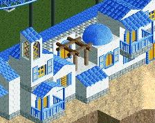
The path changes are weird, the fencing is way too high (like always) and why don't you make a building that is not white for once?
The path changes are weird, the fencing is way too high (like always) and why don't you make a building that is not white for once?
Woah, wtf happened there?!
well i have changed the bottom right building from white to salmon, which works well i think. as for the fencing, it's actually exactly as tall as many normal fences, just 2 units.
Switch the Drop to the Coaster Track aswell. At the moment it just looks strange, like where is the water of the drop going? Additionally, the coaster track you used for the hill is also pretty accurate for a Mack Water Coaster overall, as they don't really have a lot of water on their coasters (the drop has some water in it, but in your version, like I said, the water would have nowhere to go).
i think i managed to improve most of your points in my new screenshot, there now is a drain for the water to go into an underground tank from which it can be pumped up the ride for reusing
I saw some of the comments on reddit about adding in water towers and stuff; you have two 'canyons' here [one with water, one without] why not make the path a bridge and have the water go underneath? It would also look more like your source material.
Not sure about the fence height; it makes sense to be that height in my opinion, but it does look a little too big.