Screenshot / Minotaur Area
-
 08-July 14
-
 Project Mythology
-

 5 of 11
- Views 1,611
- Fans 0
- Comments 2
-
 Description
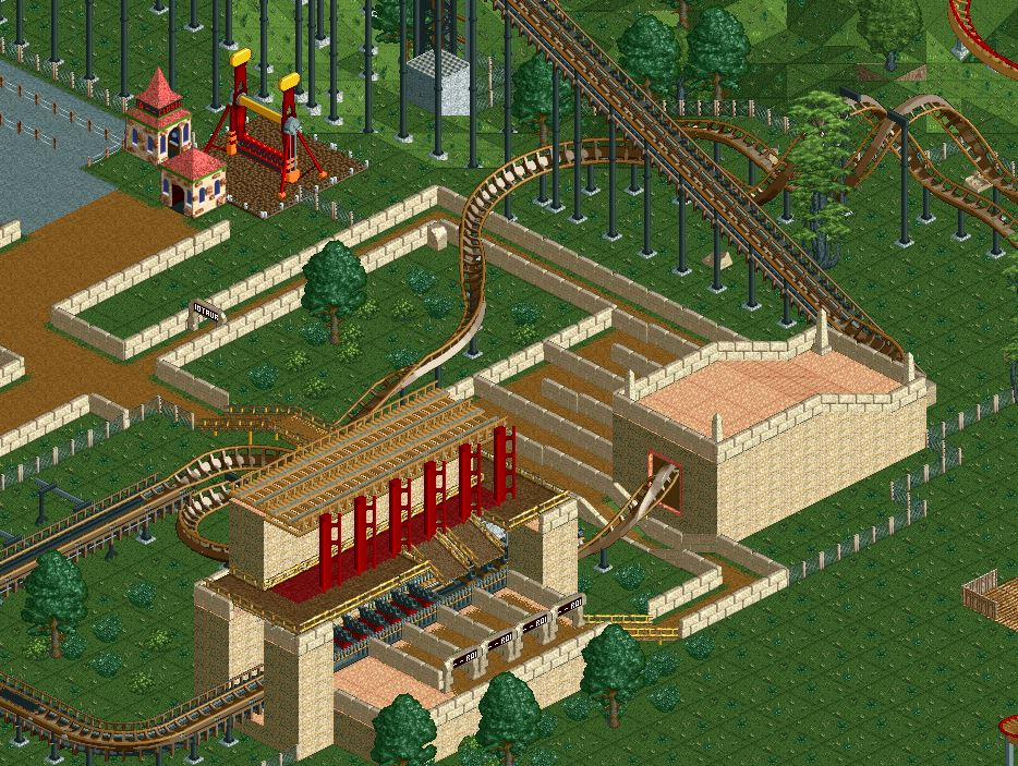
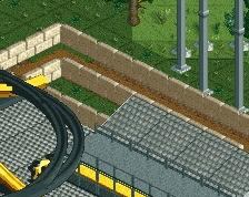
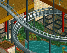
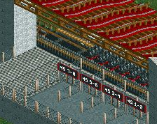
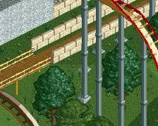
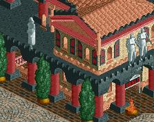
This is the area of Minotaur. I'm considering replacing all paths with dirt and the fences with the Egyptian-style walls. The ride starts off with "entering the labyrinth" upside-down. The labyrinth here, of course, is the twisted layout ahead. Also, you can see snippets of the next coaster at the right of the screen. The new queue area can be seen, having been totally overhauled with dirt paths and Egyptian-style walls.
I've decided to give the whole park an Ancient Crete/Minoan theme. However, I'm having trouble of thinking what to name the Star Flyer. I'll let you guys help me with that. Right now, it is Zeus, but that will hopefully change with the new theme aim.
Fun facts about the screen-
-The Top Spin is Hades, but I want to change that, too.
-The maze from my first screen (I think) is gone. I replaced it with the Star Flyer.
-Observant eyes will realize that the paint job of the new coaster is very similar to my first (and best, but still crappy) accolade submission, Tyrant. -
 Full-Size
-
 No fans of this screenshot
-
 Tags
Tags
Try to bring the path in a bit closer so the station and queue and everything don't feel quite so far removed from the rest of the park. You will also get the added bonus of any structures or theming elements you make for the ride also contribute to the atmosphere on the midway.
Also, use dirt ground texture under the paths, instead of struggling to make it work full tile.