Park / Harkview Heights
-
 02-October 06
- Views 12,107
- Downloads 1,014
- Fans 1
- Comments 61
-
1 fan
 Fans of this park
-
 Full-Size Map
-
 Download Park
1,014
-
 Objects
295
-
 Tags
Tags


I really doubt it.
Realism isnt just about the coasters and architecture but the landscaping and foliage too.
-JDP
(post 666)
Edited by JDP, 04 October 2006 - 07:35 AM.
Raised error, or something... help?
Xcoaster Offline
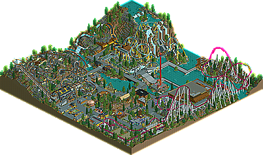
Anyways, great park. I really liked Karnij, especially the ending. The dive machine was pretty good, but the only part I really liked was the splashdown thing at the end. The hyper was pretty good too, but nothing really stood out to me. The buildings were all very nicely done. I especially liked the customer service type buildings outside the entrance and one of the restaurant's (BC's Diner, or something). The only part of the park that felt like it had a much lower quality was around Abyss. It didn't look very finished. And of course, I could complain that realistic parks can have themes, but I'll let it go since you had a couple themed rides. Plus, beating dead horse.
Excellent job guys.
Unless the park sucked.
So it's a blending of fantasy and realism. Like every other fucking park on this motherfucking site.
-ACE
blend of fantasy and realism = semi-realism, which is what this site is all about.
there are extremly few parks (1 or 2 per year) which aim at the "true" realism.
at the moment, beagle delights us with his.
So this is what h2h has come to? I thought h2h was about doing the best you could and making sure you get a park in each week, forfeiting a week should really be more than just a loss if it becomes strategic? And how exactly is it strategic, mastermind? If you would have beat us here, you would have gotten into the playoffs, now you have to hope that either strangelove or my team loses the last week because otherwise you're screwed. The only strategy behind this is that the park we put forth wasn't going to be beaten by your team, even if you had tried.
It's crazy to me how picky you guys are about this park. Fact is, this is the second park out there in h2h that pulls of an entire park feel like no other. The buildings are small, but they look good and unique that way. No one said this park was meant to be 'totally' realistic either, why are you commenting on it as if it is put out that way? So this park is landscaped too heavily to be realistic, but why couldn't a real park be built near a hillside and a waterfall, and if it were why can't there be a diver right over the waterfall? I really don't see your point. The only part that is unrealistic about this park is that it's slightly better than believable. I for one thought six flags was almost a horrible place to visit, why do you guys want to see it recreated in rct so badly? And more so, if you're so into realism why are most of you making mostly unrealistic parks?
I agree with the area around abyss being slightly off. I think slightly more theming elements would have helped, it's too bare now and seems undetailed/unfinished. Albeit slightly rushed in some parts due to some time problems, i think the rest looks marvelous. This park deserves way more credit than it's getting right now, as i see it.
I think it's absolutely amazing first of all. I don't know how people are complaining about the coaster layouts...they were realistic and very enjoyable to watch, and I imagine if those 3 rides were built IRL they'd blow away just about every other ride on the planet. Karnij was excellent...great interaction with the landscaping and solidly themed as well. The rapids ride, while a bit short, was very enjoyable and could very easily be built IRL too, and I'm sure it would be quite enjoyable as well. The landscaping around the vert is amazing, and the coaster itself is very well done as well. The splashdown above the tunnel of the second vert drop was excellent. The hyper was a solid coaster as well; it was probably the weakest of the 3, but still quite nice. The archy throughout the park was, of course, exquisite. And while some of the filler rides did seem too underthemed or hastily done, they all had a believable aspect to them and contributed to the park as a whole. I'd say this somewhere around 3rd or 4th so far in H2H along with MK, MSM, SM, and the Corky Jkay one whatever it was called.
Edited by eman, 04 October 2006 - 10:07 PM.
I think the whole fantasy/realism stuff is a bunch of bullshit. Let people build fucking parks the way they want to. The way I look at it is the RCT community a endangered species. Some parks are better than no parks and bitching about a park not being absolute fantasy or absolute realism only makes matters worse. Thats like complaining about van gogh being a post-impressionist painter instead of sculptor. I realize people have opinions, but I think the whole "fantasy/realism" argument should be kept to themselves when discussing parks here. Don't constrict the RCT artform. Ed hits on some good points too.
And, WME, I agree with you. Since when did h2h become some trophy contest? I thought it was supposed to be just good old fashioned fun.
All in all, I think the park itself, as in architecture scenery and restaurants, could have used a bit of work, but the rides themselves were very well done.
Great tunnel on Cliffhanger's first drop. God, I love it!!
Are you saying he should have tried for something that is more or less impossible, instead of doing what he could do well within the constraints?
Honestly, posix, I hope you're still around when geewhzz advertises his solo. Because I do believe you'll be eating your words...
He can do realism. But realism is not practical on a map this size. And this contest is more about originality than anything else.
-ACE
The landscaping was pretty well done, and I liked the fact that all the parts of the park had something interesting to see. The invert was just great, it showed a very nice and thrilling layout, and I liked how it interacted with the landscaping and buildings. The giga coaster also looked good, although the layout was kinda short for my taste. I didn't like very much the vertical coaster, I mean, it was ok, but it was the one I liked less...
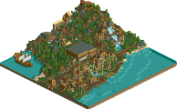
The architecture was nice, although I think that you could have made some bigger buildings on some areas, but I guess that what you made was enough. The waterfalls zone is pretty nice, I like how you made that. Geewhzz is really improving and that's a good thing, I hope you keep improving man. Drew: you also made a great job, hope to see some more work from you.
Anyway, this park has a pleasant atmosphere and it shows a lot of efford.
Well done.
I'm glad all of you, for the most part, enjoyed the invert. While I really only did the layout and the foundation for the mountain, I am really proud of it. I went through about ten layouts for that damn coaster. I got so sick of it... LOL.
But, honestly, I think the park deserves any good recognition it gets. Gee worked extremely hard on it and I think it turned out fantastic.
I'm pretty sure you guys won't see anything from me for a long ass time, if ever, so, yeah. Glad you guys liked the invert...
And, yay! My first H2H win since... Ever.
Well, but it was worth the effort...
RCT was made for those fanatics who love rollercoasters and what not. As JKay said...I thought this competition was for good ol' wholesome fun. Winning the competiton OR a week match won't change a thing in your real life.
So what does it matter that people build wacky, crazy, fun things they like? I'm sure you'll remember building things like that.
Allz I'mz sayingz iz that people should really take this game less serious. It should be for fun. Everything doesn't have to be original and what not. It's just a game for Christ's/Allah's/Buddah's/Ghandi's/etc. sake.
...I'm done ranting now...
...now the park...
I loved it. Especially the use of the landblocks. Very creative. It all just seemed really fun to me. And I also loved the atmosphere.
Great job guys.
Edited by BreakAway, 04 October 2006 - 09:57 PM.