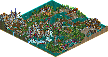
Park / Volkahros Castle
-
 02-October 06
- Views 17,174
- Downloads 765
- Fans 1
- Comments 68

-
1 fan
 Fans of this park
-
 Download Park
765
-
 Tags
Tags
 02-October 06

 Fans of this park
 Download Park
765
 Tags
Tags
 Similar Parks
 Members Reading
Corkscrewed Offline
LANDS OF LEGENDS
DOWNLOAD
MIRROR
VS
Tycoon Bandits
VOLKAHROS CASTLE
DOWNLOAD
MIRROR
Week 8 Page
Week 9 Parks are Due Saturday, October 14, at 11:59 PM Pacific Time. Please send them to nedesigns@gmail.com
I liked Strangelove's park as well, just not as much as the other. There was more to look at, but it didn't feel as cohesive and I thought the coasters let them down a bit.
2 average level parks in my view, but I preferred the Bandit's
call me crazy, but i just wasn't a fan of the bandits' park. i'm not quite sure why, though.
I voted for the Tycoon Bandit's park. I really liked the atmosphere.
The Strangelove park, IMO, wasn't put together well. As cp6 said, there was more to look at, but it wasn't cohesive and the coasters weren't that good.
My vote = Tycoon Bandits
VC had a great traditional, medieval atmosphere with a very unique coaster layout. The elegant section in the back was simply awesome, not to mention the great splash-boats ride that interacted with the inverted coaster extremely well.
Vote=Bandits
Anyway, I won't vote because I havn't had much time for RCT2, so I probably won't get a chance to download, but from screens, Strangelove's parks seems to have a lot of character to it, as well as a more welcoming feel. The Bandit's park appears to have stronger archy though. Oh well, good luck to both teams.
I really wanted to vote for it, too. I'm sick of voting for the Tycoon Bandits, and I'm sick of them winning. But when I opened that park, I knew it wouldn't be the case this week. The architecture was overpoweringly good. This alone won it for me. Add in the non-standard sprawling invert and the Bandit's win. Very impressive.
Both very impressive, to be honest. Good parks.
Xcoaster Offline
Anyways, sorry mighty Westerners, but this was no contest for me, as I feel that Strangelove clearly has the better park. Each of their themes was well executed and there was a lot of visible detail and creativity throughout the park. While I had some problems with each of the coasters (I think.. I forget if there was anything I disliked about the Cry of the Phoenix other than the mandatory glitch on the drop), primarily banking issues, all were decent, and I rather enjoyed Yeti's layout. I liked how the volcano appeared cracked apart, the kraken and sea monster were nice, and I really liked the Tibet area. Honestly, while it isn't the most amazing park, I'd probably put it as one of my favorites this season (though I haven't yet looked at some of the really popular ones...). Plus, I have a soft spot for parks that try to cram in a lot of themed areas, and don't let themselves be constrained by the fact that it's supposed to be a mini park. BTW, I'm guessing this is a solo?
The Banditos park was still fairly good, but I felt the coaster sort of just meandered along (though it had it's moments, and I especially liked the beginning), and I personally preferred the other park's archy. Plus, 3 themes > 1 theme, and 3 decent coasters > 1 decent coaster. And I thought the theme could've been a little clearer, but that seems to be fairly typical with medieval themes. This does show a definite improvement in one of the recognizable parkmakers though, and congratulations with that. In a lot of other rounds this would've been the winner for me, so not bad there. Also, the magnetic brakes on the river ride was a nice touch.
In short, I felt that Strangelove's park is easily better on quantity alone, and IMO, bests the Banditos in quality as well.
Corkscrewed Offline
Personally, I'd expect Strangelove to win, judging on their more varied theming and nice ideas. There's a lot going in their park, with the various sculptures, diverse lands, and superior quantity in content. The coasters, however, were pretty terrible. Yeti is the only decent one, and even that suffers from a slow cobra roll, an odd swooping S-turn right afterwards, and really bad block placement (the midcourse brake run is what... 3/4 of the way through the course?). The other coasters? Phoenix Cry is nothing much. Just an Oblivion "clone" with a mine train. Leviathon was just plain painful. But the theming is nice, and all the little touches are really cool, even if they've technically been done before.
Volkahros Castle has better overall quality IMO. It's more consistent. But the theme's been done often, and there's nothing that pops out as "amazing never before done" or anything like that. The invert was very nice, and the park as a whole is very solid. But nothing screams out.
Now, this matchup can go either way (and hopefully goes the way of the Bandits). But in my experience, the flashier parks tend to win, and Lands of Legends is flashier. Whether or not that pattern holds true for this week remains to be seen. In any case: go Bandits!
My first impresion was that it was a bit of a avarage park. but when I looked better at it I saw some really nice things, and some things I really HATE.
The first thing I really hate is that there are a lot of buildings in the entrance area, but none serves a purpose. is it that hard to put some shops in it? The buildings are done pretty good, sometimes I get the feeling that they are a bit simple and you need to explain me why you use the coaster track to make the roof, this don't make it better ....
Leviathan, wasn't that bad but I think it was better if you use a lighter blue for the track.
The ice area was nice. The theming was well done but I don't like that many white water or rapids tack.
Sirens Cove was build nice but didn't had any use also. The kraken was build nice but I really DISLIKE the glitch it cause. also I think you use to much track here, some things can be made better with scenery.
the vulcano didn't really look like a real vulcane, the city around it was done nice but nothing really special to it.
Overal it was a nice park, but somethings really bothered me and many things didn't had a purpose.
Bandits Park:
A park fully themed in medieval is always risky. The problem of the medieval theme is that you can't use that much colors. In this park they tried to counter this problem by using many brick colors (which not work in my eyes). The area that uses the purple and gold colors is pretty nice and has some nice things. But the other part I really dislike. The archy is to random. It don't form a total view. it are many small things that are diffrent and that causes that the whole thing looks like a scrapheap.
The coaster was pretty nice but the overuse of fogs also spoils it a bit for me.
The castle wall didn't work for me to.
Overal this park has some nice theming and some weak theming in my eyes.
My vote goes to strangelove.
I am sick and tired of people saying a building has to have a purpose. Why does it?? if its a fanasty park why does every building need to have purpose, Its just stupid looking into it as much as that. Things like that dont make building a park fun. Still you voted strangelove so thats ok.
Strange love= I thought this was a great park alot of work looks like it went into this. Top 3 of h2h so far.
Wonderful job guys.
Havn't looked at the other yet but will later.
Edited by Leighx, 03 October 2006 - 03:46 AM.
When i opened the strangelove park my first thought was wicked lol. Yeah i liekd loads of stuff in this park, and the kraken in the sea was cool. Also the minor details on buildings and stuff like that.
Vote to tha strangelove dudes.
even if it is a fantasy park you can put a shop in it to, that would give it purpose. now those peeps will starve if they are there.
I also know some buildings are just for theming, but why don't use some for shops to. it doesn't cost extra work, the buildings are all capable of having a shop in it.
Corkscrewed Offline
I agree. I could go on a fairly long rant about how I think parks should function as parks but this probably isn't a place for it. I will say, however, that in close matchups here I will always vote for the park that is more functional.
There are 100 people here who can make a park look pretty, but very few who can make it look pretty and actually function like a real park should.