oh ya, Cork or anybody else with acp privledges, i know how to fix your pull problem where people can view the results without nulling their vote, if you wanna fix it that is
I had a huge rant about nothing in either park being original, but screw that.
I should say, though, that it astounds me how everyone keeps pressing for originality and forging new paths in theming in the RCT community but no one seems to care about improving coaster building skills. If someone looked objectively at the coasters in these parks, they would have no reason to suspect that the overall coaster making ability of the community had improved in the slightest over the past 6 years. The average coaster building ability almost seems to be going down. Is there like something about RCT2 and being able to just slap any crappy track layout down and theme the shit out of it that makes people not put time into making coasters well-designed?
Seems like it.
It doesn't fly with me. I pay attention to things like track layouts, path layouts, cleanup and maintenance, stalls and shops, and restrooms. But based on the lack of these things in many (if not most) H2H parks I seem to be in the minority.
I would love to see an H2H where everyone was required to have the park open with 500 peeps in it and a sustainable 800+ approval rating. Force people to pay attention to some of those things.
I had a huge rant about nothing in either park being original, but screw that.
I should say, though, that it astounds me how everyone keeps pressing for originality and forging new paths in theming in the RCT community but no one seems to care about improving coaster building skills. If someone looked objectively at the coasters in these parks, they would have no reason to suspect that the overall coaster making ability of the community had improved in the slightest over the past 6 years. The average coaster building ability almost seems to be going down. Is there like something about RCT2 and being able to just slap any crappy track layout down and theme the shit out of it that makes people not put time into making coasters well-designed?
^^^thankkkkkkk youuu... i was waiting to hear a comment like that for a long time... -JDP
I would love to see an H2H where everyone was required to have the park open with 500 peeps in it and a sustainable 800+ approval rating. Force people to pay attention to some of those things.
How many spotlight parks can actually do that? The path lay-out of many park it good, but the peeps are just annoyingly stupid. There's no point mainly because good path lay-out in our eyes are a disaster in-game. Anyway back to the park. I personally don't have much interest in both park, but Land of Legends didn't work for me at all. I still don't know what to think of that minetrain... The castle was perhaps a bit too random, but I like it coherense in theming. The water ride won me over I think, so my vote goes there.
I would love to see an H2H where everyone was required to have the park open with 500 peeps in it and a sustainable 800+ approval rating. Force people to pay attention to some of those things.
hooray for all LL player ... And there are so many things one can do with the game which don't require peeps, like the bedroom parks last season. Well one could make those peep friendly, but there it no point in doing that ...
We should have like a scavenger hunt with these parks.
Your items as you begin your mission:
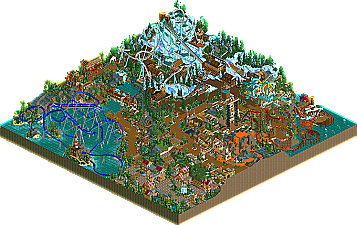
Volcano with orange lava cascading down the side
3D cinema with coaster track tentacles as sea monster
Imposing snow-themed B&M coaster painted white with snow-themed rapids ride right under it
The coaster name "Yeti"
Medieval castle theming that looks like that
Snow/mountain lodge theming that looks like that
Tropical theming that looks like that
etc.
Your task:
For each item, find the thing that was ALREADY DONE which this knocks off.
(in some cases, there may be more than one answer)
The castle park had a horrible invert layout. Painful. The heartline elements added to the track felt out of place, and unecessary; and the swamp with the bones and all that fog was just awful. Someone got really lazy there.
The castle wasn't really... castle like? the architecture was so repetitive, and annoying. Three colors, over and over and over again. It's like I've see this before. With the same architectural look--which by the way didn't sway me into thinking "medieval." It just didn't seem refined. STOP USING GRAY, AND THAT BROWN TO CREATE CASTLES. Please?
There were some parts of the architecture that even had some asian flare to it. The roofing just wasn't right.
All in all, I didn't like it.
As for the legends park. It was better, but not by much. I didn't like any of the coasters. The flyer that goes over water was sad to watch. Extremely bland.
Am I the only one struck by the fact that there was a (better) castle done (earlier) this season in the (supposedly) inferior game for architecture. That one had a better coaster too, plus it had TREBUCHETS!!!!
But at least this one's loosing as well.
I'm not the proudest of my team here, but I think they did rather well. I think we're all taking notes of "do's and don'ts" for the coming matchs.
The castle wasn't really... castle like? the architecture was so repetitive, and annoying. Three colors, over and over and over again. It's like I've see this before. With the same architectural look--which by the way didn't sway me into thinking "medieval." It just didn't seem refined. STOP USING GRAY, AND THAT BROWN TO CREATE CASTLES. Please?
I'm just curius what you should say if someone used purple to make a castle
We should have like a scavenger hunt with these parks. ... Imposing snow-themed B&M coaster painted white with snow-themed rapids ride right under it [Denali, was it?] ...
We should have like a scavenger hunt with these parks.
Your items as you begin your mission: Volcano with orange lava cascading down the side 3D cinema with coaster track tentacles as sea monster Imposing snow-themed B&M coaster painted white with snow-themed rapids ride right under it The coaster name "Yeti" Leviathan as subject Medieval castle theming that looks like that Snow/mountain lodge theming that looks like that Tropical theming that looks like that etc.
Your task: For each item, find the thing that was ALREADY DONE which this knocks off. (in some cases, there may be more than one answer)
I actually liked Strangelove's park. Doesn't matter how many times things have been done, it's still hard to actually make something like that. I appreciated the skill involved, the foliage was really nice. Architecture was ok for the most part. Coasters weren't really that bad. Nothing really stood out, but everything fitted, which was more than can be said for our park.
So this is the first time the Bandits have been held under like... 40 votes.
Final Score:
STRANGELOVE 32 TYCOON BANDITS 22
Strangelove become the first team to dethrone the mighty Bandits, just like ride6 promised.
Lands of Legend was made by best mates artist and leighx.
Volkahros Castle was made by Jazz and Breakaway
I'll have to check the standings, but I *think* this clinches a playoff spot for Strangelove? That would make three of the four available spots filled.
First off, I'd like to thank those who voted for us, and I'd also like to congratulate Strangelove. I'm even going to admit myself that your park was definitely well-deserving of a victory here; the park was amazing despite it being somewhat cliche' and such. It had a lot more substance to look at, and that was essential to your victory, IMO.
I'm not going to argue with everyone here... but I do have to say how incredibly ridiculous some of these comments were, such as this:
the other one was too cramped and the coaster layout was the worst one I ever seen.
Not quite sure what you mean by this, but if you think that is the worst layout you've ever seen, than that is just absurd. Sure, maybe it was unorthodox and different; but that doesn't mean it's bad by any means. It has a large sprawling layout, and it isn't the same generic layout with banked-turnarounds and multiple inversions. And on top of all of this, you have no right to say this, as you probably couldn't build anything any better, let alone finish a park at this size.
In general, I thought most of the criticsms this park recieved was a huge exaggeration; mainly because people are just sick of us winning, as gymkid dude even admitted himself (even though he voted for us). Breakaway and I worked extremely hard on this; for nearly 90 RCT years, and to criticize it to such an exteme level as some of you did isn't even relevant.
I'd also like to thank Breakaway for doing a ton of work on this thing, I appreciate it man.
68 Comments
riven3d Offline
ekimmel Offline
Seems like it.
It doesn't fly with me. I pay attention to things like track layouts, path layouts, cleanup and maintenance, stalls and shops, and restrooms. But based on the lack of these things in many (if not most) H2H parks I seem to be in the minority.
I would love to see an H2H where everyone was required to have the park open with 500 peeps in it and a sustainable 800+ approval rating. Force people to pay attention to some of those things.
JDP Offline
-JDP
tyandor Offline
How many spotlight parks can actually do that? The path lay-out of many park it good, but the peeps are just annoyingly stupid. There's no point mainly because good path lay-out in our eyes are a disaster in-game.
Anyway back to the park. I personally don't have much interest in both park, but Land of Legends didn't work for me at all. I still don't know what to think of that minetrain...
The castle was perhaps a bit too random, but I like it coherense in theming. The water ride won me over I think, so my vote goes there.
Magnus Offline
hooray for all LL player ...
And there are so many things one can do with the game which don't require peeps, like the bedroom parks last season. Well one could make those peep friendly, but there it no point in doing that ...
Panic Offline
Your items as you begin your mission:
Volcano with orange lava cascading down the side
3D cinema with coaster track tentacles as sea monster
Imposing snow-themed B&M coaster painted white with snow-themed rapids ride right under it
The coaster name "Yeti"
Medieval castle theming that looks like that
Snow/mountain lodge theming that looks like that
Tropical theming that looks like that
etc.
Your task:
For each item, find the thing that was ALREADY DONE which this knocks off.
(in some cases, there may be more than one answer)
Good Luck
super rich Offline
Geoff Offline
The castle park had a horrible invert layout. Painful. The heartline elements added to the track felt out of place, and unecessary; and the swamp with the bones and all that fog was just awful. Someone got really lazy there.
The castle wasn't really... castle like? the architecture was so repetitive, and annoying. Three colors, over and over and over again. It's like I've see this before. With the same architectural look--which by the way didn't sway me into thinking "medieval." It just didn't seem refined. STOP USING GRAY, AND THAT BROWN TO CREATE CASTLES. Please?
There were some parts of the architecture that even had some asian flare to it. The roofing just wasn't right.
All in all, I didn't like it.
As for the legends park. It was better, but not by much. I didn't like any of the coasters. The flyer that goes over water was sad to watch. Extremely bland.
ANYWAY, I'm going to stop commenting here.
Edited by Geoff, 04 October 2006 - 05:54 PM.
Ride6 Offline
Am I the only one struck by the fact that there was a (better) castle done (earlier) this season in the (supposedly) inferior game for architecture. That one had a better coaster too, plus it had TREBUCHETS!!!!
But at least this one's loosing as well.
I'm not the proudest of my team here, but I think they did rather well. I think we're all taking notes of "do's and don'ts" for the coming matchs.
Ride6
Levis Offline
I'm just curius what you should say if someone used purple to make a castle
Panic Offline
egg_head Offline
tyandor Offline
Why? They're the only suitable colors for a normal castle (perhaps black too). I don't think I did a bad job here
Geoff Offline
Leighx Offline
Your abit of a nob really.
Panic Offline
Just trying to make a point kinda.
Turtle Offline
I actually liked Strangelove's park. Doesn't matter how many times things have been done, it's still hard to actually make something like that. I appreciated the skill involved, the foliage was really nice. Architecture was ok for the most part. Coasters weren't really that bad. Nothing really stood out, but everything fitted, which was more than can be said for our park.
Corkscrewed Offline
Final Score:
STRANGELOVE 32
TYCOON BANDITS 22
Strangelove become the first team to dethrone the mighty Bandits, just like ride6 promised.
Lands of Legend was made by best mates artist and leighx.
Volkahros Castle was made by Jazz and Breakaway
I'll have to check the standings, but I *think* this clinches a playoff spot for Strangelove? That would make three of the four available spots filled.
Ride6 Offline
Ride6
Jazz Offline
I'm not going to argue with everyone here... but I do have to say how incredibly ridiculous some of these comments were, such as this:
Not quite sure what you mean by this, but if you think that is the worst layout you've ever seen, than that is just absurd. Sure, maybe it was unorthodox and different; but that doesn't mean it's bad by any means. It has a large sprawling layout, and it isn't the same generic layout with banked-turnarounds and multiple inversions. And on top of all of this, you have no right to say this, as you probably couldn't build anything any better, let alone finish a park at this size.
In general, I thought most of the criticsms this park recieved was a huge exaggeration; mainly because people are just sick of us winning, as gymkid dude even admitted himself (even though he voted for us). Breakaway and I worked extremely hard on this; for nearly 90 RCT years, and to criticize it to such an exteme level as some of you did isn't even relevant.
I'd also like to thank Breakaway for doing a ton of work on this thing, I appreciate it man.
Edited by Jazz, 05 October 2006 - 07:30 PM.