Park / Horstmann Laboratories
-
 28-February 03
- Views 18,375
- Downloads 770
- Fans 0
- Comments 94

-
 No fans of this park
-
 Download Park
770
-
 Tags
Tags
 28-February 03

 No fans of this park
 Download Park
770
 Tags
Tags
 Similar Parks
 Members Reading
Go Labs
hpg Offline
That is exactly what I am thinking, atleast some people understand. Otherwise the world would make ugly things and people would call them creative, that would be bad.
*Stargazer*
I can't stop myself from laughing.
All you try to do is hiding yourselves being so not creative and making boring parks one after the other.
You should stop trying and live with it.
hpg Offline
God no would that be sad....
It's all about if things look aesthetic or not. Same for landscaping.
Whole MM is what I call "aesthetic". All the colours fit, all the buildings fit, trees fit, coaster fits... just everything. Same for arrangements, names and what not. It's all PERFECT. Now if I look at something like Elfwood (it doesn't have to Elfwood necessarily, it's just a good example for a not perfect park (of course Horstmann isn't perfect either)), I see that it's all not planned, just space filled, cramped with way too various trees or shrubs and all flat. This is what I call some "not good" landscaping. Same for the buildings. They somehow don't seem to fit at places... same for the rides. That's the striking difference between good and less good parks....
no, this seriously wasn't a good explanation.... I know.
Let's talk about that in German on AIM Mantis
Yeah I totally agree, some people really confuse me. I mean, not many parkmakers make up new things, most of the time they still do the apparently "Boring" stuff.
u chat so much shit its untrue........
who is arsed if we get beat......not me ...its a game !!!!!!!!!!!!!!!!!!!!!!!!!!
ok urs was bloody creative i admit but i mean reality is a lot to a lot of ppl. Ours was more reality and urs was more creative
bwahahahha!
Anyone who says that wouldn't know creativity if it smacked them in the face with a brick at 70mph.
Elfwood IS good, but it is ALSO a cop-out of a park creativity-wise. Adam understands this, he just SAID it. Labs got creativity, elfwood got reality, and theres very limited things you can do with reality in my humble opinion.
I dare you all, you hear me? ALL OF YOU to start building DIFFERENT fucking things for a change, break away from the goddamn formula, or even just your own formula. What I just said applies to all schuessler, KM, and Nevis wannabes especially.
You could maybe chill a little bit and let some of the people vote for this thing on their own?
6 posts in this topic on why people should vote for Horstmann Labratories?
They get the point already.
It's realism vs. fantasy.
You're obviously going to be incredibly biased towards your teams park. And mantis offered a different (yet pretty accurate opinion), but it altered from what you're wanting to here right now.
Everybody gets it. I'm not making this huge case for why realism is better then fantasy am I? Or why my park was betters, or "why not to vote for Pufferfish", or any of that.
Yes.
Icons park was cliched.
It was seen before.
The coasters weren't revolutionary.
It wasn't as good as Moonlight Magic (can't believe we're holding that against it).
But.
Has anybody mentioned how bare and unfinished/cheap the bottom portion of your map is, with the S&S Towers?
Or that more then 50% (of a minipark no less) is all water?
Or that its more or less the same building made over and over again?
I've kept my piece and watch you just tell these people why to vote for you, and I feel it's my duty as team captain to call you out on it, and give my team the same kind of benefits you're giving yours.
Thank you.
Therefore I voted elfwood
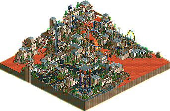
Labs--nice coaster-nice idea with red water. But the layout of the coaster wasn't to hot, not to mention, it really looked like you kinda, ran out of time, or something, and decided not to really build much else...I don't know.
So yes. Elfwood.
Man, really makes me wish I woulda signed up for this!