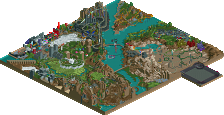
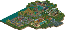
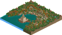
Park / Revels Pipes Amusement Park

17 Comments

  • posix%s's Photo

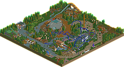
    Revels Pipes Amusement Park


    Fairly frequently on the site, some new member comes in posting a barrage of screens, commenting and posting in every topic, and generally getting on people's nerves. SSSammy started out doing just that, but in the midst of it all, he improved rapidly. During H2H5, he was a member of the Flying Germans team, participating in both Park Asterix, with Magnus and Sey; and Dream World Indoor, with Liampie and RCTFAN. Like many other members on the site, SSSammy has also joined the dual-game player front, improving both in RCTLL and RCT2. With that, SSSammy's first NE release shows his adeptness in LL, bringing him his first accolade, Revels Pipes Amusement Park, NE's latest bronze. | Read On...

  • turbin3%s's Photo
    The topic isnt on the View New Posts list?
    EDIT: Now it is. :p

    Congrats Sammy. :)
    The layouts were really great, especially Black Hole.
    They all had a nice interaction e.g. the Buzzbe and Black Hole.

    Some parts in the park were really great like the Top Spin, but
    others like the big wheel werent.

    Moreover I really liked the foliage, well done.

    All in all it was a good, little park. smile.gif

    Hope to see a bigger solo of you soon. tounge.gif
  • robbie92%s's Photo
    Congrats SSSam!

    I really do love this, and every time I look at it, it gets better for me. My favorite parts were the log ride and the shuttle, as both seemed much neater than the rest of the park. Although it was messy in a fair amount of places, I feel that if you take the time to improve, like you've been doing, you'll "clean" it all up, and then you'll be a force to be reckoned with in LL. Congrats on getting a solo done as well, as that's insanely difficult.

    Oh, Posix/Gee. There's an error for this park when you try getting to it from either the link in this topic or the link on the front page. However, it's accessible by the Bronze menu. I just figured you would like to know.
  • gir%s's Photo
    Good minimalist approach to parkmaking, but I also like how you don't accept the game's normal angles and really play with diagonals and curves.
  • posix%s's Photo
    thanks rob, should be fixed now.

    sssammy, as much as i love you as a member, i thought this was just "okay". you focused a lot on the hacks, overall you've done very well with them. although at times they seem out of place and unnecessary. there are signs of brilliance like the custom made stall out of fences. however, i felt a bit half done. many empty spots that didn't seem to serve any purpose, so they actually did look empty, instead of "purpose-empty", if you get me.
  • Ozone%s's Photo
    Nice work, Sam. We share a lot of the same LL goals - I like your creative way to create new buildings and the peeps in the park. It was a bit messy in places with the paths (fyi, if you place another path over the paths where the peeps are with codex it won't glitch like that with the tarmac path and the stone path) but all in all it was fun to look at - I'm excited about seeing more LL from you.
  • SSSammy%s's Photo

    The topic isnt on the View New Posts list?
    EDIT: Now it is. :p

    Congrats Sammy. :)
    The layouts were really great, especially Black Hole.
    They all had a nice interaction e.g. the Buzzbe and Black Hole.

    Some parts in the park were really great like the Top Spin, but
    others like the big wheel werent.

    Moreover I really liked the foliage, well done.

    All in all it was a good, little park. smile.gif

    Hope to see a bigger solo of you soon. tounge.gif


    thanks yannik. thanks for the feedback and for taking the screens :)

    Congrats SSSam!

    I really do love this, and every time I look at it, it gets better for me. My favorite parts were the log ride and the shuttle, as both seemed much neater than the rest of the park. Although it was messy in a fair amount of places, I feel that if you take the time to improve, like you've been doing, you'll "clean" it all up, and then you'll be a force to be reckoned with in LL. Congrats on getting a solo done as well, as that's insanely difficult.

    Oh, Posix/Gee. There's an error for this park when you try getting to it from either the link in this topic or the link on the front page. However, it's accessible by the Bronze menu. I just figured you would like to know.


    hi robbie! thanks for the congratz, i apreiciate it. i have the same feelings towards this, tbh.

    Good minimalist approach to parkmaking, but I also like how you don't accept the game's normal angles and really play with diagonals and curves.


    thanks, gir. you're a huge inspiration.

    thanks rob, should be fixed now.

    sssammy, as much as i love you as a member, i thought this was just "okay". you focused a lot on the hacks, overall you've done very well with them. although at times they seem out of place and unnecessary. there are signs of brilliance like the custom made stall out of fences. however, i felt a bit half done. many empty spots that didn't seem to serve any purpose, so they actually did look empty, instead of "purpose-empty", if you get me.


    all very valid critisisms, posix. my thinking might have been a bit more focused on excerising and exploring codex as opposed to building a pretty little park. i've certainly learned a hell of a lot from it. i think you might like my upcoming RCT2 parks more. you've influenced me more on them :p


    Nice work, Sam. We share a lot of the same LL goals - I like your creative way to create new buildings and the peeps in the park. It was a bit messy in places with the paths (fyi, if you place another path over the paths where the peeps are with codex it won't glitch like that with the tarmac path and the stone path) but all in all it was fun to look at - I'm excited about seeing more LL from you.


    thankyou ozone :D you - along with gir and posix- are all very influencial on me. it really makes me proud to see encouragement like this.
  • Wanted%s's Photo
    Not my cup of tea for LL, but congrats on the bronze.
  • Themeparkmaster%s's Photo
    ^ Agreed, with all due respects my first reaction was 'seriously?'. Congratulations though, just not to my liking.
  • zburns999%s's Photo
    I think it looks really cool from the overview. It was really unlike anything I've ever seen before in LL, for sure. Congrats on the bronze man. Wish I could see some of this LL stuff in game.
  • Wanted%s's Photo
    Torrents^ hehehe
  • Nokia%s's Photo
    kinda seemed bare and rushed in spots. idk, maybe it's supposed to be like that..
  • geewhzz%s's Photo
    i agree with gir here. i love your style and the fact that you go against the grain, but parts of the park needed some major refinement and it felt in some areas that it was a little half-assed, like the station for the standup. very nice emphasis on foliage and architecture though. all this LL really makes me want to play it more.
  • SSSammy%s's Photo

    Not my cup of tea for LL, but congrats on the bronze.

    cheers

    ^ Agreed, with all due respects my first reaction was 'seriously?'. Congratulations though, just not to my liking.

    sorry for the dissapointment. =]

    I think it looks really cool from the overview. It was really unlike anything I've ever seen before in LL, for sure. Congrats on the bronze man. Wish I could see some of this LL stuff in game.

    thanks zburns :)


    kinda seemed bare and rushed in spots. idk, maybe it's supposed to be like that..

    proabably not :p

    i agree with gir here. i love your style and the fact that you go against the grain, but parts of the park needed some major refinement and it felt in some areas that it was a little half-assed, like the station for the standup. very nice emphasis on foliage and architecture though. all this LL really makes me want to play it more.

    thanks gee :) i actually tried alot of things for the stand up, but i just fell in love with the one which stayed. maybe it grew on me through seeing it all the time. you lose perspective when you're looking at it all the time, and i did this with no advertisement and very little input from others, which i was proud of.
  • ][ntamin22%s's Photo

    I think it looks really cool from the overview. It was really unlike anything I've ever seen before in LL, for sure. Congrats on the bronze man. Wish I could see some of this LL stuff in game.


    PM me your address and I can see about sending you a disk.
  • SSSammy%s's Photo
    any more replies would be deeply apreciated. :)
  • Themeparkmaster%s's Photo
    I'm bored and you probably deserve more explanation as to why this wasn't really to my liking.

    Firstly you unfortunately committed a couple of my pet peeves, one being your lack of naming rides you used for architecture and also your use of open toilets. Both these things really bug me and make the park seem ugly.

    There is also a huge amount of sick at the exit to Black Hole. You have enough handymen but their designated areas are too broad.

    Generally the park just looks like you didn't put a lot of effort into it, the grass needs mowing, the ride names are very unimaginative and the queue lines are very boring and plain, even for the realism style. When I see realistic parks I ask myself whether I would like to visit this park and I am afraid I wouldn't be paying £40 for entry to Revels Pipes!

    There were a few things I did like, the lift to the time experience building was a nice idea but it could have been executed better. The log flume also looked reasonably well thought out but again some of the roofs look severely under supported and it could have been better executed.

    I think the highlight for me was Black Hole's turnaround over the paths after the pretzel loop, that just looks very believable.

    Overall though for me this felt more like an old scenario that I would get a little carried away in rather than a well thought out theme park.

    Edited by Themeparkmaster, 28 April 2010 - 09:19 AM.

  • SSSammy%s's Photo
    all incredibly rational and i apreciate the reply :)