A couple of months late, we FINALLY bring you what could have been the deciding match of the H2H3 playoffs! It would have been a dream match too... Corkscrewed and Slob vs X250 and X-Sector...
Instead, it sort of turned into a one on one process. At the time, Slob was pretty loaded with school and AP's and understandably didn't have as much time to work on it. So he made the awesome dive machine and themed the area around that. And I did the rest.
X250 had a similar scenario, tho maybe we should just say X-Sector was just lazy and figured having a life was better than playing RCT ( ). So I think X250 actually made the whole park by himself! If this doesn't scream rising star, I dunno what will. As it turns out, both parks are pretty good (if I can call my own park good... I dunno), and it would be a pretty even matchup.
Just for fun, we're going to have a poll and vote on this, H2H style. Would this have been my first H2H loss ever, or would I have saved the season for my team?
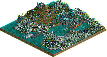
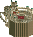
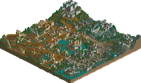
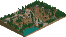
I'd make you just go straight to the site, but that might end up turning off people more, so I'll post the map overviews and two screens here. Go to the site anyway.
Catlava - Mars Vulcan was fucking weird, but the Dive machine was nice. The theme was pulled off real nice, but I dont get the whole volcano there. You could've found something more interesting for that area, and the Agriculture place ON THE VOLCANO looks like a throw in filler.
Voodoo - GREAT theme. I fucking love the archy in the middle and how you pulled it off. The Bridge is very well done, and the woody is FANTASMICAL. I really dont like the awkwardly cumbersomeness of the custom ride, but it was still interesting to see. I really liked this theme and it really caught me. The little mini floorless dive machine was a nice touch too.
My vote goes to X and X.
GuestGRIDE
Offline
I was a fan of Corky's and Slob's. The other one was nice, but I think that the architecture and landscaping was better on theirs.
i voted hurricanes bit disappointed though to see no slob-work in the park. still, tesla was an amazing ride. i've always wanted to do a space/tropical mix myself and this definitely inspires me a little. generally the futuristic feel was very well pulled off, in my opinion. i didn't like the landscaping much. it was unrefined and loveless. the park also needed the mountain too much. on a small map like that, i think mountains are very improper.
don't mean to let my own guys down, but their park was just more for me, sorry
Wow. Fantastic work to the Hurricanes. I loved everything about that little park. Most notably, the support work for the monorail - for some reason I thought it was lovely. Great coasters, especially Telsa, even if it was a bit cramped around that area. That was the main drawback to this park - everything seemed like a tight squeeze. But I tip my hat to you Corkscrewed. You've seemed to just excell further and further with your parks ever since DisneySea. Excellent work.
I can't say the same for the Germans. Honestly, I don't know how it's managed to get votes thus far. It seemed horribly thrown together. The buildings are nice, yeah, but what are they for? There was just this huge mess of architecture (if I can call it that) in the middle and I had no idea what the point of it was. And URGH THOSE FLAMES! The animated objects are such an annoyance. As soon as I noticed them it was an immediate turn-off. Slows down everything. blech. And to top it off, the coaster was awful, in my opinion. No offense, Simon, since I know you can do much better. Just keep it up for the Pro Tour and you're good.
EDIT: Yes! Richie brings up yet another reason why it sucked - Unfinishedness!
FG - There park was pretty good, I liked the archy style and detail, tho as steve sad it had no use really witch I don't like. The rides were all ok, tho none were really great imo, I could not even figure out how that big slide made flat ride worked. Very nice little park, but no vote here, coz im a Hurricane and stuff...
Canes - I must admit I hate the atmospher in this park as I have been saying from Day 1, its dull and dinggy and made me feel kinda sick with all the puke green, then add the fact that its raining when it opened and I almost just closed it to go hurl. After getting rid of the rain however I was able to aprecaite the soild archy, awsome B&M and many other things. I really liked the monrail, great support system on that. Very good work guys, tho I hope I never see that theme again.
X250 had a similar scenario, tho maybe we should just say X-Sector was just lazy and figured having a life was better than playing RCT ( ). So I think X250 actually made the whole park by himself! If this doesn't scream rising star, I dunno what will. As it turns out, both parks are pretty good (if I can call my own park good... I dunno), and it would be a pretty even matchup.
This is true indeed so it is all X250's work so Well done mate.
I was lazy and did have a life when we first started this but I've been doing nothing for the past month now and so yes I'm a bit disappointted that X250 never contacted me so I could work on it but I suppose he was pissed off with me from not doing anything at the start. anyways well done for completing it you did a good job.
To be honest I liked our park less than I expected to and I like the 'Canes more...
I'm not sure which to vote for. Both have one coaster that I liked, the dive machine and the woodie respectively. The theming in both is excellent however I find the Hurricanes slightly easier to take in most places and it was complete. Still team loyalty and all... hmmm. Hell, I'll vote Hurricanes.
Still X250 almost matched/beat Corkscrewed. I think we're about to get a second "X" parkmaker.
Wow, what a great matchup this would have been. Both parks are great for their own reasons
Calatravas - Once again, Corky doesn't fail in the IMPRESS department. This was as good, if not better than Avaira Cove imo. Amazing theming, but nothing over the top. Great ride composition, with useful and meaningful hack. Stellar architecture. I could go on and on. I think the monorail was my favorite part of the park, closely followed by slob's dive machine. Great park guys. I think this easily would have won h2h3 had a game 3 been played I think.
Voodoo Laos - Well, a great looking park from the overview, but a little disappointing in game. I couldn't seem to get over the cluttered feeling I got from this. The architecture was good, don't get me wrong, but it seemed forced and over-decorated in places. I think the asethetics were killed by too many layers of details. On the bright side tho, Kong, the custom gyro swing was damn cool, except that its size scale didnt' really fit with the rest of the park. The woodie was pretty cool, but wasnt really the focus of the park in my eyes. I still can't believe that X250 built this himself tho! He's easily the best up and coming parkmaker at the moment. Great park man, even if it didnt get my vote.
- Architecture and atmosphere
I was going for that eerie and sort of unsettling atmosphere, and as explained in the readme, it's supposed to retain that sort of mysterious haunted technological feel. The colors... basically the opposite of what Kumba likes. And really, if you look at it, they ARE sort of ugly, but they're that way to fit the theme. Imagine rusted steel and bronze and you can get an idea of what this might be like in real life. Also, I think the architecture was more refined here than in Voodoo Loas, not that X's was bad.
- Dive Machine
Slob so totally kicks ass, and his dive machine was superior to X's IMO. Just overall a better layout, better pacing, longer... I really need to learn these skills.
SUPERIOR THINGS ABOUT VOODOO LOAS
- The "main coasters"
I kinda trapped myself by building too much too fast and messing up the available land for a coaster. So what I had left was something that sort of had to fit into what was there. My aim was to make an adventure coaster, something similar to TDS' Journey to the Center of the Earth. Hence the underground sections and stuff. Still, that doesn't necessarily work in RCT, so I can understand comments like Roger's. This is something I know I need to improve in the future, because as awesome as theming and architecture can be, a truly great park needs amazing rides. So I would say the "main coaster" (i.e. longer coaster) in this park is definitely inferior to X250's woodie
- Landscaping... sorta... Germans' is stronger and more articulated. For me, the volcano was the centerpiece, but you were meant to imagine the land continues beyond the borders, and that this was just a small section cut of the island. Hence the placement of how it was. But it could prolly use more articulation.
So it all works out to be pretty even. I'd like to say mine is a tiny bit better, but that's blatant bias. If we lose by one, though, I'll blame Slob.
49 Comments
Corkscrewed Offline
Instead, it sort of turned into a one on one process. At the time, Slob was pretty loaded with school and AP's and understandably didn't have as much time to work on it. So he made the awesome dive machine and themed the area around that. And I did the rest.
X250 had a similar scenario, tho maybe we should just say X-Sector was just lazy and figured having a life was better than playing RCT ( ). So I think X250 actually made the whole park by himself! If this doesn't scream rising star, I dunno what will. As it turns out, both parks are pretty good (if I can call my own park good... I dunno), and it would be a pretty even matchup.
Just for fun, we're going to have a poll and vote on this, H2H style. Would this have been my first H2H loss ever, or would I have saved the season for my team?
You can find the matchup downloads at the H2H3 Archive Site.
The direct link to the page can be found here.
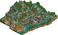
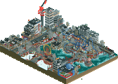
I'd make you just go straight to the site, but that might end up turning off people more, so I'll post the map overviews and two screens here. Go to the site anyway.
HURRICANES: Calatravas
FLYING GERMANS: Voodoo Loas
GigaForce Offline
GigaForce Offline
Voodoo - GREAT theme. I fucking love the archy in the middle and how you pulled it off. The Bridge is very well done, and the woody is FANTASMICAL. I really dont like the awkwardly cumbersomeness of the custom ride, but it was still interesting to see. I really liked this theme and it really caught me. The little mini floorless dive machine was a nice touch too.
My vote goes to X and X.
GuestGRIDE Offline
Corkscrewed Offline
Down by one... wouldn't it be funny if we lost by one... again?
posix Offline
bit disappointed though to see no slob-work in the park.
still, tesla was an amazing ride.
i've always wanted to do a space/tropical mix myself and this definitely inspires me a little. generally the futuristic feel was very well pulled off, in my opinion. i didn't like the landscaping much. it was unrefined and loveless. the park also needed the mountain too much. on a small map like that, i think mountains are very improper.
don't mean to let my own guys down, but their park was just more for me, sorry
deanosrs Offline
disneylandian192 Offline
BUT, both was pulled off very well. Kudos!
inVersed Offline
My Vote Goes to the Gemans
Hurrincanes- A nice entrie. I loved the dive machine. The archy was great in all apects
Flying Germans- Amazing entry the archy was supperb. The detail was brilliant. No complaints at all with this entry
Havingfun Offline
Richie Offline
i voted hurricanes, because the germans wasnt finished.
Steve Offline
I can't say the same for the Germans. Honestly, I don't know how it's managed to get votes thus far. It seemed horribly thrown together. The buildings are nice, yeah, but what are they for? There was just this huge mess of architecture (if I can call it that) in the middle and I had no idea what the point of it was. And URGH THOSE FLAMES! The animated objects are such an annoyance. As soon as I noticed them it was an immediate turn-off. Slows down everything. blech. And to top it off, the coaster was awful, in my opinion. No offense, Simon, since I know you can do much better. Just keep it up for the Pro Tour and you're good.
EDIT: Yes! Richie brings up yet another reason why it sucked - Unfinishedness!
So. Hurricanes get my vote. Amazing park.
Kumba Offline
FG - There park was pretty good, I liked the archy style and detail, tho as steve sad it had no use really witch I don't like. The rides were all ok, tho none were really great imo, I could not even figure out how that big slide made flat ride worked. Very nice little park, but no vote here, coz im a Hurricane and stuff...
Canes - I must admit I hate the atmospher in this park as I have been saying from Day 1, its dull and dinggy and made me feel kinda sick with all the puke green, then add the fact that its raining when it opened and I almost just closed it to go hurl. After getting rid of the rain however I was able to aprecaite the soild archy, awsome B&M and many other things. I really liked the monrail, great support system on that. Very good work guys, tho I hope I never see that theme again.
x-sector Offline
I was lazy and did have a life when we first started this but I've been doing nothing for the past month now and so yes I'm a bit disappointted that X250 never contacted me so I could work on it but I suppose he was pissed off with me from not doing anything at the start. anyways well done for completing it you did a good job.
Ride6 Offline
I'm not sure which to vote for. Both have one coaster that I liked, the dive machine and the woodie respectively. The theming in both is excellent however I find the Hurricanes slightly easier to take in most places and it was complete. Still team loyalty and all... hmmm. Hell, I'll vote Hurricanes.
Still X250 almost matched/beat Corkscrewed. I think we're about to get a second "X" parkmaker.
ride6
Richie Offline
JKay Offline
Calatravas - Once again, Corky doesn't fail in the IMPRESS department. This was as good, if not better than Avaira Cove imo. Amazing theming, but nothing over the top. Great ride composition, with useful and meaningful hack. Stellar architecture. I could go on and on. I think the monorail was my favorite part of the park, closely followed by slob's dive machine. Great park guys. I think this easily would have won h2h3 had a game 3 been played I think.
Voodoo Laos - Well, a great looking park from the overview, but a little disappointing in game. I couldn't seem to get over the cluttered feeling I got from this. The architecture was good, don't get me wrong, but it seemed forced and over-decorated in places. I think the asethetics were killed by too many layers of details. On the bright side tho, Kong, the custom gyro swing was damn cool, except that its size scale didnt' really fit with the rest of the park. The woodie was pretty cool, but wasnt really the focus of the park in my eyes. I still can't believe that X250 built this himself tho! He's easily the best up and coming parkmaker at the moment. Great park man, even if it didnt get my vote.
So yeah, I voted 'Canes. No way around it.
Titan Offline
X250's park was just a little too crowded for my liking. Also, the only ride I really liked was Kong... heh...
Anyway, Calatravas is going down as one of my favorite parks all season.
Corkscrewed Offline
I shoulda expected this. Really.
Here are my honest feelings about the parks.
SUPERIOR THINGS ABOUT CALATRAVAS
- Architecture and atmosphere
I was going for that eerie and sort of unsettling atmosphere, and as explained in the readme, it's supposed to retain that sort of mysterious haunted technological feel. The colors... basically the opposite of what Kumba likes. And really, if you look at it, they ARE sort of ugly, but they're that way to fit the theme. Imagine rusted steel and bronze and you can get an idea of what this might be like in real life. Also, I think the architecture was more refined here than in Voodoo Loas, not that X's was bad.
- Dive Machine
Slob so totally kicks ass, and his dive machine was superior to X's IMO. Just overall a better layout, better pacing, longer... I really need to learn these skills.
SUPERIOR THINGS ABOUT VOODOO LOAS
- The "main coasters"
I kinda trapped myself by building too much too fast and messing up the available land for a coaster. So what I had left was something that sort of had to fit into what was there. My aim was to make an adventure coaster, something similar to TDS' Journey to the Center of the Earth. Hence the underground sections and stuff. Still, that doesn't necessarily work in RCT, so I can understand comments like Roger's. This is something I know I need to improve in the future, because as awesome as theming and architecture can be, a truly great park needs amazing rides. So I would say the "main coaster" (i.e. longer coaster) in this park is definitely inferior to X250's woodie
- Landscaping... sorta... Germans' is stronger and more articulated. For me, the volcano was the centerpiece, but you were meant to imagine the land continues beyond the borders, and that this was just a small section cut of the island. Hence the placement of how it was. But it could prolly use more articulation.
So it all works out to be pretty even. I'd like to say mine is a tiny bit better, but that's blatant bias. If we lose by one, though, I'll blame Slob.
JJ Offline
FLYING GERMANS - Voodoo Loas
yesterday, just appealed to me more, although they were both VERY good